In GIMP I can create red, green, and blue and black using cyan, magenta, and cyan multiplication layers with a white background.
I can also make cyan, magenta, yellow and white by using red, green, and blue addition layers and a black background…
I can’t figure out how to make orange, violet and green using the “primaries” of red, yellow and blue… the “grain merge” layer mixing mode is the best I can do and it makes the primary colors become pastel and it doesn’t create green using yellow and blue…
You can’t create tertiary colors using pure 100% primary values in either the additive (RGB) or subtractive (CMY) color models.
In RGB, for instance, the secondary colors are the colors from the subtractive model and vice-versa. So, to get a tertiary like orange, you’d have to use 100% red, 50% green, and 0% blue (as r100, g100, and b0 would be the secondary color yellow).
The inverse is true for the subtractive model.
As far as I know, Photoshop doesn’t support the RYB color model natively, and I doubt GIMP does either (as the primaries for these would be impure mixes from every RGB monitor out there, which may be why you’re getting lackluster results).
This is because the traditional RYB model in mixing pigments has a much more limited gamut. CMY(K) is the modern subtractive color model to achieve a far broader chroma range.
Yes, because RYB is actually a terrible base for primary colors, especially when using pigments/paint. I suppose this is why other pigments are available, as mixing blue and yellow is in fact mixing one secondary with a primary, so it muddies your mix.
So, blue and yellow don’t create green, [COLOR=“Cyan”]cyan[/COLOR] and yellow do.
Since blue is really magenta and cyan, your tainting your mix with magenta, which bends the hue toward grey.
Believe you me, this is one misconception I wish I could reverse. Crayola and kindergarten teachers need to be giving kids yellow, cyan and magenta, not yellow, blue and red.
When I say “subtraction”, I’m speaking in terms of the color model in general (as in Color Theory). But for mixing in GIMP or PS, yes, you’ll want to use the “multiply” blending mode. (Or Screen/Add if using RGB… The additive color model).
Sorry, my bad for not being clear. Lots of confusing terminology to wrangle!
I thought this was interesting… it talks about how we see and suggests the color wheel should have four primary colors…
It also says:
That suggests that bluish-yellow doesn’t exist either. i.e. it doesn’t make green. edit: well I guess red and green would make yellow though if you’re talking about lights.
Yep. Now you’re delving into the deeper waters of color theory.
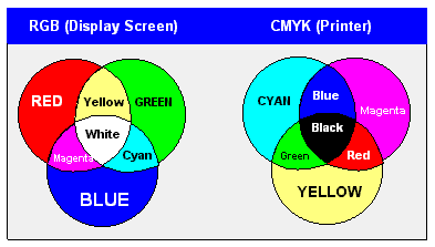
Today, we’ve basically standardized two color models for practical purposes:
The Additive Color Model: Which is how light mixes to create white light (RGB).
The Subtractive Color Model: Which is how pigments/inks mix to create black (CMY).
An easy way to remember which is which is you add the colors to get white (red, green and blue light would add together to create white light), or subtract the colors to get white (no pigments would leave you with white paper).
Primary colors are more or less a way to create as many colors as possible using as little “color elements” as possible. This creates what’s called a color gamut — basically a spectrum map of all achievable colors that model can produce. You can have more than three, but to achieve any semblance of full-color, you need at least three.
Of course, keeping primaries down to the minimum is largely practical to for obvious reasons. But still, the printing process uses 4 “primaries”, CMYK (cyan, magenta, yellow and black… My namesake ) because inks, dyes and pigments at best can only produce a muddy dark grey since the CMY gamut is much smaller than human vision, and the pigments produces only close approximations to the three primaries and never mix perfectly. So black is added to give printed images their proper snap and richness.
Another, more common-sense, reason to abandon RBY as the primary color for dyes (and paints and crayons and pigments, and inks, etc…) and the color wheel is that when you mix colors, the medium becomes darker, i.e., closer to black. Pigments absorb bands of light and reflect the light you see, so, a red pigment absorbs all colored light except red and bounces the red to your eyes. If you mix in blue, the blue is absorbing everything, including red, and bouncing blue to you while the red is absorbing everything, including blue and bouncing red to you. And so, the level of brightness is now reduced. There is still some red and blue being bounced to your eyes and you see that as purple, but, that purple will necessarily be darker (closer to black) than either the red or blue.
If you ‘lighten’ the red and blue with white first to make them pastel red (i.e., a shade of pink) and light blue, then you’ll get a light purple that’s brighter (but still darker than the red and blue), but, it will be washed out in saturation because of all that white.
By mixing red and blue dyes, you will never get an intensely saturated and bright purple (i.e., magenta). By mixing blue and yellow, you won’t get a saturated and bright blue-green (i.e., cyan). You’ll just get a darker and/or more washed out versions of those blended colors.
So, rather than starting with red and blue which are dark colors (compare them to yellow!), you start with cyan and magenta and yellow. Those bright colors will easily get you to the darker blue and red when you mix them properly. And by themselves, you get all the ‘bright’ colors of the color wheel.
Conversely, for colored light, you start with the dark colors (RBG) because when you start mixing them, you then get the brighter colors (CMY) as each blending gets you closer and closer to white.
“Blue” in photoshop is actually #0000ff. For a blue that can mix with yellow (#ffff00) and make green (#00ff00), you want #00ffff, or “cyan”–what we used to call “printer’s blue.”
Similar relationship between “red” (#ff0000) and “magenta” (#ff00ff). The fact that art departments continue to get this wrong is one of my pet peeves.
The real color wheel:
Magenta (subtractive primary)
Red (additive primary)
Yellow (subtractive primary)
Green (additive primary)
Cyan (subtractive primary)
Blue (additive primary)
And back to Magenta.
Actually, Red is hue 0 in Photoshop, but I hope you take my meaning.
Orange is a tertiary between red and yellow. The purples are in a range roughly from magenta to blue.


