Underwear! I knew I’ve been forgetting something! ![]()
Darn seniors moment!
Underwear! I knew I’ve been forgetting something! ![]()
Darn seniors moment!
I was thinking about the bar chart failures as I was ranting, too, but decided not to focus on that because… all of it is just so bad.
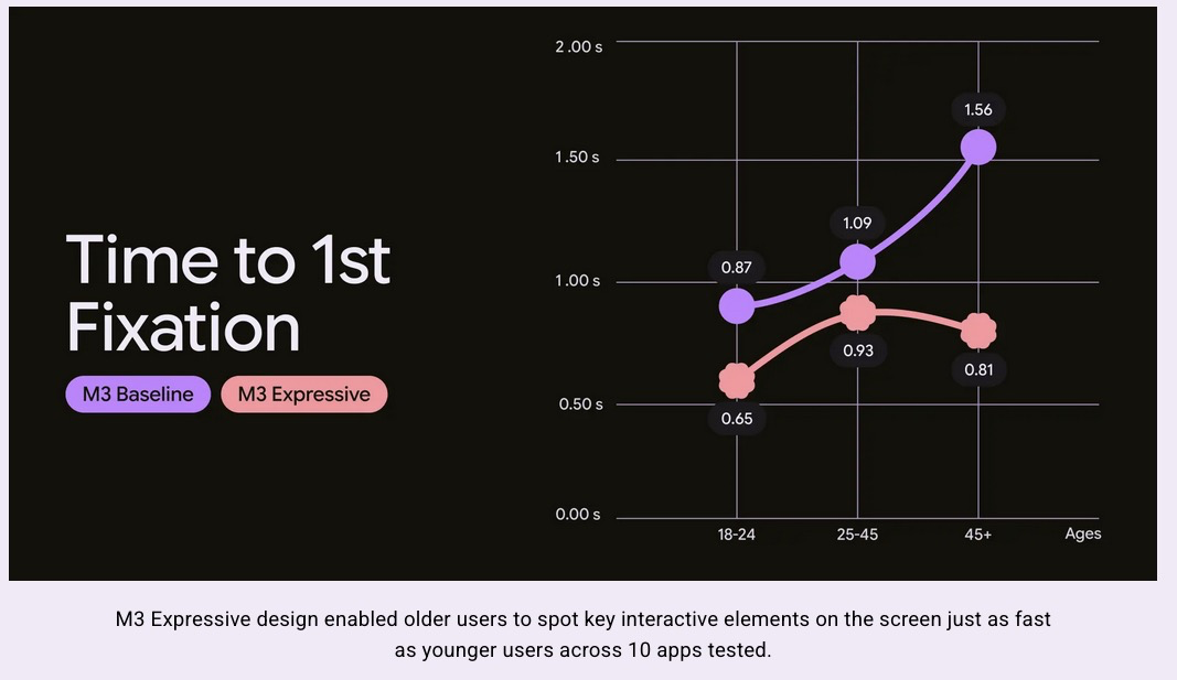
The whole exercise is apparently about making software feel good at first glance to first-time users:
It doesn’t say much about usability, only modernness and visual appeal. Their eye-tracking tests only asked the user to “send the email”. Of course they’re going to do it faster when the button is huge. But the Send button is not the main part of interacting with emails… it is just the final step in a long process that mostly centers around the email text, which this design completely obscures. Did their users have to try to actually write the email before sending…?
Apparently all of this helps old people find the Send button 0.75 seconds faster:

They want to kill my ability to actually read and write emails so I can find the Send button less than a second faster?!! Nevermind the bar graphs, this is straight-up malware.
And here’s what gets me… this is made by a team of seasoned professionals, not interns or high school grads:
Did none of them think to see how these changes affect people who’ve already been using their phones & apps for many years, multiple times a day?
Is Google really so desperate to market to the 18-24 crowd they just decided to ignore all the older, existing users? It’s infuriating…
I don’t know why this bothers me so much. The world is full of ugly, amateurish software. I guess I just expected more out of Google.
Apparently we’re the product, not the customer. Who knew?
I showed this to my 19 year old and she asked if my laptop screen was broken.
Meh. I like it fine. Probably not my first choice, as I like more minimal setups.
I read this thread (and saw the photos) last week, then on Saturday my Samsung phone notified me that it had a major UI update ready to install, and I thought “Oh shit, here it comes.”
But apparently the Samsung UI update was not related to this Google thing, and for the most part I’m liking the UI update (although there are some changes I’m still getting used to). I kinda feel like I dodged a bullet.
Yeah, Samsung uses their own thing, “One UI”. Other big Android manufacturers (like Amazon Fire or Xiaomi, popular in China) also have their own design systems.
It’s only really Google and smaller third parties that use Material directly. Material is most prominent in Pixel phones & tablets and newer Google apps & services.
(Android is a shared operating system, but manufacturers can build their own interfaces and designs on top of it.)
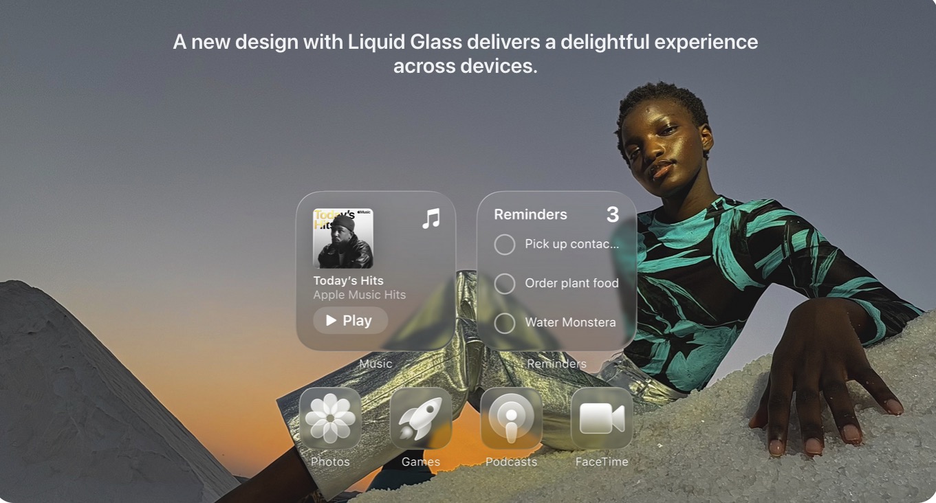
I didn’t think this was worthy of a whole separate thread, but Apple also announced a new design system today: Liquid Glass
They’re gonna make everything translucent and glassy, like Windows Vista:
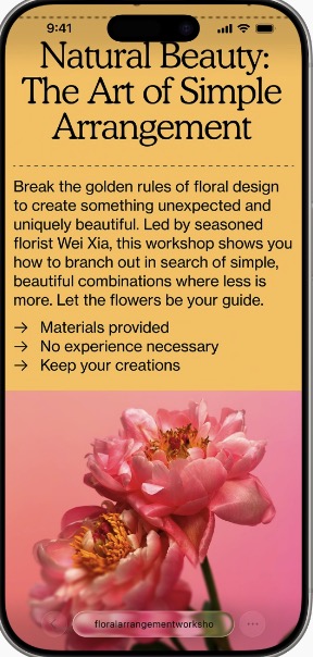
God, what a usability nightmare ![]() You can’t even clearly see the icons anymore, like the “Library” one in the lower left:
You can’t even clearly see the icons anymore, like the “Library” one in the lower left:
Or whatever the bottom text hidden in the flowers say:

Even on bigger screens, all the buttons and text are just harder to read:

Mostly this just says to me… software is made by people in their 20s and 30s, for people in their teens and 20s, and it’s only going to get harder to use every year older you get after that ![]()
God, I miss the simplicity of the Windows XP days. Is this what getting old feels like? ![]()
The first thing I’ve done on e fresh OS install since back in XP / Server2000 is ensure the desktop background is a neutral uniform color. Not a picture of something. My phone is the same way. No pictures.
Now THAT is assinine.
If the bleed through was about 2%, not 50% I could see it offering some assurance that the thing on top is only a pop-up that can be dismissed and the screen beneath will then become visible.
Android 16 is supposed to come out today, but material 3 expressive won’t be included until the first feature update in August.
Verizon home page just changed too. It’s big blocks of bright red and bright yellow. It’s making my eyes bleed.
The whole world is uglifying! Arrrrgh. Give me back my Windows XP and Yahoo.
If it’s good enough for laundry detergent, it’s good enough for cell service.
![]()
Windows 2000 Server Edition.
Robustness like that does not exist outside of specialised *Nix (Alpine, etc)
Though I do run XP on a dual-boot Mac.
Hot Dog Stand strikes again!
I know. How did this get past ANYONE. We are leaving Verizon for a different reason, but good lord. I’m a GIS Application Engineer. A cartographer that uses code to make maps and web sites. Color and presentation for maps is critical. Not just for being nice looking, but for presenting data spatially. Both my parents where artists.
This site offends me on every level.
Yeah, it’s pretty bad (and, I think, predictably bad), but that’s what beta releases are for. Now we wait to see if Apple listens to the complaints and tones down the transparencies or whatever.
And we know Apple is paying at least some attention to the buzz because they’ve already changed the thumbnail to its Liquid Glass intro video on YouTube where the play button sort of changed the vibe…
The silver lining is that the liquid ass glass look can be turned off in the settings.