Why is it that in some areas of retail, the industry leaders seem to be actively working to make themselves indistinguishable from their primary competitors?
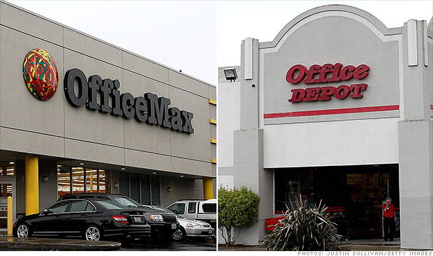
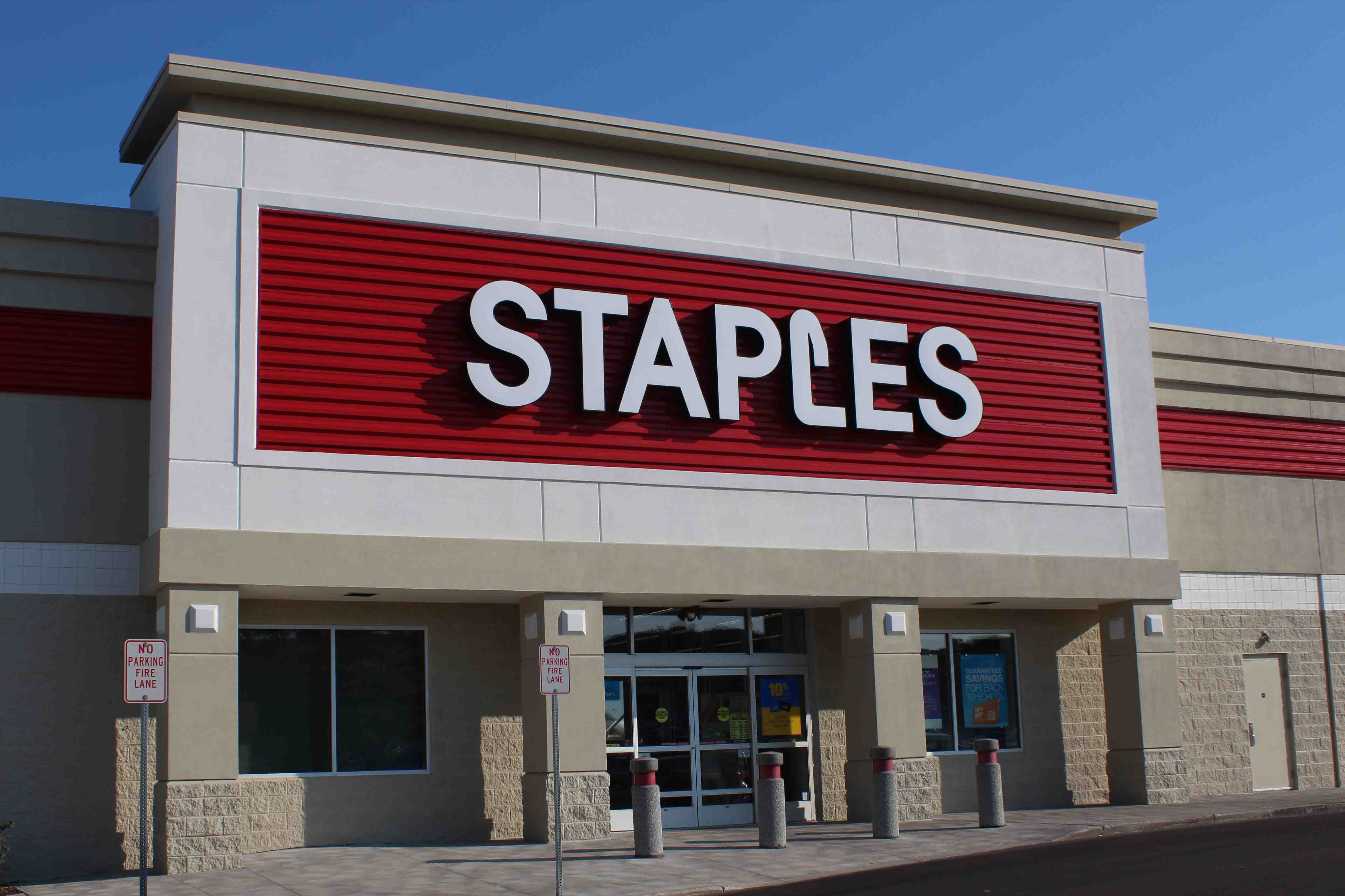
Example 1: Office Max, Office Depot, Staples.
Red and white, red and white, red and white. And fonts that are at least ballpark similar.
Example 2: Petco and Petsmart.
Both red and blue, and very similar names.
In both cases, they’re so similar that I often find myself having to use the internet to remind myself whether such-and-such shopping center has a Petsmart or a Petco (which is important in that case, since my wife loves the former and dislikes the latter).
I mean, look at other types of chain stores. Home Depot and Lowes have extremely distinct visual signatures. So do the top half-dozen or so fast food burger chains. So do the top few pizza chains. And that makes sense to me; as someone who works in marketing, I’m constantly trying to make sure that my company stands out from our primary competitors.
So why is it that some companies almost seem to be trying to blend in with each other? Educated input or wild-assed guesses welcome.
Office Depot and Office Max are the same company, I think. Staples logo isnt really similar, except that it includes red, which is a really common logo colour.
ETA: logos before the office max/depot merger were different:
Can confirm, since I worked for one of their corporate offices and got laid off last February due to the merge! Generally, Office Depot was the red/white combination but OfficeMax (though it wasn’t all that consistent throughout all locations) did yellow/black, usually with a rubberband ball as shown in the above linked picture.
Sure, but KFC, Toyota, and Coca-Cola don’t compete head to head, and each of their primary competitors in their own market uses a different color scheme.
Staples has a branding scheme that might use similar colors, but it is totally distinguishable from Office Depot/Max. I don’t see how anybody could confuse one with the other.
As for the pet store names, the only real similarity is the fact that they both start with the word “pet”. I don’t think that is particularly noteworthy given what they sell.
Their color schemes are only vaguely similar. Different shades and different focuses. Petco tends to emphasize the color red in their branding, whereas PetSmart emphasizes blue.
Fine, but you haven’t really presented any significant examples of the phenomenon you’re talking about.
Petco and Petsmart both use light blue and red in their signage, but the similarity ends there:
Petco uses a rounded/chubby font, Petsmart uses one with corners
Petco has the text all in one colour, Petsmart uses two
Petsmart has the text set on a wavy line, Petco doesn’t
Both logos incorporate graphics, but so what? - they have nothing in common
I’m not saying the phenomenon you describe doesn’t exist at all (because I can think of very clear individual cases of branding that is trying to copy something else), but individual cases don’t make it a trend.
Not exactly what you’re asking about, but if you’ve ever wondered why nearly all supermarkets are laid out in the same way, regardless of the company running them, the answer is science.
I get Petsmart and Petco confused all the time too. Mostly because they seem to claim shopping centers in some kind of weird turf war so if there’s a Petco down the straight, the nearest Petsmart is in the next town over and vice versa. It wouldn’t really be a problem as like 75% of their stock is the same, but that last 25% of the stuff is crap at Petco and great at Petsmart.
I can relate to the examples given in the OP since they are both the ones that come immediately to mind.
I live in a large metro area and know the exact locations of a dozen or so Petco/Petsmart. But I’d be damned if I could tell you wether they are a Petco or a Petsmart. Same thing with the OfficeMax/Depot/Staples. I know where each one is, how to get there, and have shopped at all of them at various times but I couldn’t for the life of me tell you the exact name on each one.
The other one that feels the exact same to me are those budget haircut places. GreatClips, SuperCuts, FantasticSams. I could be getting my hair cut and the stylist could ask me if I knew where I was and I wouldn’t be able to.
As do I. One of them has had a periodic dollar a gallon sale on aquariums. The other guy began a dollar a gallon tank and light sale, with inexpensive, difficult to open tops.
The National Geographic line of aquarium equipment carried by Petsmart is said to be very good.
As a designer, if I had to guess why I would say a) the obvious “wheel” visual reference and b) it makes for a symmetrical logo, which is nice when you’re putting the logo in the center of the grille or the center of the decklid or whatever. Even non-circular logos are often bascially symmetrical, like the Honda “H,” the Acura “A,” Pontiac, Mazda, Audi, etc.
Bonus if it’s an actual circle like BMW, Mercedes, VW, etc. (and not just an oval, like many are) as then you can put it on a wheel center-cap or steering wheel, where the logo works best as a circle.
I was going to say that Aldi and Lidl had similar logos, but apart from being squarish and including blue, theyre not that similar. The stores themselves are incredibly similar inside.

