Is there a non-fonted version of this alphabet? Does it necessarily require some kind of font or are is there a sort of standard, of certain dimensions for each character, like this and that angle between lines at such and such ratios, on which fonts are based?
If I’ve understood your question correctly: No, there is not an non-fonted version of the Latin alphabet as used in English. Some letters vary quite widely between different fonts, so it would be hard to be sure what is the ideal shape of lower-case “a”, lower-case “g”, or upper case “Q” (to take some really wiely varying letters). Even “O” would be hard: is the ideal “O” an ellipse or a circle?
I’m glad Giles stated what I had intended to about there being no “standard” that I’m aware of. I was going to suggest that whatever “font” they teach in early grammar school would be as close to “standard” or “natural” as anything.
Somehow the notion for an alphabet being “natural” just squeaks in my head.
Giles has the most thorough answer I have seen on this board when I have no idea at all what the question means.
This answer assumes what “natural” alphabet means, but I have never heard the term. Different languages have their own alphabets; the term “Latin alphabet” refers to the letters used to write English, although Spanish has characters in its alphabet that English does not, and English has letters that are missing in Italian. So what’s “natural”?
I also do not know what “non-fonted” means. A font is a graphical realization of an alphabet. There are no standards for what is an “A”, for example, like what the angle between the legs; it differs from font to font. (Hey, I’m startin’ a new thread.) But “font” is not a verb so I do not know what “fonted” or “non-fonted” means.
I think you could describe the fundamentals of the latin alphabet, but they would have to be relative to other letters and very vague. As in, you define I as a general vertical shape and O as a general round shape, and then L as a vertical and horizontal, H as two verticals and a horizontal, T as a vertical and horizontal. Now things like Q, A, G would have to be described as “round thing with an oblique tail on the right sufficiently distinct from O”, “two slanty things, more slanty than an H, with a horizontal thingy”, “half a round thing with an interior tail on the right sufficiently disctinct from C”, et cetera.
I have no idea what “non-fonted” means.
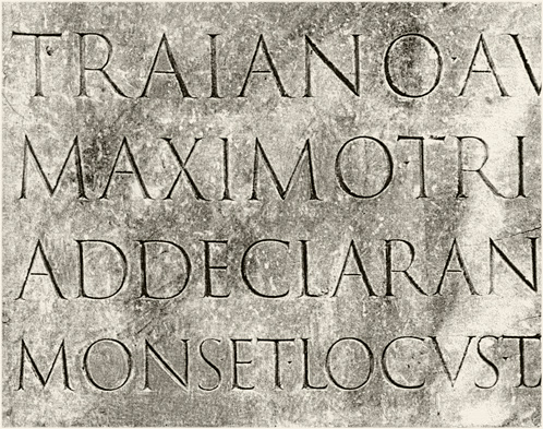
If you’re looking for the the grandaddy of what we call latin letterforms, you’re looking for the Trajan capitals.
This site credits the Roman letterforms as being the source of our Latin alphabet:
This site echoes what I was taught in art school:
Here is Twombly’s design.
But be aware that there is no set “standard official base font” typographers from Garamond to Frutiger to Gill to Zapf have spent big chunks of their lives trying to attain perfect letterforms. The design of our letters is and always has been in flux and there’s no one way to design a letterform.
I once did a project on Optima and recall my teacher telling me that the capitals were based on Trajan (though I can’t find any cite). Though I will say that when you compare the letters side-by-side, their construction is uncannily similar.
What I could find is that Optima’s designer Hermann Zapf used the Golden Section as a basis for it’s geometry.
Here is a PDF file that talks more about the geometry of Roman lettering.