I’m not in the marketing business but I assume when companies redesign their packaging they expect and probably achieve a level of success but I really find it annoying. I might be more a pattern recognition person but when I go to the grocery store looking for the yellow package with the red letters I expect to find just that. If I see something similar but am not quite sure it’s exactly what I had previously bought I just move on and they don’t make a sale. I understand the “new look, same great taste” or what have you can be found for a period of time but I still don’t trust that. Am I unusual here?
They do expect you to be somewhat literate and realize that the product’s title hasn’t changed, even if the branding has changed a little bit. I mean, if the box says “Purina Cat Chow” and is still blue and white, but in a different type face, they expect most normal people not to be so illiterate, skittish or stupid as to not buy the product because the packaging changed a bit.
Generally speaking the idea would be to revamp their product packaging/image to give it the appearance of freshness and newness without actually changing the product.
That’s why they’re never usually very far off from the old packaging.
I’d guess if the packaging is new or drastically different, they’re probably trying to reposition themselves in the marketplace, and by changing it up a lot, they’re trying to break people’s associations with the old product.
Case in point- Bud Light Platinum’s packaging is pretty far off from Bud Light/Budweiser, and it’s because they’re trying to set it apart from their other offerings as a more premium beer.
Besides “freshness” - part of what’s called “product news,” believe it or not; same reason your grocery store moves product around from aisle to aisle - repackaging is often to change standard sizes without buyers noticing. That bright, fresh, appealing can of Corn Moisties! is probably a half-ounce to 25% smaller and likely at a higher unit price, maybe even the same shelf price as before.
The whole purpose of “product news,” whether driven by manufacturers or grocers, is to shake up regular customers’s expectations and product baselines. It usually has a positive effect on net sales and profits, especially when products are downsized. (And when a more efficient sales pattern is found - that is, people going down Aisle 6 buy more Corn Moisties from that end cap than when it’s on the Aisle 3 end cap.)
Fun game: count the “security cameras” in your local big-chain grocery or big-box store. Gosh, there are a lot these days! Gone are the three or four big black balls watching you; now there are a dozen baseballs per aisle. Must be a lot of theft… or, say, optically-based shopper tracking.
I would think they are trying to gain new customers as well. Maybe they will lose 10% of their customers due to the packaging change, but gain 15 or 20% new customers.
Also, when a shopper sees that packaging hasn’t changed in X years, they might think it’s old or stale or has been on the shelf too long.
Amateur Barbarian, my daughter’s working at a general merchandise store where they do that very thing – move items to different aisles for no apparent reason.
Off subject, but she told me something that explains the bubble packaging that drives people crazy. She says shoplifters at her store don’t take the whole package – just the stuff in the package – and they leave the empty packages on the shelf. The thieves must think that taking the whole thing would trip an alarm.
If it’s more difficult to get the stuff out of the packaging, it’s less likely to be stolen.
Customer loss due to packaging changes per se should be minimal unless the marketing design team really screws up, as in the recent Tropicana debacle (they went from their trademark look to something that looked like a cheap generic product) - sales plummeted and they backpedaled to their old design in an expensive hurry.
Customers that notice package shrinkage or cost increases will drop (at least for a while, but they’ll be back if they are brand-loyal and don’t find an acceptable alternative), but in general, repackaging that isn’t screwed up produces a jump in sales.
A number of responses that have made the same points have snuck in while I was writing this, but here it is in full:
It’s uncommon that a package is redesigned in such a way that it is unrecognizable. Companies do not want to make it hard for the customer to find the product. Just the opposite! Yes, it happens, but if they do it, it’s usually for a specific reason and the marketing people are well aware of the cons of the change. They do it because they think the pros clearly outweigh the cons. There are a lot of reasons they might make the major change, but they do not do it capriciously.
Companies absolutely need to update their packaging on a regular basis. If they don’t, the packaging soon becomes very dated-looking. You just don’t usually notice because all the design themes stay pretty much the same. They might substitute a more modern script typestyle for the older script typestyle, but while you’re shopping, it’s familiar enough that you don’t even think about it. Even products that have “old-fashioned” as part of their brand identity update their packaging because they still have to appeal to modern consumers.
If the redesign is done badly, it’s more noticeable. Sometimes the more drastic redesigns happen because the company hasn’t been updating the packaging as frequently as they should have, and bringing it up to modern standards requires a big change. If it’s done right, it barely registers.
Sometimes companies do release products with previous versions of their label, but you’ll notice these are usually 50 year old designs, not 20 year old designs. The 50 year old ones are “vintage” and charming. The 20 year old ones are just dated and ugly.
There are some rare exceptions, like Coca-Cola, where the visual identity has stayed virtually the same over they years, but even they make subtle updates. The gorgeous Spencerian script of “Coca-Cola” doesn’t change. The typeface they use for other words on the package keeps up with modern standards. The exact shade of red they use has shifted a bit. It’s less orange now. Cans now let the silver show through instead of being printed in both red and white. Of course part of Coke’s brand identity IS to be “old-fashioned” and unchanging, and they work this angle hard. For example, the plastic bottles have an hourglass shape to evoke the classic glass bottle. The brand identity is so iconic, they can play around with the elements all they want but the package still screams “Coke.” And coming out with alternate label designs does help to keep things fresher. This isn’t the best photo, but it’s a good illustration of what I just described.
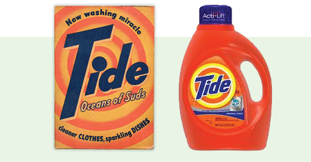
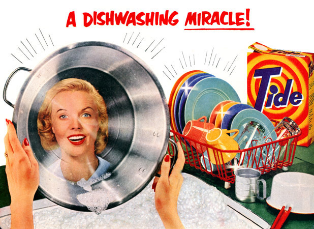
Tide detergent is one of the greatest package designs of all time. Just about all of you can picture a package of Tide. It’s orange with an orange and yellow bulls-eye design and “Tide” written diagonally in blocky dark-blue sans-serif letters. The essential elements of the package design have remained absolutely consistent for 67 years. Here is the package in 1946 next to a current package. The package design has changed and changed again over the years, but the basic elements remain the same. Orange, yellow, and dark blue. You see it, you know it’s Tide. You’re in the Middle East and you have to wash your clothes, but you don’t know Arabic? No problem! Here’s some Tide! Some Tide products do come in non-orange containers now, but that logo is still there screaming “Tide.”
The packaging for Tide Pods is interesting because they did something radical on the label: They added purple! This says clearly that “this is not your same old Tide,” while also making it very clear that “Yep, this is Tide.” The logo is there loud and clear, the lid is orange, and even the pods have orange and blue sections on top of the white. And…the package is round. Like the logo. Absolutely brilliant design. (Except for this little problem, but the new package is, surprise surprise, orange.)
Thank you for that. What I found interesting is that apparently in 1946, Tide detergent was sold both for clothes and dish washing. (The 1946 package mentions “sparkling dishes”.)
Or in some cases, with buyers noticing: the clothes-soap market seems to be hit by periodic waves of re-formatting. Now it’s powder! Now it’s powder with colored dots! Now it’s liquid capsules! Now it’s solid “pills”! Now it’s powder again, but without colored dots so we can say it doesn’t have any dyes! and so forth.
The marketing/product placement people are always trying to find some way to differentiate themselves from the competition, even if it’s in ways that are kind of absurd.
To wit: the latest crop of packaging “improvements” to mega-brew bottles and cans. We’re supposed to buy Miller Lite because their bottles have “vortex” necks, or because they have some funky little vent that you can punch out with a key and guzzle beer even faster. Or some sort of label with mountains on it when it’s appropriately cold.
They feel like they can’t change their product, and they don’t want to drop their prices out of a fear of being perceived as lower quality, so the only wiggle room they have is with packaging, or with touting “Less filling- tastes great” or even more nonsensical things like a giant silver locomotive crashing into a stadium, making it snow and somehow creating a giant party where everyone is wearing beach clothes.
All of which is to disguise that laundry soap is laundry soap, whether it’s generic white, All with Power Dots! or (genuflects) Tide.
I know of at least one change that caused the product to lose me as a customer, and cost the store as well.
I drink 1% milk, which many places sell with a light blue label (dark blue for 2%, red for whole milk). I always looked for the light blue label on milk, which I frequently purchased at Safeway, where I shopped. One day there was no light blue label, and it took some searching to discover that Safeway had changed all of their house-brand milk colors, and 1% now had a mustard yellow label. I thought it was really ugly, and didn’t like the idea of always having it in my refrigerator. So when I spotted a different brand in another store that was still light blue, I purchased it instead. I’ve never gone back to Safeway milk, and since milk is a staple I purchase every week, it’s lead to me shopping at other stores much more frequently. Now I only go to Safeway about once a month, for specific products that I can find there. So changing the milk label colors has had a very small negative impact on their business. Hopefully enough people purchased the ugly yellow milk to make up for it.
I didn’t know it was sold for that either until I went looking for a pic of the original Tide packaging.
It doesn’t actually surprise me though. I didn’t even know Tide was laundry soap when I was a kid. A bucket of water with a scoopful of Tide powder in it is what we used to scrub down the decks of the boat. (I hated swabbing the decks, but I did love the smell of it. Still do.) So that suggests that it used to be seen as a more general detergent than just a laundry detergent.
A couple months ago I was looking to buy some Gatorade powder. I went to the aisle of sport drinks and … just stared. What had happened? No Gatorade at all.
I was ready to give up and picked up a package of something that looked like a knockoff of Gatorade to see what was what. Oh, it is Gatorade but now called “G2”. Complete with a useless variety of types based on workout status, etc.
Wait a second. You have the most famous brand name in the field and you drop it?
How many customers walked away or bought Powerade since they couldn’t find Gatorade?
Next up, Coca Cola relabels itself C2!
Stupid, stupid, stupid.
The Gatorade renaming debacle was pretty roundly criticized in retail circles when it happened, and sales did drop noticeably precisely because of the loss of brand identity. Pepsi has been trying to position Gatorade as part of a three-step pre-/during/post-game sports “system” branded with a giant “G” (traditional Gatorade being step 2), ignoring the fact that most users aren’t participating in athletics. They’ve stuck to their guns, so I imagine they were willing to lose a few percent on Gatorade sales for an increase in sales across all three steps… but you’d think it wouldn’t hurt to make the Gatorade name more prominent, at least on step 2.
In my little niche of the retail world (OTC), one of the intended side effects of regular packaging updates is that it encourages product rotation. While rotation ideally would occur anyway when stocked, a packaging update pretty much forces it to happen; customers will not buy old packaging when new is available, so stores will force the old to the front in order to not get stuck with it. By introducing regular updates, the manufacturer can get stores to clear out older merchandise, important since most of the large chains have deals with the manufacturer that they will buy back or pay a refund on unsold merchandise that expires.
Problem is, many medicines (cold remedies and the like) aren’t regular purchases for most people, but they do have brand preferences. Any single packaging update is usually minor and not disruptive to the “look” for regular users, but when someone only buys something once every few years, they’re looking for something that’s undergone five or six cumulative changes since they last bought it.
I almost did that a couple of months ago. I very rarely buy Gatorade, and didn’t know of the name change. I thought G2 must be some other form of Gatorade, like maybe something “superpowered” or whatever. I didn’t want G2. I wanted Gatorade. My kid had to explain it to me.
LOL! Is that why they did it? If a kid has near-uncontrollable diarrhea and vomiting, does that count as pre, during, or post-game? That’s why I was buying the Gatorade. The doctor said he should have some for the electrolyte replenishment.
Does anybody actually take Gatorade that seriously as a performance drink that they’d want to buy 3 different types anyway? I know it is used and useful, but that just seems a little over-the-top for what is essentially bug juice with a little salt in it.
Agree that they should have kept the Gatorade name more prominent even if they wanted to do the 3 step thing. There are many ways they could have kept the name and brand identity without confusing consumers.