Let’s try to take Trump out of the equation as much as we possibly can, and just look at the aesthetics of the issue (don’t let pro-Trump or anti-Trump feelings affect your color preference):
The new, Trump-proposed, paint appearance looks like this.
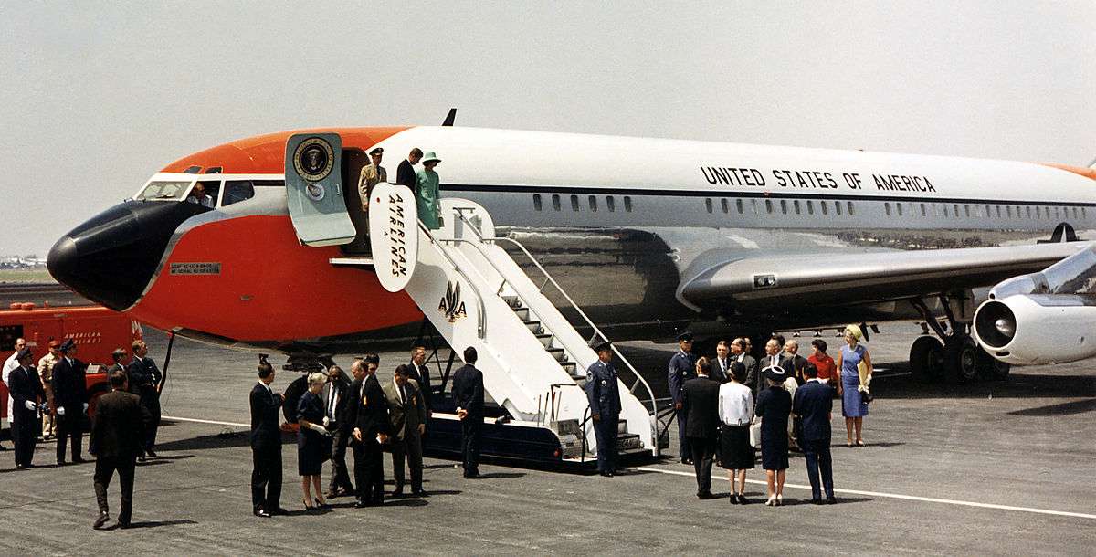
IMHO, the new paint job makes it look like a 1960s airliner. Maybe that’s a good thing if one likes old-school classic style, but it looks rather stodgy. But I don’t like pale blue either.
(Again, ignore the Trump factor, and just assess the paint art by preference)
I don’t like either one. I would prefer to see it painted entirely for camouflage. But then perhaps that’s what the sky-blue bottom was intended to do?
I like the new one better than the old one, that blue is unappealing to me. It does look like a 1960s airliner, but it’s at least solid looking to my eye.
What would be the point of that? Even military planes don’t use camouflage paint schemes, and anyone that’s actually attacking the plane would have access to radar, they wouldn’t be trying to sight down an old WW2 anti-aircraft gun with iron sights.
They normally last about 30 years, and these were delivered in 1990, so it’s time. Then again, they haven’t gone through as many flights as a commercial jet would have gone through, so maybe they won’t fall apart sometime in the next few years. Given the mission of the craft, it’s time to retire them.
I voted old. The old one, at least, is a classic look. The new one is just bland.
I actually thought the new one looked like an inverted version of the old US Airways livery from the late 1990s-early 2000s. But I looked up some pictures and the old US Airways scheme was gray on the bottom rather than white.
I’m pretty sure it’s dark blue, not black, since blue is one of the colors of the American flag an all.
They can tell that a plane is there, by why make it obvious that it’s the one the US President uses? Maybe a stock private plane scheme, or even something close to a popular airline would be wiser camouflage?
You are both assuming it’s a military or government sponsored attack. What about the Joe Schmoe who wants to aim his personal laser into the pilot’s eyes? Is it wise to let him know which plane to look for?
And what about when it’s parked and the majority of the detail is protecting the President? Might it not be wiser to make it hard to tell which one is the target?
I’ve always said the same thing about the Presidential limo and the SS escort vehicles. They are technically unmarked, but far too obvious to anyone who’s been here a week.
I voted old. Strictly on aesthetics, neither is terrible, but the old paint scheme has been around for nearly sixty years, and at this point I think it’s “iconic”. We’re not re-designing the American flag are we? (Barring statehood for Puerto Rico and/or D.C., or us annexing Cuba or something like that, and even then it would still be the same fundamental design.)
(For what it’s worth, I’m rarely impressed when commercial entities–like airlines–come up with a “new look!” either. By all means update the actual equipment, but I would be no less likely–or any more likely–to fly Delta if their paint scheme and logo still looked like this, and would find it slightly bizarre if anyone else would either.)
Disobedience to OP instructions:
Also, I just can’t not be political about this. If it were something George H.W. Bush had come up with, or even George W. Bush, that would be one thing. But I do not want to have to look at Air Force One for probably the rest of my life–assuming “the rest of my life” isn’t lived out in some post-hydrocarbon Mad Max world where the President of the United States travels The Wastelands in a convoy of wheel-less Humvees borne on the shoulders of his enslaved enemies palanquin-style–and be reminded of the Dumpster Fire Presidency.
Except for the tail, the proposed scheme looks a lot like US Airways. If you parked it at a commercial airport, you’d be hard pressed to quickly spot it in a collage of other commercial aircraft.
The existing scheme is unique in the world, and after decades in use, it’s iconic. I don’t care for the harsh contrasts of the proposed update; the muted contrasts of the original announce the plane’s arrival in an understated and elegant way, without blaring like an advertiser that’s trying to grab your eye.
Coin flip for me but I chose the new. I love the old scheme, mostly because it has become iconic world-wide. So for that reason alone, I’d have preferred the new one to follow in a similar paint scheme. I do like the new design, nothing about it offends me. Hmmm… I prefer the iconic style of the old and nothing about the new offends me. I should probably change my vote! Haha!
.jpg)