Need answer fast.
I have to print an 8ft by 4ft poster. I have access to the printer through the print shop and they suggested I use Adobe Illustrator to make the poster.
What do I need to know?
Is it as simple as setting the document size to 8’ x 4’?
Is there a better Adobe program for what I want to do?
I usually make the document 1/4 size, then print at 400%. Therefore, your document would be set up as 24"x12". Actual size is ok too, but the smaller layout just seems to make the file more manageable. I prefer Illustrator for large format printing, but you could use inDesign too. I’d stay away from Photoshop, since it’s not vector based and your file could get huge if you want to print at a decent resolution.
It’s way easier to layout a page in inDesign unless you’re an Illustrator pro. It’s the part of the Adobe suite that is designed for that. Yes, make it 1/4 size. inDesign also gives you more control over the PDF you will send to the printer.
If your pictures are to small to blow up that large, then they’re too small to blow up that large. You lose quality and clarity, but if the image works and is fine for what you are doing, then you compromise. If you have a PNG, a very low resolution file intended for web use, basically, and isn’t print quality. But it’s what you want to use it for. If it looks okay, fine. But you’re not going to get a high resolution image that large from a PNG.
which the designer utilizes is up to their specific project and outcome. if the audience stands back ten feet … pixelation may not be detrimental as, say, color or gradation.
[ul]
[li]photoshop is great for rastering images 'n touch-up 'n color-correcting bitmap images.[/li][li]illustrator makes creativity come alive when vector images are preferred over bitmap images.[/li][li]indesign … puts all the elements together in a nice layout … the later versions offering “liquid” layouts. rendering, for instance, a web-page that can look acceptable using iphone … ipad … or even 30" computer monitor … all from the same modest file![/li][/ul]
with regard to illustrator … again, depends on the image*(s)* … some images might actually produce better results if they have “image-trace” applied to the original image. if this is your choice, remember to “expand” the vectors after the trace completes.
as for print-output … pdf-files are probably the most “transportable” medium … also do a nice job of compressing data … and, often times, are the most compatible with the peripherals in the pipeline. your print-shop may prefer multiple versions of the final file … say, one utilizing spot-color … another specifically rgb/cmyk versions (no spot-color).
If you are a designer the professional thing to do is make all typography and graphics using adobe illustrator or indesign so they will be vector based not pixel/raster based —because vector is resolution independent and can be enlarged or reduced to any size and will stay crisp. Then you import the photos that are pixel based into the file with the type and graphics.
If you have a photograph, you enhance it in Photoshop and do what ever special effects you need in photoshop at 300 pixels per inch so that it will be high res with no pixelation. However you probably can not make a file with a photo that is 4ft by 8ft at 300ppi because it would take too much memory so you need to drop it down to what you think you can get away with which may be around 125ppi. You save the photoshop file as a Tiff and then you import it into the vector based program which I guess will be Adobe illustrator since the technician asked you to use illustrator. But I’ve never done it that way, I use Indesign for typography and import photoshop tiffs into my Indesign file and save it as a PDF at the end.
Yes, InDesign is a far better tool for any kind of page layout than either Photoshop or Illustrator. Lots of older users can do amazing layouts in them because that’s all we had for a long time. Lots of sign shops use them similarly through inertia and ignorance and because that’s what all the printers and cutters are optimized to work with (when it’s not CorelDRAW, gag).
As for working scaled, use only vector graphics where you can and if you have to use raster images, try to use ones that will hit the large-format surface at at least 100dpi, 150 is better. Those will be some big-ass files, so you might want to work with comps while you’re doing the design part, and lay in the 50MB versions at the end.
I always try to work to full scale when I can but you run into some limitations. Some of my print vendors absolutely reject anything not scaled for final print (their ignorance showing, again). Others have no problem taking a PDF of any nominal scale and printing it at billboard size. It usually works best if you work in an even mulitple (4 is usually enough) and keep the proportions exactly the same as the print layout.
Send the print file only in PDF. If the shop doesn’t take PDF and won’t explain why in very detailed technical terms, find another shop.
Finally, ask the shop whether they want the file in CMYK or RGB. Depending on their skill and the exact workflow, they may have a strong preference or none. If colors (especially things like skin tones) are critical, you will probably want to convert to and proof in CMYK. Ditto if you need to have a close match for a logo or corporate key color.
Happy to answer more questions, here or PM. I do this all day.
This is a one off project using a poster printer at work. I have a backup plan if the pictures are too pixelated by Illustrator. I’ll let everyone knows how it turned out and in the future I’ll know to convert my pictures to SVG format for this work (I may be able to do this through Photoshop for this project).
Converting raster images to other formats won’t produce more resolution when they’re printed at large scale. At most, they will be smoother and less pixilated, but not more detailed.
Yes please let us know how it goes and how it turns out.
Also, would like to add… I’m not sure but in Illustrator you may have to make sure tiff/photoshop file is embedded or linked properly when you print the file. If its not linked or embedded when it prints out it will only be the screen preview information that prints so it will look very pixelated.
True, and this is another reason to always export the final output to PDF for the printer (of any kind) to use. PDF embodies all the best of PostScript, especially as it was used by pros to preflight and check layouts for errors and composition problems.
If the PDF is right, the print job will be right. I don’t think I’ve had anything printed except from PDF for most of a decade, and we’re talking thousands of jobs from business cards to books.
Speaking of the Image Trace feature, the CC version of Illustrator just outputs black & white, if you go through the Object menu. More color options are available through Window/Image Trace. Wonder why they relocated it and kept the base 0 version in the Object menu?
knowed-out … cs6 and cc are virtually identical. the reason adobe keeps “reorganizing” is all about marketability … changed, new, replaced, re-positioned, etc. hence, everyone thinks they need to upgrade (our company does). the windows/image-trace you mentioned is just for bringing the image-trace interface into view. personally, i keep that interface docked to my right-side (same group as “layers” palette).
as for the menu/object/image-trace/make which you are referring to … this, primarily, executes the trace command … albeit, with an assigned default parameter. you can always choose a different option, after illustrator finishes rendering it’s “default”. this is done by going to the image-trace options which reside on the control-bar. or … as you iterated earlier … one can always utilize the image-trace interface via windows/image-trace.
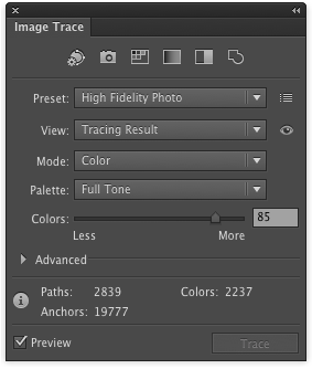
if, for some reason, the render does not seem to allow/show color … verify the following criteria has been satisfied (within the image-trace interface):
[ul]
[li]preset: high-fidelity[/li][li]mode: color[/li][li]palette: fulltone[/li][/ul]
here is a link to how your interface might look: image link (photobucket.com)
and … i humbly apologize to saint_cad for hijacking this thread.
When you say “convert,” do actually trace them, as others have detailed. Merely converting will just wind up with a PNG file inside an SVG file, and will be no better than just a PNG in the first place.
I’ve occasionally encountered this while working on Wikipedia. People think they’re being helpful, bless their hearts.
And once you do trace it, you’ll probably want to tweak it. There might be spots that overlap incorrectly or stuff like that. The anchor tool can help you move points.
