I don’t have an answer for the OP, but it occurred to me that this icon might *not * change, and sometime, 20-30 years down the road, that’s all it will be known for. And someone will post to this board (or whatever comparable thing exists then) – “what are the series of squares on the Save Icon supposed to represent?”
I’m not sure it needs replacing - it’s an icon that has come to mean ‘save’, now quite independently of the fact that is represents a physical storage medium.
Phone icons have pretty much kept up with the times though (or maybe trailed about ten years behind). There are push-button phone icons and icons with push buttons on a blocky handset, and mobile phone icons (admittedly, they look like 1980s cellphones, mostly).
Whoa. If you didn’t say so, I wouldn’t have known what that was. Some sort of RF transponder for a toll booth? A special gas station? “Camera” would’ve been very low on the list…
I’ve seen a “down arrow into folder” icon, like this one. Also, manual saves are rather old-school… can the program provide background autosaves with unlimited undos?
NeoOffice has already moved away from the diskette. The “save” button is an oblongish box, similar to the icon OSX uses for a mounted non-internal drive.
Yes. I mean, everyone here knows what it means because the price of not knowing that means ‘camera’ is a possible speeding ticket.
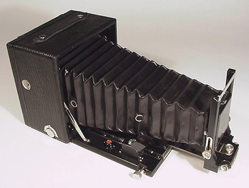
It’s meant to be a representation of something like this:
Cameras similar to that are still in use by specialist photographers, but they’re just not common - and were not common even when the sign was designed.
I’ve wondered how much longer we’re going to use this http://cgi.ebay.ph/ws/eBayISAPI.dll?VISuperSize&item=190318381541 as the icon for a fire truck? (For non-US types, that’s a pic of the US-standard road sign indicating that a fire station is nearby and you should be on the lookout for fire trucks pulling in or out)
Fire engines haven’t looked like that since the 1930s or 40s.
I vaguely recall seeing that kind of icon somewhere, too. Though (after checking ) it wasn’t WordPerfect, Word or OpenOffice, which are all still (3.5inch) “floppy” drive icons.
I’d love to know when the speed camera sign was designed. I mean, surely they didn’t use speed cameras in the days when a logo designer would think that looked like a camera.
Generally, road signs seem to “freeze” what an item looked like when they were designed, which is why the cars on UK road signs look like 1960s Austins.
Very few programs that I use are so toolbar intensive that they actually have a save icon. Usually this is left for the main menu bar in text form and keyboard shortcuts. I think having GUIs with a save icon will die out long before we need to worry about recognizing a disk. In any case, the disk could easily be made to look like a memory/flashcard without much modification, or as other have mentioned, the folder with down arrow.
