Correlated. In general concordance. Maintaining a relationship within a reasonable margin of error.
The line really extends to 1992. Look at the blue line in the chart I linked to earlier.
http://www.wooster.edu/geology/tr/esper1.jpg
You are claiming that if we extend it from 1992 to 2007, we get a hockey stick, right?
So you agree that no splicing = no hockey stick?
And what does it say that many of the proxy measurements don’t reflect the recent increases in temperature? For me, it casts major doubt on proxy reconstructions that rely on such proxies.
Here’s an article from 1983 you might find interesting:
http://www.grisda.org/origins/10051.htm
Although it’s called “The Little Ice Age,” it does touch on the MWP.
Not really. You’re using a single data source (Esper’s) which doesn’t show a particularly pronounced upturn at the end. This could be because the location of the data source doesn’t follow the global average; because it is lopped off at 1992 and/or has some delay in change; was poorly calculated; global warming isn’t occuring; or any other number of possibilities. Looking at a single source outside of it’s conjunction with as many other data points (including the instrumental temperature) is meaningless. Debating whether there would be a hockey stick if you carried the line out to 2007 is equally as meaningless as debating whether there wouldn’t be a hockey stick if bristlecones were screwed up in Mann’s graph.
Individually, you can find potential faults with any single item of data. This is just the same as examining evidence in a court of law. Any single item can be explained away.* But the odds of them all or in majority having no relevance approaches zero as evidence grows.
- The glove doesn’t fit. Police placed the blood there. We fought, but that doesn’t mean I killed her. Etc.
Instrumental records of temperature temporally coincide with global temperature rise, and you find that to support your rejection of the AGW hypothesis. Oddly enough, the existence of instrumental records also closely coincides with industrialization.
The only really complete and uniform set of temperature records over a broad region, over a long period are the NOAA records made by what was then the Instrument Division of the US Weather Department, since 1910. (Every other set of data has to be interpreted because of differing methodology and data collection techniques.) The team that installed and monitored the weather data recording equipment in the NOAA records eventually became the Bureau of Standards, and pioneered the idea of uniform techniques, instruments, and records for their studies. That data completely supports the contention that temperatures in the US have generally risen over time, in an accelerating curve. The data was not taken for that reason, of course. It was taken to allow for weather reports.
Proxy examinations of geological formations all rely on assumptions and every proxy looses confidence rapidly over climate significant time periods. Ice cores, pollen distribution, coral growth rates, and a dozen other proxies are examined and no set of data shows that the planet is not warming. Desperate attempts to debunk each proxy are immediate when the holy cow of progress is perceived to be under attack. The contention that the enormous change deliberately wrought over the earth by human action is not a significant part of whatever is happening is laughable. The absence of a three digit percentage breakdown by cause does not disprove that green house gases are being released by human activity, and that that particular source is growing rapidly because of industrial greenhouse gas production.
Tris
“Sapera Aude” ~ Immanuel Kant ~
And besides the simple issue of the margin of error for a proxy, is that the Average Global Temperature, is meant to be a measurement averaging every square foot of the planet surface.
If I find a temperature proxy in a valley that, due to odd wind patterns or whatever, does the exact opposite temperature-wise as the other 90% of the planet–then if I never look for any other data sources, I’ll have an exact opposite of the real historical gobal temperature for 90% of the world. I won’t even know that it’s the opposite.
10 sources of data, while better than one, is still a far far way away from averaging every single square foot of the surface of the planet. Putting any faith in any single one of them is very very silly. The 10 averaged together is a semi-decent start, but still only gives 66% confidence rate when saying things like, “Average Northern Hemisphere temperatures during the second half of the 20th century were very likely higher than during any other 50-year period in the last 500 years and likely the highest in at least the past 1,300 years.”
Just eyeballing it, it doesn’t look like a very good fit to me. It’s noticeably higher than the instrumental record for one stretch, and noticeably lower in another. Also, it seems to me that Esper et al would have calibrated their proxy measurement, i.e. moved it up or down to get the best possible fit to the modern era.
But anyway, if you need to splice to get a blade, it follows that there may very well be other blades more than 150 years ago that the proxy is also not picking up.
Ok, so how about you cite me 3 proxy studies (besides Mann’s original) that produce hockey sticks?
Indeed, and hence posts #95, 104, and 106 (and really pretty much all of my posts.)
Eyeballing Esper’s graph tells us next to nothing about the global average temperature. If it’s from a location that closely matched the actual global average temperature, well that would be nice, but it’s entirely possible that the amount of correlation is going to be small for that one source, which does appear to be so.
Looking at the graph of all 10 sources, I’d personally say that #7 seems to be the one that sticks closest to an average of all the lines, if you wanted to guesstimate.
Why would I average 3 sources when I can average 10?
Oh really? So it’s your position that the Esper proxy study was intended to reconstruct the temperature for only 1 location?
Anyway, here’s what you said before:
It looks like you are now stating that Esper 2002 is not a measurement (or reconstruction) of global temperature. In which case, it makes no sense at all to splice it.
Why would you average any at all? Keep in mind the question you were responding to:
It sounds like your answer is “no.”
But anyway, since you are so hot on averaging proxy studies (do you understand why it doesn’t make sense to just average studies like that?) why don’t you produce a chart that shows the average of the 9 (not 10) proxy studies you keep citing. I predict there’s no hockey stick.
I honestly don’t know. I know that it’s not using the same data as the other studies shown on the Wikipedia page or else they would all have the same line. Whether that’s an issue of location(s), proxy type(s), or what, I can’t know without reading through each of the studies graphed.
It isn’t. It is “from 14 sites in the Northern Hemisphere (NH) extratropics”. All of the studies are limited and different from each other in source location(s) and proxy type(s), and each independentally just a single study with no more worth than anyone should ever give to a single study.
Because the average global temperature is reliant on averaging.
My answer was that it’s worthless to ponder over. Without actually going back and collecting more data from the proxies, guessing is meaningless, and as that still only gives you the result of a single study it is worth no more in creating an average global temperature than every other study.
Dude… shakes head
Please start a GQ or IMHO asking people for some books on the scientific method.
I mean, I’ll be the first to admit that simply averaging all of the lines together, willy nilly, is potentially bad. But I at least know why that can be a problem (some of the studies might share data sets from each other, some might be regional and others global, etc.) But damn dude…
There are ten. I know this because there are ten studies listed and ten colors.
- (dark blue 1000-1991): P.D. Jones, K.R. Briffa, T.P. Barnett, and S.F.B. Tett (1998). High-resolution Palaeoclimatic Records for the last Millennium: Interpretation, Integration and Comparison with General Circulation Model Control-run Temperatures, The Holocene, 8: 455-471.
- (blue 1000-1980): M.E. Mann, R.S. Bradley, and M.K. Hughes (1999). Northern Hemisphere Temperatures During the Past Millennium: Inferences, Uncertainties, and Limitations, Geophysical Research Letters, 26(6): 759-762.
- (light blue 1000-1965): Crowley and Lowery (2000). Northern Hemisphere Temperature Reconstruction, Ambio, 29: 51-54. Modified as published in Crowley (2000). Causes of Climate Change Over the Past 1000 Years, Science, 289: 270-277.
- (lightest blue 1402-1960): K.R. Briffa, T.J. Osborn, F.H. Schweingruber, I.C. Harris, P.D. Jones, S.G. Shiyatov, S.G. and E.A. Vaganov (2001). Low-frequency temperature variations from a northern tree-ring density network, J. Geophys. Res., 106: 2929-2941.
- (light green 831-1992): J. Esper, E.R. Cook, and F.H. Schweingruber (2002). Low-Frequency Signals in Long Tree-Ring Chronologies for Reconstructing Past Temperature Variability, Science, 295(5563): 2250-2253.
- (yellow 200-1980): M.E. Mann and P.D. Jones (2003). Global Surface Temperatures over the Past Two Millennia, Geophysical Research Letters, 30(15): 1820. DOI:10.1029/2003GL017814.
- (orange 200-1995): P.D. Jones and M.E. Mann (2004). Climate Over Past Millennia, Reviews of Geophysics, 42: RG2002. DOI:10.1029/2003RG000143
- (red-orange 1500-1980): S. Huang (2004). Merging Information from Different Resources for New Insights into Climate Change in the Past and Future, Geophys. Res Lett., 31: L13205. DOI:10.1029/2004GL019781
- (red 1-1979): A. Moberg, D.M. Sonechkin, K. Holmgren, N.M. Datsenko and W. Karlén (2005). Highly variable Northern Hemisphere temperatures reconstructed from low- and high-resolution proxy data, Nature, 443: 613-617. DOI:10.1038/nature03265
- (dark red 1600-1990): J.H. Oerlemans (2005). Extracting a Climate Signal from 169 Glacier Records, Science, 308: 675-677. DOI:10.1126/science.1107046
Ten.
And as said, I’d probably guess that #7 is probably closest. You can see it, alone, on page 16 (the last graph in Figure 5) of:
http://holocene.meteo.psu.edu/shared/articles/JonesMannROG04.pdf
In that case, why did you say this:
?
Fine, then you agree it makes no sense at all to take the Esper 2002 graph and splice on the instrumental temperature record, right?
Lol. Dude you gotta be kidding. But anyway, the question you were responding to is this:
Sounds like your answer is “no,” right?
Ok, so jshore’s earlier statement was meaningless, right?
Dude . . . shakes head. Please start a thread asking people why you can’t just average the results of different studies.
Lol. Ok, so you admit it now.
And you think I don’t know? GMAB. I’m the one who pointed out that it might be a problem. You’ve been the one who has pushed for averaging.
Why did you push for averaging? Because global temperatures are averages. Lol.
Actually there are 11 colors. But I agree that there are 10 proxy studies. Earlier you claimed that each one produces a hockey stick. That was wrong.
Now you claim that what you were really claiming was that the average is a hockey stick. So show me the average. I won’t accept your guess that a particular one is an average. Show me the average.
It doesn’t have anything to do with the scale you examine the graph at. The “Hockey Stick” refers to a relatively steady “handle” (which will have its own ups and downs) from a thousand years ago until about sometime between 1850 and 1890. From sometime around 1900 or 1920 to the present there’s a very different shape which we might call the “blade.” In between, by default more than any actual diagnostic characters, we might call it the “elbow.” The instrumental temperature record exists before the “blade” is clearly seen - the temperatures from 1850 to 1920 don’t have a wide range of variation relative to the variation from 1920 to 2007. Between 1850 and 1920 the range of temperature anomalies is about -0.6 to 0, between 1920 and 2007 the range is about -0.4 to +0.6. You may not want to count the 1910 cold snap because it could make the trend appear more dramatic than it needs to be, so let’s start it at 1920.
Would that it did. While time machines are on the block, I’ll wish for a temperature record going forward 1000 years too! 
A little cayenne should do the trick, and maybe we can cobble together some lyrics for the black line, too. 
All temperature reconstructions should be spliced. One proxy is generally considered insufficient, so what you should do is splice together data from different proxies to get a better view of what was going on temperature-wise. I’d be concerned if the data weren’t spliced - that would be a major critique of the work for me. If you don’t splice proxies from different places and time periods, you can’t do a temperature reconstruction.
What you appear to be trying to argue (correct me please if I’m wrong) is that splicing creates an artifact of a hockey stick - in other words, all of the proxies systematically underestimate global temperature relative to instruments, which I haven’t read any evidence of. Why shouldn’t proxies ever overestimate global temperature?
I respectfully disagree. If you smooth the curve on a 40 year scale, it will have a lot fewer elbows than if you do so on a 5 year scale. Consider the extremes: What if you smooth the graph on a 1000 year scale? Then it’s extremely smooth. What about a 1 year scale? Then it’s very jerky.
On further reflection, I suppose that “scale” is something different. So I may have used the wrong word.
But anyway, scaling makes a difference to. Here’s an instrumental temperature record:
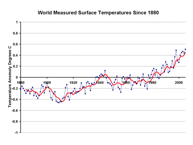
No hockey stick.
I’m not sure about that. I did an image search for “mann hockey stick” and found this:
http://earthintime.com/hockey.jpg
The instrumental data starts at 1902. Just about exactly at the elbow.
I’m using “splicing” to refer to something a little more specific than simply combining data as you describe.
And anyway, splicing isn’t inherently evil. However, if there is a huge inflection point in a graph at the point where two different data sets are spliced together, it suggests that the inflection point is more a result of a change in data than a change in reality.
Further, if you look at an unspliced graph that relies just on proxy data, you get much less of a hockey stick – if any. This produces an important question: Why aren’t the proxies picking up on the recent increase in temperature? There are two reasonable answers: First, that the recent increases are overstated; and second, that the proxies are not accurate. And if the proxies are not accurate, it follows that there may have been other temperature increases (such as during the Medieval Warm Period) that the proxies did not fully pick up.
Either way, it casts a lot of doubt on the hockey stick.
Certainly most proxies seem to be doing so:

Indeed, if you do a web search on “briffa” and “truncate” you will learn some interesting things.
But anyway, that’s more of a divergence problem than a splicing problem. In any event, the two problems are related. I have spelled out my argument above with a little more detail.
Hi brazil84 - there are some other issues in your post that I’ll get to later, but I just want to address the two most important right now.
You’re joking, right? You do know that increasing the moving average reduces the sensitivity of tests and the eye to detect trends in the data?
(bolding mine)
This quote is from stockcharts.com discussing use of moving averages with financial data, but the same principle applies. As you increase the length of your moving average, your ability to detect trends and signals decreases.
Why do climatologists tend to use 5-year moving averages? Because temperature variation year-to-year is noisy. For example, 1998 was a relatively warm year while 2000 was a relatively cool year, no one believes that a significant trend in climate cn be detected between 1998 and 2000. So you smooth out the year-to-year variation by using a 5-year average.
What happens when you use a 40-year average? There, instead of smoothing out year-to-year variation, you’re smoothing out decade-to-decade variation, trying to pick out trends that last centuries. Anthropogenic global warming (AGW,) if it exists, hasn’t been occurring for longer than about a century since the industrial revolution was well underway, so a 40-year moving average would easily smooth it out.
It would be a strawman, or at least a vaguely human-shaped hapless haystack, to claim that AGW would be found if you eliminated the decade-to-decade variation.
I can think of a few reasons to use a 40-year moving average:
-
If a person were only interested in ancient temperatures - an academic interest in the last 1000 years of temperature excluding the present day because you can’t calculate a 40-year moving average without smoothing the 2000s temperatures with help from temperatures in the 1960s. I guess that’s fine if you’re Archie Bunker, but I notice some things that are different since the 1960s. Case in point - I wasn’t even alive in the 1960s.
-
If a person were interested in eliminating the signal from anthropogenic global warming.
-
If a person was unaware of the limitations in sensitivity of using a 40-year moving average.
It’s as if we’re sitting down watching a horror movie, and I said:
“Look, there’s the monster on the screen.”
Then you get up, turn the brightness control on the TV all the way down, and say:
“I don’t see a monster.”
:smack:
Did you think we all fell off the turnip truck yesterday with bells on our legs and 50 playing cards in our pockets? Really, how can an “open mind” on this topic be compatible with using a 40-year smoothed average to damp out the decadal signal we’re looking for?
What you mean is that the instrumental data used in that graph starts at 1902. You yourself linked to instrumental data in that same post that goes back to 1880: here’s the link you posted, and there are other temperature data sets that go back further: here’s a Hadley - CRU instrumental data set going back to 1856. NASA’s GISTEMP goes back to the 1880s. There’s temperature records from before 1902, and we’ve linked to them before in this thread.
This might be helpful: stop being concerned with the vertical (y-axis) scale on the graph - that shouldn’t matter. Just do a rough calculation of the slope of the line - that is independent of the scale of the graph the line is shown on.
Don’t get me wrong - you do make a good point in that post, so I’d love to talk about that in my next post, but there’s a lot in there that I have trouble reconciling with an “open mind” on the topic.
Brazil has weighed in that simply by reading articles he should be able to assess the merits of AGW, so I don’t think requiring math of him will sit well. He’s said that laypersons should be able to judge complex scientific evidence as well as a PhD. You can’t expect a layperson to have a grasp on algebra now can you?
Cite for that if anyone cares.
I wouldn’t quite agree with that, but let me ask you this:
Let’s define an “elbow” as a point where there is a large change in the slope of the graph. All things being equal, a graph with a 40 year smooth will have equal or fewer elbows than a graph with a 5 year smooth. Right?
Let’s carry this analogy a little further: Suppose that you leave the TV on from 5:00 to 5:40 with the brightness on maximum and don’t see anything. At around 5:45, give or take, you turn the brightness down and you start seeing whales every few minutes. Would it be reasonable to infer that Fox started broadcasting whales at 5:45?
The thread isn’t about looking for a signal in recent temperatures. It’s about comparing recent temperatures to older ones. The question is not whether there is a trend in recent temperatures. The question is what precedent there is for such a trend.
Of course I mean that. We’re talking about the Hockey Stick.
I think that an layperson ought to be able to understand basic mathematical concepts. Personally, I’ve had a lot more math than most people.
Lol. I said exactly what I said – nothing less and nothing more.
You don’t think longer moving averages decrease sensitivity towards trends? Or are a lagging indicator? Why not?  I provided cites for my views on moving averages, could you do the same?