Maybe it’s just me but there’s a particular commonly used font that I see in film posters as advertisements that I find very hard to read - it tends to tne squashed and too much text gets squashed in a small space. it’s usually used to list all the “lminor” contributors etc to a production - the stars names etc are always large & in a different readable font of course.
The poster art etc gets designed specially then they stick this artless block of text in it. It seems a particualrly Hollywood kind of thing to do on posters.
Does anyone know the name of this font (or similar ) and is it a deliberate ploy to list credits from some legal requirement without making them easily readable like quickly flashing credits at the end of a TV prog but too fast to read or are they just trying (and often failing) to sqeeze in more than they have space for ?
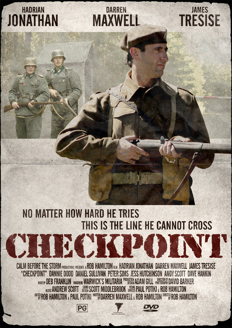
There’s an example linked below though it’s not as bad as some - as it’s only three lines whereas many have more lines and a larger block of text in the same font- sorry but it’s a large image - may take time to load.
I don’t think that’s a common font. I think it’s a common usage of similar sans serif fonts
The reason they are squeezed like that, I suspect, goes to how a poster is viewed. You are usually eye-level to the center of the poster, so when you look down at the credits an optical illusion is created that makes tall, thin fonts look bigger than they are.
We used to do the same things as kids in school. write words really tall and thin and you can only see them if you turn the paper with the bottom edge almost eye level.
There’s a font called “Bee Three” that’s appears to me to be identical to it and has the same height-to-width proportions as the letters in that poster.
There are many fonts that can be used this way, and they all suck. I used to to typesetting, and I remember when an art director first wanted this configuration. I think it was in the early 80s. I told him it would look like shit, but he insisted that it’s the only way to fit the legally-necessary information into the smallest amount of space.
There are also legalities involved with the information listed on consumer products . . . like the ingredients listing on a box of cereal or makeup or a medicine. Many of these laws specify the height of the characters, but not the width.
Whenever I make a poster for the short films my friends make, I try to add in the skinny credits font. It’s just regular Arial or Helvetica but with artificially compressed width.
My guess is that the poster designers choose from various ultra-condensed san-serif faces. Such as this one.
But maybe there is a standard poster typeface. (Like the famous movie scream… the name of which I can’t remember now) If so, that would be neat.
And speaking of neat, the closely spaced CAPs form non-distracting rectangular shapes that work well with most designs. It also let’s the studio tell the actor that their name will be on the poster in inch high letters. (I’m kinda joking there, but I would not be surprised if that’s an actual consideration.)
Finally, that style of type just says, Movie Poster. Posters are full of familiar stylistic devices (heroic low-level perspective, women giving “come hither” looks) and there’s a certain comfort in encountering the familiar.
I don’t know if it’s a specific font, but I doubt it. Almost any font can be horizontally compressed, although of course some will lend themselves to the process more than others. The designer just chooses a suitable font (one that isn’t too ‘blocky’) and performs the necessary compression digitally.
As for why this is done, credits on movies and on movie posters are the product of countless legal and contractual stipulations, union rules, conventions, plus behind-the-scenes arm-wrestling and haggling by the agents of just about everyone associated with making the movie. The prominence of a particular credit, while it may seem quite a minor point to outsiders, can be a significant point of negotiation when deals are being made, and can also be important to someone’s career. The result is that lots of people win the right to have their name on the poster, and the only way to fit all the names on is to use heavily compressed lettering.
[QUOTE=Baal Houtham]
It also let’s the studio tell the actor that their name will be on the poster in inch high letters. (I’m kinda joking there, but I would not be surprised if that’s an actual consideration.)
[/QUOTE]
That’s the reason. After much negotiation, Camera Lens Cleaners Local 529 arranges to have the names of the lens cleaners listed on the marquee poster, and at a size not smaller than 43% of the lettering used for the director of photography’s name, who, by the way, negotiated to have his name listed in lettering not smaller than 91% of the stars’ names.
Nowhere along the way did anyone ever think to say “and in a normal, un-squished typeface!”
That font is a weight of Univers— Univers 39, to be specific, by Adrian Frutiger. The number is a code that specifies how narrow and bold the glyph is. I did a project on Univers in my Typography 1 class at art school.
It’s not the only font to be used for the movie posters, and indeed the sample you’ve provided looks like it’s had some subtle modifications to it, but it’s definitely the basis for the font.
To the neophytes who say that you can take any font and apply horizontal scaling to it and it works just as good, please leave the typography to the professionals.
[QUOTE=B. Serum]
To the neophytes who say that you can take any font and apply horizontal scaling to it and it works just as good, please leave the typography to the professionals.
[/QUOTE]