A Dilbert cartoon had this theory when naming some new product. I think the choices were “The Acorn” and “Syphallus.” (sp?)
The only thing that comes to mind when looking at these two designs is “Giant Mechanical Jesus.”
A Dilbert cartoon had this theory when naming some new product. I think the choices were “The Acorn” and “Syphallus.” (sp?)
The only thing that comes to mind when looking at these two designs is “Giant Mechanical Jesus.”
Dear Sirs,
I saw the two final designs for the WTC site in the Times, and was pretty much taken aback. I realize that you will never come up with a design that everyone likes—but surely no one can actually “like” these soulless, violent, in-your-face buildings? New Yorkers love the Chrysler Building, for one, because it has charm, personality and a sense of composition. The only WTC design I have seen that combines all of these is the 1908 Antoni Gaudi design. It could easily become the best-loved building in New York. Was any serious consideration ever given to it? If not, why not?
I may not be an architect, but I will have to look at whatever you folks put up!
Ok, I’m going to be contrary here. I went to visit the exhibit of the proposals last week, and much to my amazement they picked to two I liked the best. And I honestly do like them, but that’s because of what’s very difficult to see or imagine based on small photographs of models.
One thing these two designs share is that they can be achieved partially and still get most of the effect. The office towers are entirely secondary, which is a very good thing both aesthetically and economically. (The WTC itself was mostly a boondoggle, relying heavily on state agencies; only in its last two years or so was it ever fully rented.)
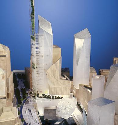
The Liebeskind design is especially wonderful in its treatment of the memorial and the ground level, incorporating a glorious trick with light that’s completely invisible in photographs of the larger scheme. Once each year, on September 11, between the hours of 8:47 and 10:30 (the first hit and the second collapse), the great plaza that includes the footprints will be filled with sunlight. His treatment of the building masses is most interesting as well, beautiful in his use of glass and quite human. The proposed Garden Tower, which unfortunately gets most of the attention simply because of its height, is actually the least interesting, most superfluous part of the design. It works equally well without it, which (I suspect) is part of the reason it was selected.
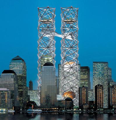
I continue to like the Think World Cultural Center proposal, too, with its latticed shadows of the two towers. It’s absolutely vital to picture these towers from below, which is something photographs just can’t convey. It’s quite stunning. The proposal uses the Eiffel Tower as its model, and there’s certainly an analogy - the structure is the building, which is marvelous. (Picture them lit from within, as is now done with the Eiffel…) Unlike both the interesting, but ultimately irrelevant Gaudi revival, and the pair of cracker boxes we lost, the WCC would be both massive and filled with light and air, casting little shadow. That is itself a powerful memorial, I think.
The remaining designs are, for the most part, no loss. The only idea from them worth retaining is some of the garden boulevards in Petterson/Littenberg (whose timid, wee buildings were an atrocious compromise). Otherwise, I think they’ve done well.
I agree with OxyMoron, I think Liebeskind’s design is great. Here’s a better look than the link in the OP. The crystalline silhouettes remind me alot of Superman’s Fortress of Solitude in the 1979 movie. How could anyone not like that? But, then again, I also love Frank Gehry’s work, so what do I know?
Oxy, does the THINK design actually have an airplane-looking thing embedded in it, or is that just an unfortunate, unintentional feature of the little rendering that is so frequently reproduced? Because that would be HORRIFIC, to say the least. Resolved: There should be no things that look like airplanes crashing into buildings.
The Gaudi, I’m sorry to say, is just too dated. I think it’s important that the building(s) that ultimately stand on that site be designed specifically for that site.
I’ve thought the Libeskind design was the best of the bunch from the start.
Here’s a link to the THINK design from the same site I linked to in my previous post. That certainly looks like a plane-shaped lump embedded in the middle. Very tasteless, to say the least.
Huh? Plane? I don’t get that at all. Oh wait, OK, sorta, but I think that’s just from an odd play of light. The structure that you’re looking at is a sort of an s-shaped form linking the two latice towers, which would house an interpretive museum. It’s much more visible in the “main animation” (requires WMP or QuickTime) - in fact, that’s a really cool overview of the design.
For a static view of that structure, try here.
The THINK idea looks like a tasteless frame of crap.
I should know, Houston is famous the world over for its classy arkeetecher.
Ok, the WMP version of that is lousy and incomplete, look at the quicktime animation and you’ll see what I mean. Unfortunately, there doesn’t seem to be a similar animation for the Libeskind design (having searched under that spelling and Liebeskind, which seems pretty common, too, even in quasi-official places).
Actually, it’s already happened. At 1,776 feet, that spire would be shorter than the CN Tower, which is 1,815 feet tall.
So what’s the point to having it?
I’m not thrilled with either one, but the Think design is awful. Like something from the ‘mauled and mutilated reject’ table at IKEA. Did somebody drop a candy wrapper into the middle of the model? Blech.
I like old New York architecture, along the lines of the Empire State building, but would something like that work in the WTC area of Manhattan? The Gaudi design is a bit dated, I agree, but maybe they could noodle with it and come up with something that bridges the eras.
I do wish they’d leave it as a memorial park as other major sites of destruction have been turned into (Oklahoma City Federal building and also the sites where the nuclear bombs dropped in Japan).
But I guess is , and prime real-estate can’t go to waste…
(Sad, I know.)
Nooooooooo. What is going on. The ribbon building it not only bland but ridiculous. The other is just plain.
The Antoni Gaudi design was the obvious choice. It has style.
New York had a perfect opportunity to build something that will be recognised workd-wide as stylish, eye-catching and appealing. Now it will have a piece of shit.
*Eve[/e], thank you for the letter.
Uh, actually, Hodge, it looks more like something out of Logan’s Run. I’m with Berzon.
James Lileks agrees with me (though he doesn’t bring up Gaudi . . .).
Ack, we had this debate already.
Out of the THINK designs, I like the sky park the most.
The THINK great room proposal looks awesome. I could go for that too.
I don’t like the cultural center towers. They’re too much of a reminder of the WTC towers and they’d be a total financial boondoggle.
I could live with the Libeskind buildings. They look like they’d be extremely expensive to build, though.