How come they could print color dots, but not solid color in those color comics in the Sunday funnies of yesteryear? And, what is this technique called? Is the phenomenon known by the same name - the phenomenon of tricking the eye to thinking it is seeing a solid color, but it is really not?
Hmm, it is strikingly similar to the multiplexing tricks of today’s high-tech IT age!
m-w.com doesn’t know the English translation for “cuatricromía” (lit “four colors”), which is the Spanish name for the technique.
Current printers still use dots and still use four inks, it’s only that the dots are a lot tinier thanks to better paper and better printers. Also, it used to require a person to “separate” the four colors (and an error on his part would produce things like someone having light-green lips instead of dark-red, which is (saturated-red)+(light-yellow)+(light-blue)) whereas nowadays the computer handles it and there aren’t four separate printers for the four separate inks.
In English, the technique is called four-color-process printing. It uses cyan, magenta, yellow and black inks to create full-color images in a similar way to a computer monitor creating all colors from varying amounts of red, green and blue light. Theoretically, you should be able to create most colors using just cyan, magenta and yellow, but in practice the black is needed as well for the darker and less intense shades. Color inkjet and laser printers use the same four colors.
Solid colors can be printed using this technique, but screens (the dot patterns) are used to create “between” colors. In fact, I have an old children’s book that uses the 4 process inks, but only in solid shapes, so that the number of colors available for the illustrations is very limited, but also very intense.
This is all a hold-over from the early days of color printing when a photographic process used colored filters to create the different printing plates from a color photograph or illustration.
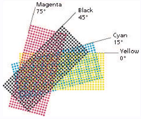
This is called “Process color” (as opposed to “Spot” color). You can create any color with the right combinations of the 3 subtractive primaries (Cyan, Magenta, Yellow) + Black. The dots are called “halftone” dots. They are a way of varying the saturation of the ink on the page, with a system that is not “continuous tone” - i.e. - it can only print 100% ink or no ink at any particular spot.
It’s called halftones. Since traditional presses can’t print a continuous gradient, they use this technique to create the illusion of gradients or different tints of gray, by just using one color (For oldschool newspapers, this one color was the ever ubiquitous Black) and breaking that color up into a pattern of dots to create the illusion.
Now, to get to the heart of your OP, they certainly could use solid colors (called Spot Colors in the biz) to color in the comics on the page, but you’d need to create a printing plate and mix an ink for each and every color you want to use for that page. Not very practical. Besides, most offset presses (the kind that transfer ink from wells onto a cylindrical blanket, then the blanket transfers that image onto the paper) can usually only print up to 6 colors. There’s a better way to do this…
…enter Process Printing (aka: 4-color printing or CMYK; Cyan, Magenta, Yellow, Black, the first three being primary subtractive colors). Knowing how colors combine to create other colors, why not just combine halftoning with primary colors (plus a little black for richness) to create the illusion of full color imagery? Brilliant!
From there you can get into all kinds of particulars, like mixing Process with Spots and so on. But, the main reason why this halftone pattern is so noticeable in the comics, is because they use big high-speed web-offset presses for newspapers, so they need to use larger “lines per inch” (or LPI for short) so the ink holds together better on newsprint, among other factors. A larger LPI value simply means the individual dots in the halftone are bigger. The standard LPI for newsprint is 85. So, there’ll be 85 dots in an inch of image. The standard for high-end lithography can be anywhere from 150 to 300 LPI, so the dots are MUCH smaller, and therefore the resultant image looks much smoother, and the halftoning far less visible to the naked eye. But go ahead, look closely at a nice magazine, or brochure, you’ll notice them with a keen eye.
Using this process, comics (strips and books) had an available range of 64 colors for the better part of 50 years (each of the four colors printed at one of four options – 100%, 0%, or with a light or heavy screen). Some of the colorists did some gorgeous work with that palette. I don’t know newspaper strips that well, but there are plenty of websites that have comic book covers. By the '70’s and '80’s, George Roussos was the primary cover colorist of Marvel Comics, and much of his stuff is gorgeous.
Advances in print technology in the '80’s through the '90’s made a lot more colors effectively available in comic books, although IMO it took a long time for the colorists to understand how to use the new tools. (And perhaps I’m being crochety, but I think the new stuff is rarely a well-colored as it was when the palette was more limited.)
[QUOTE=cmyk]
The standard LPI for newsprint is 85. So, there’ll be 85 dots in an inch of image. The standard for high-end lithography can be anywhere from 150 to 300 LPI…
[/QUOTE]
Have newspapers been at 85 lpi for long, and what’s the current “state of the art” in daily papers? Just wondering as one of the local papers here, the San Francisco Chronicle, recently made a lot of noise about their new “high definition” printing plant. They don’t say what their new LPI is, but I do at least know that they’re running on new 3-tower MAN Roland XXL presses, and have also switched from flexography to offset.
Strangely, their pages don’t look any different than the San Francisco Examiner, which does not claim to be high-definition or anything other than free. (The Chron sells for 75¢ and the Zam is free.)
You know, I’m not really sure these days.* It wouldn’t surprise me if they were somewhere around 150 lpi, what with digital technology and presses (and perhaps paper and ink quality?) these days becoming so advanced.
Tell me this, is their newsprint of a finer tooth or smoother quality?
*Besides, I haven’t even touched a newspaper in probably more than a decade.
When you print color on a page, you’re basically mixing four different inks – cyan (bluish), magenta (redish), yellow and black.
A four color printing press basically lays down four color tracks on a page, one after the other. The amount of overlap and separation each color has from the others determines how your eye perceives it. The ink is printed in dots, and the smaller the dots, the more the printer can cram into a given space, which makes it able to print more detail.
Think of it as being similar to an old dot-matrix printer versus a modern laser printer. A dot matrix produces big dots, splotchy colors and jagged edges. A laser printer produces smaller dots, better colors and smooth edges.
One reason newspaper graphics look worse than magazine graphics is because newsprint tneds to soak up more ink than glossy paper. The ink spreads out a little more, so you can’t make the dots as tiny. (There are also differences in the printing process itself.)
85 lpi (or maybe 80) is still the minimum standard for newsprint. I’ve seen some newspapers that can print photos as high as 130 dpi, making them stand out from the rest of the page. Good for photojournalism as well as advertising. By contrast, with the right combination of composition, paper, ink and printer, I’ve seen high-quality printing at 3,000 lpi.
Ooh, and someone should mention registration, which is the process of matching the plates so that your eye blends the colors properly. You still see photos with poor registration in the newspapers all the time, where you can see the magenta plate, for instance, printed a quarter-inch off, making everyone look like like they’ve got a reddish halo on one side, while on the other they’re pale and dead looking.
Every time I read a thread like this, I’m glad I did all my stuff in monochrome or spot colours. At my old work, we once went on a tour of a high-end printing plant in Mississauga. (I believe they printed stams there, among other things. My work was interested in it for printing the annual report.) They had a grey room with special lighting where printers could judge the colours of materials coming off the presses. And you weren’t supposed to wear coloured clothing for that job either, lest the coloured light reflecting off the clothes throw off the perceived colours of the work.
Then there’s colour calibration of computer monitors…


 At my old work, we once went on a tour of a high-end printing plant in Mississauga. (I believe they printed stams there, among other things. My work was interested in it for printing the annual report.) They had a grey room with special lighting where printers could judge the colours of materials coming off the presses. And you weren’t supposed to wear coloured clothing for that job either, lest the coloured light reflecting off the clothes throw off the perceived colours of the work.