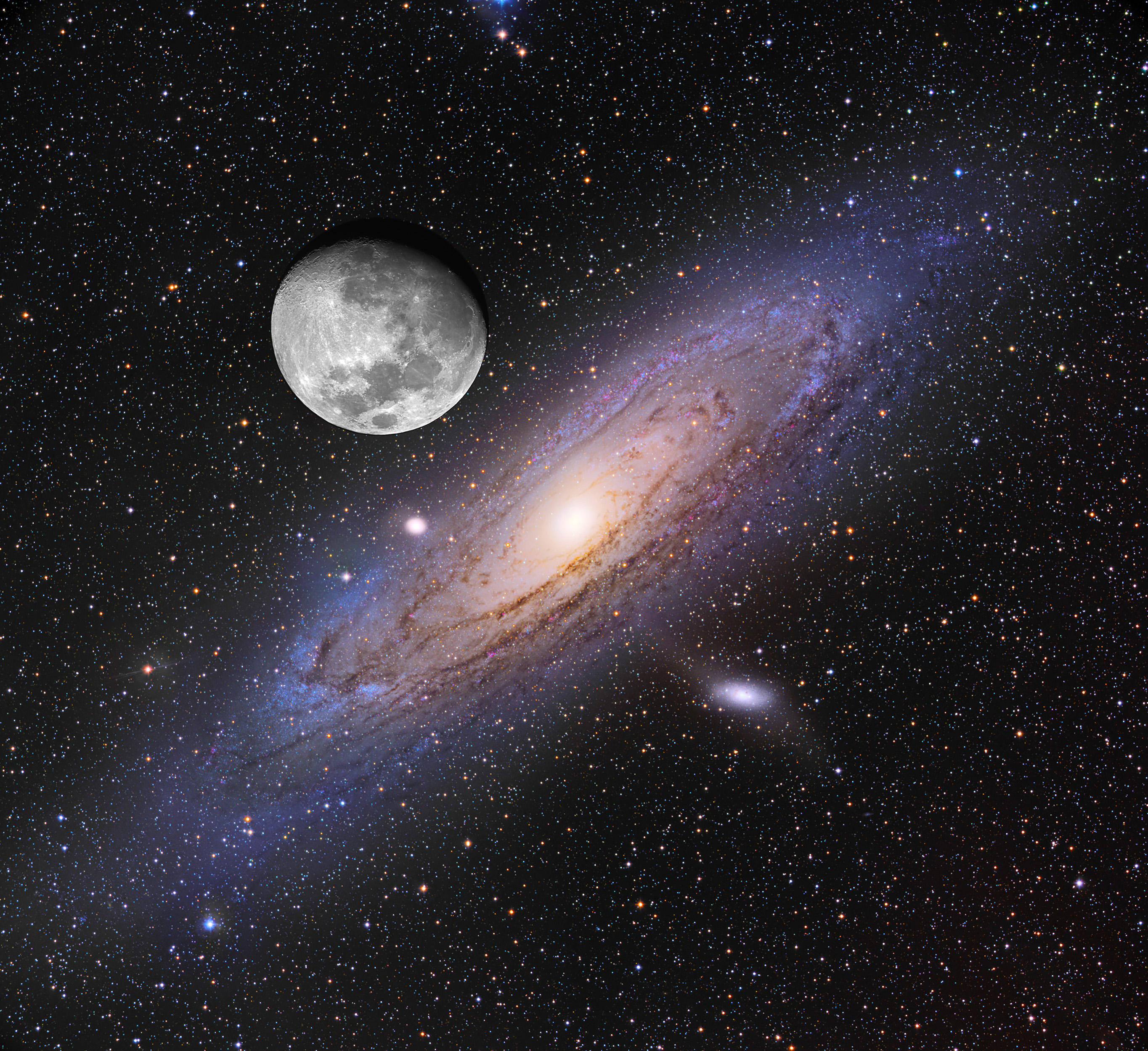
Pretty cool. In this composite picture they’ve kept the same angular scale for both objects, but Andromeda has been over-exposed to clearly show it. In the normal night sky, Andromeda is faint but visible with the naked eye.
Per Wiki,
The Andromeda Galaxy is the most distant object and the only spiral galaxy outside our Milky Way able to be seen with the naked eye. The galaxy is commonly located in the sky in reference to the constellations Cassiopeia and Pegasus. Andromeda is best seen during autumn nights in the Northern Hemisphere when it passes high overhead, reaching its highest point around midnight in October, and two hours later each successive month. In early evening, it rises in the east in September and sets in the west in February.
Blockquote
I really have to learn how to insert an image with this new software. Can someone do that please?
Here’s what I did to take it one step farther. Resize the image so that when printed out, the diameter of the moon is 3/8 of an inch. The entire image will seem disappointingly small, but… when held at arm’s length the objects in the printed image will be the same size as the real thing. Try it and see. Once you’re satisfied that the printed moon is apparently the same size as the real thing, marvel at how huge the Andromeda Galaxy actually is in our sky.
You’re welcome, ahead of time.
I have APOD bookmarked and visit most days. But I have to say I’m increasingly unhappy with the images like this that have no correlation with what I can actually see with real eyes.
The various false color nebulae pix are another example. I agree that it’s valuable to use our innate visual skills to help people visualize data about e.g. magnetic flux that we otherwise cannot see.
But just like cartoon superheros with impossibly big pecs (or impossibly large, rigid, and perky breasts), these massively enhanced and juxtaposed composite pix take on a cartoonish caricature of reality that detracts. Yes, Andromeda really is that big. No, it doesn’t really look like that. Harrumph!
Yeah, but showing what our eyes can’t percieve is precisely the point of such images.
That Andromeda image enhances the reality underlying what our human eyes can see. The galaxy really does look like that (to someone closer to it with better eyes than ours). Whether or not we can see it with naked eyes from our distance makes the image no less spectacular and informative, in my view.
Similarly, the paper trick vividly shows us how big that galaxy actually is in our sky, regardless of how well one can see it.
Now if they colorized the dark matter halo that surrounds Andromeda and reportedly reaches half-way to the Milky Way, it would look even more impressive. The moon in this scale would probably look like a point source.
My understanding is that all of those cool galaxies and nebulae that are shown in astronomy photos are obtained by allowing them to take long exposures with electronic photography.
In other words, they’re very dim, and getting closer to them doesn’t actually help. After all, look how big Andromeda already is in its current location. If it were twice as close to us, the same very dim object would be spread out over an even larger area. In fact, you could continue to approach Andromeda until you were actually right on top of it, or even inside, and it would still be just about as dim.
After all, consider the fact that we are inside the Milky Way galaxy, and all we see is a thin milky fog looking toward the center of our galaxy.
I always assumed that if we got starships like in Star Trek, we could see neat colored nebulae with our own eyes, but my understanding is that most of them are too dim to see with the naked eye even if you got close to them.
A related idea is that is not possible to see colored nebulae with the naked eye even with the largest telescope. In fact, the only way to observe them is with long exposure photography.
So although my point about apparent size:distance is correct (and self-evident, I think), I was dead wrong about brightness:distance at least as it applies to galaxies (and nebulae). Thanks for correcting and explaining. I never stop learning things here.
No hard feelings. Your points were well thought out & well made. I sounded more curmudgeonly & absolutist than perhaps I meant.
Many images, such as the famous
are beautiful and informative. Despite being utterly beyond our feeble eyes’ ability to detect, even if we were above the atmosphere.
The ones that rouse my ire are the ones colorized or composited so it’s more of an “artist’s impression” of reality than of reality itself. Which this thread’s Moon + Andromeda is a (mild?) example of.
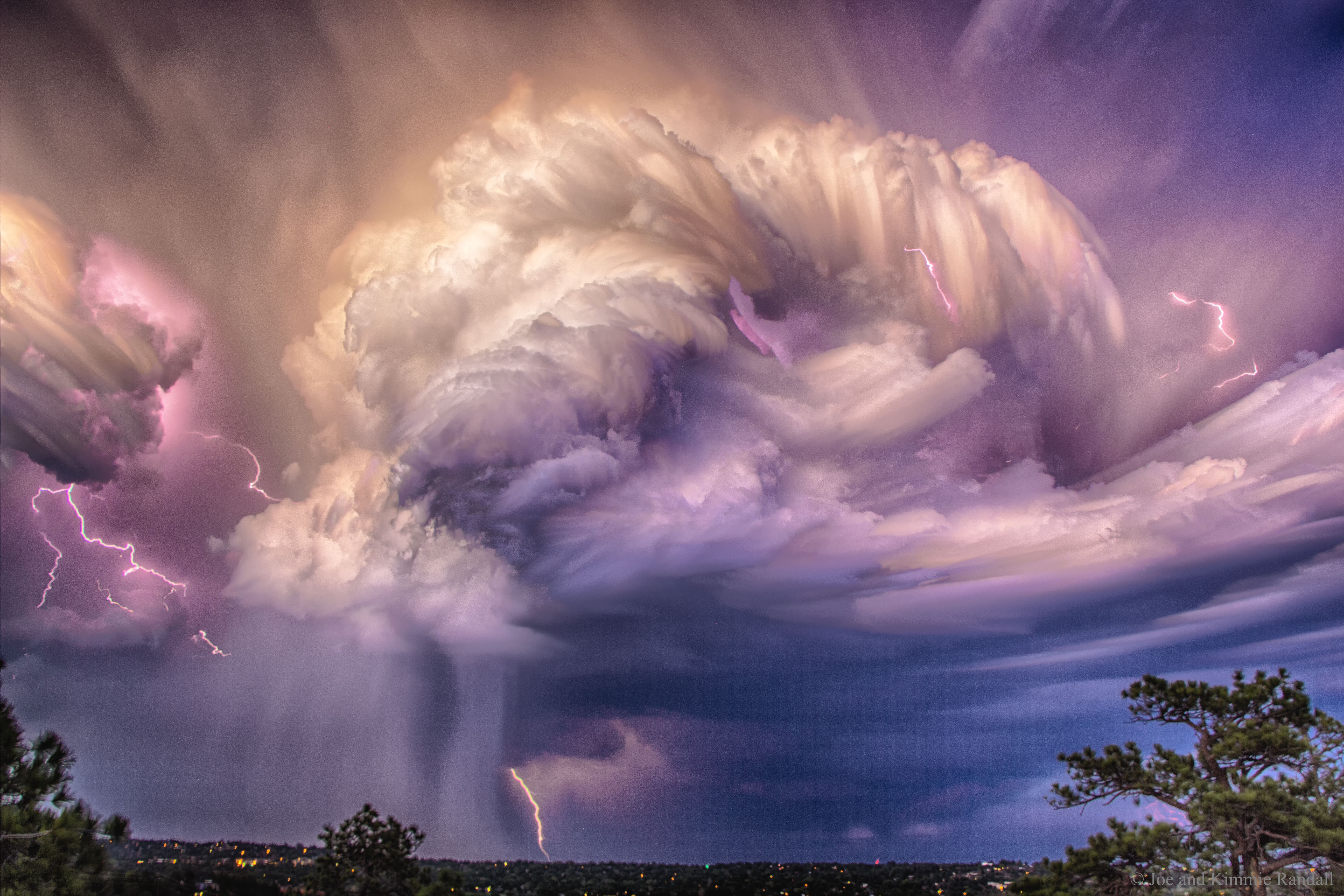
Coincidentally, today’s (9/27/20) pic although of weather not astronomy is an excellent example of my complaint.
Per the text, the artist glued 60 different pictures of 60 different events together to create the single image we see.
It’s art. It’s pretty art. It’s skillful art. It’s reality-based art. But when he got done it’s far more art than it is reality.
IMO there are many APODs of astronomical features that fail in the same way.