I was wondering if anyone on here had any advice for me. I’m a graphic designer / web guy, and I’m good when it comes to structured layouts, but when I get into more random things, like a weird-shaped banner or print ad it becomes hard for me to understand proper composition.
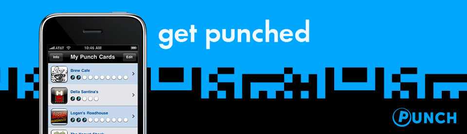
I am making this little banner to feature a series of things I’m doing for a brand project, but I’m having trouble undertanding why and how to place the three elements (the phone, logo, and text). Right now I think I have it in a good spot, but I am not sure I understand why.
For me, it’s always about balance. The elements you’re using are few and simple, and the space you have to compose in is very horizontal, so the trick will be making the eye follow in a way that feels well distributed.
As of now, it’s almost there. However, it looks like there’s too much empty space to either side of the iPhone and the copy. I’d move the phone and copy over more to the left (killing the negative space by about half), and either increasing the size of the copy (so the copy and logo aren’t competing), or adding another graphical element to complement the right side.
That said, most times as a designer, you just gotta go with what your eyes tell you is right, and not try to over-think it. Instinct, baby!
I almost agree with cmyk, who is probably more experienced than me. But I think after you’ve moved the phone to the left, centre the “get punched” text in the middle of the banner, enlarge it by about 25%, and change its colour.
The busy-ness of the background and the logo is enough to keep the balance.
Ordinarily this kind of arrangement wouldn’t work, but Graphic Design principles have been played around with so much as everyone attempts to be unique and add new spins on tradition, that you have more leeway than you might think.
cmyk is right, though, in that it is all instinct.
Sorry, but the graphic hurt my eyes trying to read what you were writing in the graphic element…I kept trying to see the work Punch in those shapes, but couldn’t find all the letters. After straining my eyes for awhile, I believe now it is just abstract and not a real word or words?
Personally, I find simple and clean the way to go.
I would use the blue color on the phone for the same color as the blue in the logo banner - less hard on the eyes and not quite as “shrill” in contrast with the black.
That is my humble opinion.
I’m afraid I think you’ve just killed it with this colour change - drab isn’t good in banner advertising and you’ve also lost the brand recognition in the colour.
I think GuanoLad nailed it - when I first saw the ad my immediate thought was that the headline was shrinking into the background - the size and colour change gives it the prominence it needs to work as a piece of advertising.
Yeah the fix provided by cmyk and Guano did the trick for my mind.
I guess my question is how does one get better at nailing this more quickly-like I knew the general direction to go, but what happens when I add another element, etc. I have very little experience with print (mostly web) so sometimes this almost open-ended composition can be tricky for me.
I’m not sure there’s an easy answer to your question, as there aren’t strict laws on how these things work - it’s more a judgment call made on experience. But if you start by putting yourself in the mind of the viewer and thinking what key thing, in what order, you want them to get out of your communication, that will help guide your composition. Many designers get wrapped up in making something look beautiful and lose sight of what they’re trying to communicate - hence my comment about the headline.
So, in your banner ad, think about the priority of the elements - headline, supporting graphic, brand sign-off (the priority of these elements will vary according to what you need to get across, how familiar the audience is with your brand etc). Think about where your eye will naturally fall on first sight and what information you will take away from the ad. It’s really like crafting a well formed, clear sentence but in visual terms.
I think there are a few things about design you can learn from books (please don’t flame me).
Some books:
The Principles of Beautiful Web Design, Jason Beaird
Transcending CSS, Andy Clarke, Aaron Gustafson, Mark Boulton
The Zen of CSS, Dave Shea and Molly E. Holzschlag
Also, I don’t have much of an instinct either, so I look to examples I like and try to figure out why they appeal. If you haven’t already found it: www.csszengarden.com
