So are crack dealers.
Just sayin’…
So are crack dealers.
Just sayin’…
Thanks for that! I actually really like the older Water Tower painting - it has texture and draws the eye in, whereas the later one is very flat and off-putting to me.
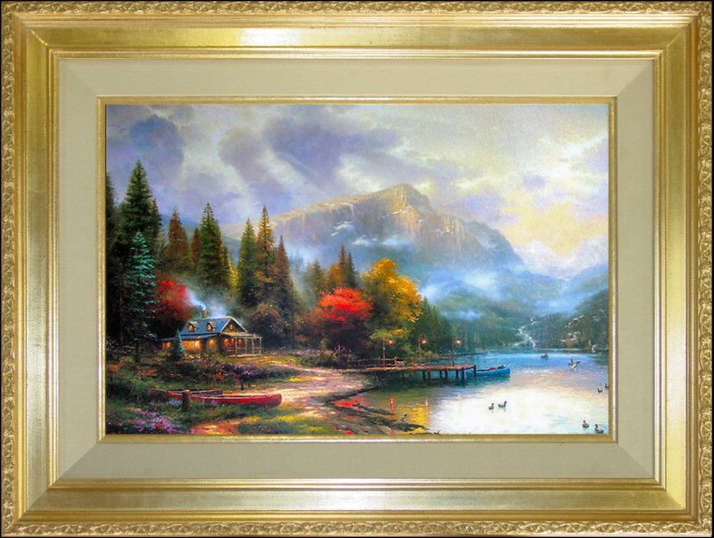
A link in that article also made me realize why I dislike looking at Kinkade stuff - it’s not just that the colors are bright - I’m sure there’s lots of great art using the impact of color. It’s that he’s trying for an evocation of emotion, but painting with such surreal colors that it upsets even a run-of-the-mill pretty scene kind of effect. I can understand wanting an idealized picture of a cottage by the sea on your wall, even if it isn’t Great Art. But honestly, would anyone want to gaze at the retina-burning melange that is Cottage by the Sea? He could have used the sunset light to infuse the whole scene (like it does in real life after all), but instead we see preternaturally vivid reds and blues, popping against a background of yellow and pink. Yech!
Ok, you have succeeded in making me see how unnaturally bright the colors in that image are. But I wonder how accurate that image depicts the actual painting. See we had a couple Kinkade prints at home, and they weren’t nearly that over-the-top.
Isn’t it though? And excellent analogy.
Is it possible to have retroactive respect for someone?
Hmmm, I’m probably being whooshed, but Richard Thompson has done Britney Spears songs. His cover of “Oops I Did it Again” is in the RT boxed set…good stuff.
Interesting you should put it that way. I have nothing against depictions of an idealized world, but a common sentiment in the world of art is that it’s the mundane that becomes beautiful. Cosmic ideas tend to make bad subjects. It’s finding the inner beauty of the everyday dull stuff that makes for great art. Honestly, what’s so exciting about a bowl of fruit? Or an old barn? Or a field? Or a chick who can barely manage to smile? And yet we can all think of great works with these subjects. Kinkaid, in going for in-your-face beauty, has stripped the soul from his work.
Some have compared his work to sugar or saccarine. I’d compare it to frosting. There’s just no cake there to support it.
I don’t get it.
What’s your opinion?

Hence the smiley. I was wondering if anyone would get the reference.
In fact, Thompson is Kinkaid made out of antimatter. He takes the extremely crass and vapid and turns it into something profound.
I am absolutely not an artist, nor have I studied painting or anything like that. But I live in the real world and I have to ask - with the sun setting in the background, wouldn’t the front of the cottage be in shadow?? Or am I missing something? 
Well, there’s that, too. :smack: I knew the flowers in the yard shouldn’t be so bright, but couldn’t put my finger on why. Maybe I’m not so bright either.
Another thing I’ve noticed looking through his catalog - while his paintings have ostensible focal points, such as fiercely glowing cottages, my eyes are jumping around the page like a frog on crack, unable to settle anywhere. It actually makes looking at his stuff a little tiring.
tdn, that’s a good point. Perhaps that’s what makes hotel decor paintings what they are so often: someone paints something pretty or cute, rather than mining the ordinary for beauty or profundity.
Yes it would, but some reflected light would illuminate it. But not that much. He seems to get his logical shadows right, but they are very poorly rendered. It’s so unrealistic that it totally fails to draw me in.
You know, I’ve been an artist for less than 2 years, so I probably shouldn’t criticize too harshly (won’t stop me, of course!). I sometimes think “Hey, he sucks, but he’s far better than I ever hope to be. I could never do anything like that.” But I wonder…
Maybe, just maybe, my next project will be a copy of that painting, but done my own way. It would be interesting to see how I fare. First thing to go is that awful Doctor Seuss roof, of course.
I have “End of a Perfect Day III”. This link shows the picture with too eye-gouginly bright colors. If that was the picture I saw, I wouldn’t have bought it. Mine looks natural. The house isn’t a fuzzy blob. The lights aren’t glowing with that TommyKnocker glow. I love the cascade up the mountain on the right. The painting, in person, and with realistic colors has an appeal to me. Thank God he didn’t put the face of God in the clouds beaming down!
I abhor his religious work and animal monstrocities. I can’t stand that “Cottage by the Sea” mess! I’m glad I knew nothing of his Disney escapades or crappy business practices, or I would be out a nice painting. I don’t like that I’ve given money for that impression of a life, but I’m not going to throw out the painting now.
Meh. I could take 'im or leave 'im.
 snort
snort
You could always pawn it off on some unsuspecting soul on Ebay.
I actually sort of like it, at least compared to his other stuff. It’s much more color balanced, and feels more natural.
I wouldn’t pay for it, though.
Or…
Brilliant!
-FrL-
That older picture of the water tower is actually pretty good… Which manages to make Kinkade even creepier, in my eyes. I had always assumed that he painted the dreck he does because he was incapable of doing any better, which makes him (at worst) an object of pity. But now I learn that he is capable of doing better, which means that he’s actually consciously choosing to produce dreck. Ugh.
Why the use of the word “high brow?” in combination with Jackson Pollack? Why turn this thread into a question of elitism as opposed to a thread on what constitutes good art? Next you’ll be complaining about the fancy terms Starbucks uses for its coffee sizes.
In any event, to me, good art is is like porn, I know it when I see it.
Pollack’s paintings appeal to me because of his use of colors, textures and forms. There’s a lot more to why I like his paintings but I’d be hard-pressed to put it into words.
There’s no doubt Kinkade is a skilled draftsman but I can’t stand his paintings because I loathe his choice of themes and colors. In other words, I don’t care for pastels and cottages.
What is “high brow” about that?
Any competent artist can do what what Kinkade does. I don’t thing the same could be said Pollack. If you think his paintings are that easy to copy, why don’t you give it a shot?
I think it’s kind of clever & trippy. The hummingbird, I mean. I really am not that offended by Kinkade. Bored, maybe, but not offended. Then again, I’ve never worked a job where I had to sell his stuff.
For me it is the harmony of the composition. Each drop of paint is placed perfectly, especially odd since in films Pollack appears to be just spattering paint. But yes, try doing it yourself and you will find that independent observers will be able to instantly tell yours from a real Pollack. I can’t be so sure that another painter of similar ability could not do as well, though. Great artists have an “eye” that talentless and untrained mortals lack.
That, more than the glurginess, is why I find Kinkade’s work somewhat offensive. He has talent and training and can really paint, yet he has sold out. If I were to find that evenings he, in the privacy of his study, paints for the pure pleasure of it my distaste would be ameliorated some, since we all need to make a living. Further, I could find it in my heart to forgive his kitschiness if he were sincere in his beliefs but, based on his truly offensive personality and actions, the tone of his paintings is a con and he is, therefore, evil.