This is related to a question I asked a while ago, and never really got a good answer to: why does the colour wheel “wrap around”? There seems to be no logical reason why the colours at the top and bottom ends of the visible spectrum should blend together so well. Is it just a quirk of human perception that red plus blue makes a very similar colour to violet?
First of all, Look at an image of the CIE chromaticity diagram. Calling this shape (the full color gamut*) a “rounded triangle,” you can see the spectral colors beginning at one corner (770 nm red), and proceeding around the rounded color, eventually to the third corner (380 nm violet). A mixture of spectral colors will appear inside the gamut as the weighted average (linear sum) of the spectral colors.
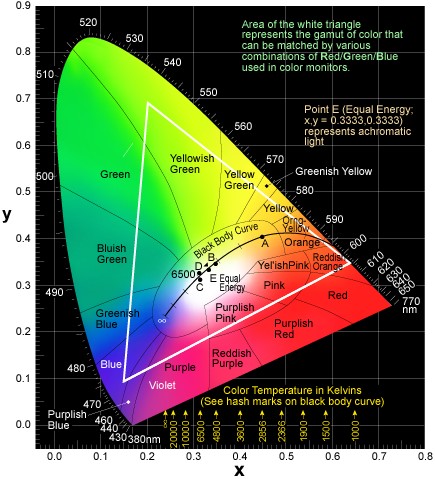
For example, if you combine 770 nm (red) with 520 nm (green) you’ll end up very close to 568 nm (spectral yellow). This red+green yellow won’t appear exactly the same as spectral yellow because the triangle leg connecting red to green isn’t perfectly straight.
The third leg of the triangle (purple, reddish purple, purplish red) are colors not present in the spectrum (i.e., they are not colors in the rainbow) — they are produced by combining indigo and red.
(* - NOT the white triangle shown inside the full gamut: it depicts the gamut of colors that can be rendered on a RGB monitor.)
Note that what this CIE diagram shows is NOT intrinsic to colored light. It depicts the perceptions formed by the cones in human retina.
Is it correct that Isaac Newton was the first to note that hues could be configured into a circular wheel, by introducing purple between red and indigo?
Before leaving retina, information from the cones is transformed into three signals, in order of decreasing importance: Light vs Dark, Red vs Green, Yellow vs Blue. You’re asking: Why doesn’t the Yellow vs Blue signal “kick in” to make a big perceptual difference between purple and reddish purple? I have no answer except to note
(a) the CIE diagram is NOT intended to have equal perceptual differences reflected in equal distances — that goal would be contrary to the linear additivity property mentioned above.
(b) colors are discussed relative to an “average human”; different subjects may perceive colors differently.
It is interesting to note that Sir Isaac Newton, when first playing with the prism in the mid 1600s, would have been aware of the difference between purple and violet. According to the Ngram viewer, the word ‘violet’ was rarely used in the body of English literature, while the word ‘purple’ was commonplace. So Newton’s choice of ‘violet’ to describe the spectral band is revealing.
The sounds nice because everyone loves Isaac Newton however pretty much everybody who lived before Isaac Newton had seen a rainbow, and it’s the same thing.
I think of violet and purple in relation to the midpoint between red and blue: Violet is immediately to the blue side of that point and purple immediately to the red side. In other words, essentially the same color, but with diverging tendencies. As for precisely the midpoint between red and blue, what to call it? Purple, violet, eggplant, amethyst, lavender, wisteria? Looking around, you find different sources using these names for different shades in the neighborhood of that point… meaning it isn’t amenable to exact, mathematically defined science.
Purple is the favorite color of both my GF and me. She and I differ in our views on the question, to an extent. Influenced by reading too many Wikipedia color articles, I conceptualize violet as next to blue and purple as next to red, while remaining aware that they’re both approximately midway. She argues that rather violet is exactly the same as purple, and purple is the proper name for it. I think either of us is as right as the other, and the actual (versus theoretical) difference between our perspectives is infinitesimal.
I always used to wonder why the books I read always called it “violet,” while all the other kids at Gesù Elementary would only say “purple.” Our generation was coeval with Harold and the Purple Crayon, after all. It just felt more natural to say purple, it seemed to roll out of the mouth more easily.
Now I get it, having read the Wikipedia explanation. Violet is defined as a range of specific wavelengths of light. Also, a violet is a flower, a thing, tangible. What’s a purple? Purple is… well, just purple! Or snail juice, when you get right down to it, but while violets were an everyday sight in my home, none of us had ever seen any snail juice, nor would we want to, so the literal meaning of purple was lost on us and it became a concept unto itself. Most of the books I read growing up were science or science fiction, and that accounts for all the insistence in print that “violet” is the correct name. My brain makes room for both purple and violet, together and opposed, mostly together.
Why a circle?
The thing is that neither the eye nor brain know anything about spectral wavelengths. The eye has three sorts of sensors. If it had two there would be a line segment of colour, but with three you define a section of a plane. As septimus notes above - the eye does not send RB to the brain - it sends luminance, and two axes of colour. Red to green, and blue to yellow. Ie, location on a plane of colour. The colour wheel is simply representing that plane. The colours on the wheel being those on the perimeter of the plane.
The world we see is for the most part actually devoid of spectrally pure colours. Rainbows and those colours build with diffraction are as close as you will get. Almost everything we see is a blend of wavelengths. There is no reason for our to actually want or need to resolve spectral colours explicitly. We see a simple averaging of three wavelength bands. Three makes it a wheel.
The little glitch in the red channel sensitivity up in the far blue means that there is a natural wrap from violet into the blue-red mix. It isn’t impossible that this has been selected for to make the colour perception work better/smoother. Or it might be a coincidence, and had it not been there we would have simply seen violet as even deeper blue, and only mixed colours as purples.
Indigo, like Pluto, has been cast into the outer darkness where there is much wailing and gnashing of teeth. Except that no one really cares that much about indigo, so very little wailing etc.
What is the deal with “indigo,” anyway? Am I right in remembering that it was sort of shoehorned into the spectrum to make it seven colors or something like that? It almost seems to me the “BIV” part should really be “CBV” (cyan, blue, violet), as there is a distinct color between green and blue that is cyan or turquoise. I mean, just look at a spectrum. There is a very obvious band (at least to me) at around 500nm that seems to me like it should get its own name as a rainbow color instead of the “indigo” transition between blue and violet. But I suppose it’s all kind of arbitrary. Or is there a possibility that the “blue” and “indigo” in the original naming of the spectral colors (I assume by Newton) really corresponds to what we might call “cyan” and “blue” now?
tl;dr
CalMeacham has written a longish explanation here, post #25
Tl;dr It’s all Isaac Newton’s fault. He was trying to make light work like a musical scale and needed 7 colors to do that. He had red, orange, yellow, green, blue and violet and needed another, so he grabbed the name of a blue dye and used that.
Huh. And I made a very similar comment in that thread, too, about ROY G CBV. And also mention the violet vs purple thing. And Pleonast mentions the blue=cyan, indigo=blue bit, too. Weird. I don’t remember that.
There were also people saying “No Pluto! No Indigo” in that thread, somewhat like my comment.
My point was Newton;s choice of a word for the color everyone saw. Purple was in wide parlance, but Newton chose Violet, which was a rarely used term in his day.
Actually, you never see spectrally-pure colors in a rainbow, either. An entire rainbow, from red through violet, is about 2 degrees wide. But because the Sun is half a degree wide, the band produced by any single spectral color in a rainbow is also half a degree wide. So at any point along the width of a rainbow, you’re actually getting a mix of a range of colors that’s a significant chunk of the entire visible spectrum.
I came across this image that Wikipedia claims is by Newton’s own hand.
See, indigo, who’s gonna argue with Sir Issac Newton?
As a fan of Indigo Girls, I’m biased, that’s given. But I find indigo useful as a name for a color intermediate between violet/purple and blue. Even though I know that literal indigo plant dye is blue, really just blue, and that our color terminology is complicated because Isaac Newton played fast-and-loose with words for the high-frequency end of the spectrum. Granted, all that. I still want a name for that blue-violet tertiary, and indigo fits well enough.
In my palette I’m accustomed to thinking in terms of a twelve-part color wheel with 3 primaries, 3 secondaries, and 6 tertiaries. At this point I’m already getting away from analyzing electromagnetic spectral frequencies anyway while I’m mixing paints. The one-twelfth between blue and violet, if I don’t call it indigo, what am I gonna call it?
As you should. The movement that though that the spectral colours were the “pure” natural ones were misguided. They sort of are if you see using a spectrometer. But we don’t. For subtractive mixing, spectral colours are even less useful. Tricks using small dots of colours next to one another are of course a way of getting additive mixing. Still not spectral colours, but you get a different gamut. Colour theory is gloriously complicated ![]()
For one of my color theory classes in art school, I decided to make a comprehensive color wheel, i.e. one that included shades, tints and saturations. It turned out to be a cylindrical in shape.
The default layer was a traditional circular color wheel, with the colors around the edge. The center was gray, and as you moved away from the center, the gray acquired color in 10% increments, and the colors increased in saturation.
The next layer upward consisted of 90% tints of all the colors in the default layer, i.e. each color was 10% lighter. Each subsequent layer consisted of colors that were 10 additional percent lighter than the previous layer. The top layer was pure white.
The next layer downward from the default mixed 10% black with everything on the base layer, followed by a 20% layer, etc., and culminating in a final layer that was pure black.
The virtue of this configuration was that you could easily see how colors that aren’t shown in traditional color wheels relate to colors that are; e.g. the browns, or what happens when you mix grays with various amounts of pigment.
This is from the original poster:
Does this really happen? How often have you forgotten this? Is it even possible to forget the order of the colors?
I don’t believe this. Are you the only person who has never seen a rainbow?
I don’t see how that proves or disproves anything, but speaking for myself over the course of my life, I have seen colors on a color wheel far more often than I have seen a rainbow. And I have never seen a full-spectrum rainbow that clearly shows all the colors from violet to red. Usually it’s just a few smudges of colors near the middle.
The order of the spectral colours is determined by ordering them by wavelength. That covers a small part of the colours that a human perceives. There are many colours that you cannot find in a rainbow that the human eye/brain perceives. The most obvious ones are those that are a mix of red and blue - so purples. But not just purples. In reality the vast majority of colours we see are not in a rainbow or even a high quality spectrum (say from a prism or diffraction grating fed from a thin slit).
As I noted above, because the eye/brain system encodes colour with two (nearly) orthogonal signals, one coding for green versus red content, and the other coding for blue versus yellow, you don’t actually see a line of colour, you see a plane of colours, and the colour wheel is simply those colours that run around the edge of that plane. There are colours over the entire area of the plane as well, and when you add the luminance component, you actually get a three dimensional solid of colours.
Ordering just the monochromatic spectral colours by wavelength is a very trivial approximation to the reality of colours.