Mark Tansey plays with a lot of these issues, with interesting and amusing results.
This is the only example given in the thread thus far that captures what I’m talking about. I’m aware of other “realistic” paintings from the pre-modern era but, even at a quick glance, it was easy to figure out that “yup, that’s a painting”. The Hofverberg painting was one I actually had to do a double take and stare carefully to figure out that it was actually paint on canvas.
Look, I’m perfectly aware that extreme photorealism isn’t the primary purpose of art and is culturally uninteresting in certain ways, I’m not disputing any of that. I’m well aware of the existence of a vast array of non-photorealistic art. What I was asking was whether there existed any photorealistic art before photography was invented and why that was or was not the case.
Given that we now have an existence proof that such art did exist in the 18th century, my question now becomes exactly how technically challenging it would be to create a piece of art like that? Like, if I showed a bunch of talented artists from around that time that Hofverberg and asked them to create a painting in that exact style, would they all be able to do it or was Hofverberg unusually talented at the time?
We seem to be going in circles in that photo-realism is a thing precisely because it emulates photographs; it isn’t a matter of just painting an object very realistically, it’s deliberately “quoting” another medium: I suggest you check out Walter Benjamin’s 1936 essay The Work of Art in the Age of Mechanical Reproduction, which very approachably addresses the question of why people still painted when they could take pictures.
I mean, you say that the painting is undistinguishable from reality, but it’s clearly very heavily mediated through the conventions of a genre in that it’s depicted in isolation and divorced from any other context, heavily saturated and brightly lit from a single source. That’s not what a packet of M&Ms looks like, it’s what a picture of a packet of M&Ms looks like, and a picture constructed in a very particular context, that of advertising. In essence, and as I said in my last post, it’s a painting quoting a photograph.
Others could. All I am doing is a google image search for “trompe l’oeil old” and up pops this by William Harnett, and this by someone in “the German School”. Search with German School and a whole host more come up, like this 16th century work, and this work of Dutch immigrant artist Jan van der Vaardt (c. 1650-1727) (scroll down; it’s the violin). So on.
it could be done but somehow I think when it was done they were not as often referred to as artists. The reason that photorealism became a thing to any degree is IMHO exactly as Penefeather posits: it is a response to and a reference to photography, very much in the same way that Magritte’s comments that “This is not a pipe.” was influenced by his immersion in the then emerging medium of photography.
It wasn’t done because few wanted to buy them or to paint them is more the reason I think than anything else. If you just wanted to copy something completely faithfully might as well be a forger and make more money!
As others are saying, photo-realism isn’t so much an exact rendering of visual “truth”, as it is duplicating a photograph. Humans see by scanning their eyes over a scene, there’s only a small central area of sharp vision. A camera has one plane of maximum sharpness, wheareas a scanning eye constantly changes focus; near and far objects can seem equally sharp.
Cameras have a limited dynamic range-- the M&M package had burnt out highlights. Skies in photos often burn to white. The iris of the human eye is constantly adjusting as we scan a scene… The sky is gray, not white.
Traditional photography had limits on the colors that could be produced by the dyes used in printing or in color transparencies. The human eye has different limits, and traditional painting pigments offer yet another limited palette.
It’s no surprise that painters didn’t use the same colors that photos use.
Finally, there were lotsa amazingly realistic paintings done before the advent of photography. I’m thinking of still lifes with flowers and fruit from northern Europe, but at the moment don’t have the motivation to link to anything.
I once saw a program on PBS (How Art Made the World) about art history that described how over time the sculptors of Ancient Greece got better and better at creating realistic depictions of the human form, eventually achieving perfectly proportioned and anatomically correct human figures.
However, the realistic style was soon replaced by a sort of super-realistic style that was considered “even better than the real thing”. For instance, the legs were longer in proportion to the rest of the body than they would be on an actual human being, and the tailbone was eliminated to improve the curve of the back. So it wasn’t that later Greek sculptors lost the art of creating realistic human figures, they were deliberately trying to make statues that would be perceived as even more heroic, athletic, or beautiful than real people.
The chromatic aberration on the blue dress is what clinched it for me. That didn’t happen before crappy lenses, and if he was trying to duplicate what his lens saw he’d need to put it in.
It’s only undistinguishable from reality if you do a significant amount of mental editing, as well: for a start, reality seldom includes objects floating in a formless white void upon which they can still cast a shadow. Without wanting to get too heavily bogged down in any kind of theory, what it really shows is that any picture, any photograph, is a result of decisions made by the artist, either consciously or unconsciously: what to include, what to omit, how to present, and decisions made by the viewer about how to interpret those choices.
The fact that it’s divorced from any kind of natural setting, that it floats in its white void, that’s an artistic choice; another might be to go for a still-life effect and paint in it a bowl on a table, another might be to juxtapose it with a bloody tampon, another might be to go all out Cubist, or Impressionist, or Fauvist. Even the fact that it’s being displayed on a canvas and hung on a wall rather than having a logo and a few lines of copy and printed in a magazine, that’s a choice too. The point is that there is no unmediated reality in visual depictions; our response is a combination of the artist’s presentation, and our perception.
I can hear you argue, “Well, what about photographs, they’re real, aren’t they?” There’s a famous and - probably apocryphal - anecdote about Picasso, who was challenged by someone that his paintings were unrealistic, and the critic produced a photograph of his wife as proof. the story goes that Picasso looked at it and remarked “She’s a little small, isn’t she?”
The fact that we accept a flat representation measuring a few inches by a few inches on a screen or on shiny paper says more about the our conventions than it does about reality. That’s not a bad thing, there has to be some form of editing and interpretation if we are to visually depict anything, but it does no harm to have that artificiality called to our attention from time to time.
There’s a similar story of some remote primitive tribe who were unfamiliar with photos and I guess with graphical representations. They were shown photographs of local birds, and didn’t recognize any of them. I think it was because of size, but mostly it was because they had never learned to translate between photography and vision.
The researcher (who was there for the birds) was able to teach them how to make that connection. They weren’t stupid, just naive. But it made the point that photos aren’t actually “realistic”, we are just really really good at reading them.
I don’t remember the source, but it’s likely Jared Diamond in New Guinea.
Charles Willson Peale is known for his portraits of Revolutionary heroes–sometimes produced in a hurry. But he had many interests.
Here’s a painting he did after he’d mostly abandoned commercial paiting--his sons Raphaelle & Titian climbing a stair…
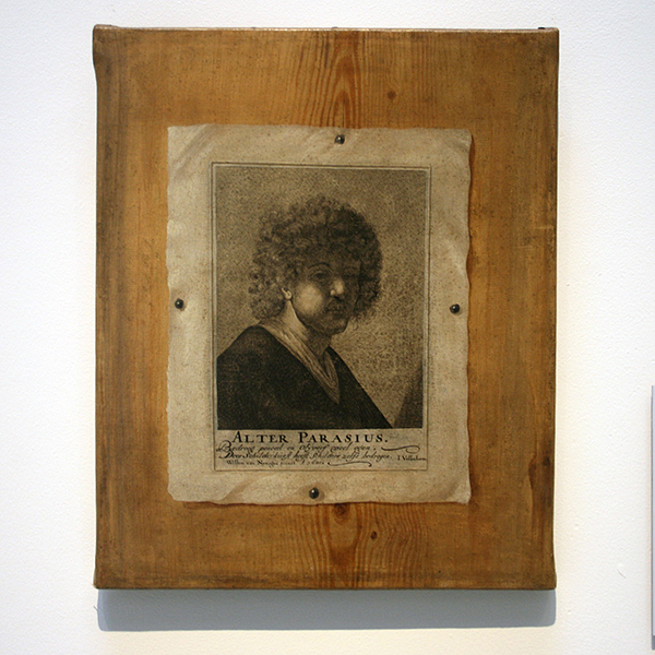
In the late seventeenth and early eighteenth century paintings of letter racks were a popular genre all of its own. Hofverberg is actually one of its less celebrated exponents. Samuel van Hoogstraten and Edward Collier are much more famous, even if only to art historians. But there were limits to their ‘realism’; it has been suggested that such letter racks never actually existed in real life.
A closely-related genre was that of painted ‘engravings’, such as those by Willem van Nijmegen. Then Cornelius Gijsbrechts took things to their logical conclusion…
Could every painter paint like that? No. It was a specialised skill which had to be practised. That’s why their works so impressed potential purchasers. So not so very different from today’s photorealistic painters.
These interesting bits in an article about William Hartnett:
Significant difference between the M&Ms painting and something that could actually “fool the eye.”
Put the M&M painting on a counter and viewers might not be able to tell if it is a photo or a painting but they would easily be able to say it is not really a bag of M&Ms sitting on the counter. Those highlights and shadows that make it look so much like a photograph of a bag of M&Ms give it away: actual viewing is dynamic and a real object that shiny would have its highlights and shadows changing as the viewer moved his or her head. It is a good painted copy of a photograph but no one would mistake it for a real object that they could reach and touch. Hartnett’s paintings OTOH actually fooled people.
APB, how were those artists viewed by the critics of their time, immediately after, and now, in comparison to the peers? Say for Hoogstraten, how is he thought of today compared to others who worked in Rembrandt’s studio (e.g. Maes and Fabritus)? And is he known more for his letter rack trompe l’oeil work or his other paintings? Thanks in advance for any education you can offer me!
It’s a lot easier to paint a “photorealistic” (not quite) image of a totally synthetic industrial product like that, versus natural-world scenes and living people. It’s like… I can draw a Bugs Bunny that would ‘fool’ you at first glance. Not so much a real rabbit.
So you’re saying you’re no Albrecht Dürer :)?
I am not.
Brunelleschi’s paintings, experiments in perspective, circa 1420 were so similar to the actual view that he challenged people to tell the difference between the painting and the actual view, when looking through a peephole. See James Burke’s TV series The Day the Universe Changed. or here:
https://books.google.com/books?id=63PfDnIuiqMC&pg=PT78&lpg=PT78&dq=The+Day+the+Universe+Changed+Brunelleschi&source=bl&ots=dwd69XvBmG&sig=sfbzTgXAPLSXlCFAdp2E-rNGZtM&hl=en&sa=X&ved=0CDYQ6AEwBGoVChMIgYjU05-9yAIVx6OICh3IhQRf#v=onepage&q=The%20Day%20the%20Universe%20Changed%20Brunelleschi&f=falseHave to mention my favorite William Adolphe Bouguereau, a french painter in the romantic style. Many of his works are near-photographic quality, like this one: http://www.bouguereau.org/Gabrielle-Cot-1890.html
Note the play of light on the girl’s satin ribbon and lace bodice, not to mention how perfectly imperfect her face is. (A little roseacea or blemishes?)
Interestingly he was disparaged for painting the peasant class with as much love and care as the nobility, like this: http://www.bouguereau.org/La-couturière-(Sewing).html (always clean and pretty)
And at the end of his career when impressionism was becoming popular, he was scorned for painting in such accurate detail because “anybody can paint what they see”. (Yeah, right. Sure wish I could!)
I just want to point out that the very concept of trompe l’oeil art is that it is indistinguishable from reality (and thus, of photographs), and that such art dates back at least to Classical antiquity (and probably longer):