I see this phrase frequently in discussions of statistical analysis, but I’ve got no idea what it means? Is it something like margin of error?
It’s related to margin of error. Typically, they’re used to show the plus/minus range around the reported value that represents some level of variability or margin of error – because it could be any of several measures (standard deviation, standard error, or confidence interval, among others), if the chart is built correctly, it should indicate what the error bars represent.
Why are they called bars?
Because it’s usually visualized as a vertical (bar shaped) line around the data point in question.
They’re called “error bars” because they are typically shown on bar charts as a thin vertical bar (shaped sort of like an I-beam) that extends above and below the top of the main bar itself, as shown below:
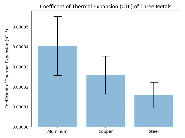
Interesting. So in that graph, the three bars show the plus-or-minus for the coefficient of thermal expansion for each of those elements?
That’s how I’d interpret it, yes. Though, the chart lacks a label to tell us what, exactly, those error bars represent (i.e., is it one standard deviation, a 95% confidence interval, etc.).
(It’s not my chart; I just did a Google image search for a chart with error bars that was good-sized and clear.)
This article tells a little more about how error bars work:
It should be standard practice to communicate clearly exactly what your error bars mean. In the simplest case, you are estimating a parameter and have an estimate of its standard deviation, assuming a Gaussian distribution. More generally, you could report a Bayesian interval that is supposed to have a certain probability of containing the true value, or you similarly construct a confidence interval that covers the true value with 95% or 99% probability. For example, if your measurements follow a Gaussian distribution, you can be 95% confident that the true value is within plus or minus 1.96 standard deviations of the measured average. Or, if it has a Poisson distribution and you detect let’s say a single event, you are 95% sure the mean is within 0.05 and 5.14; in that case the confidence interval is not symmetrically plus and minus around your measurement.
The graph of the spectrum of the cosmic microwave background radiation is usually shown with 1000-sigma error bars, because they’d be too small to see otherwise.
If you have a couple minutes to watch part of a video – just enough to see his test methodology …

… then my error bar comment may make some tangible sense:
in case it hasn’t been raised before … you could consider doing a ‘control’ test on videos like your super glue tests, where …
you glue 10 or 20 or 50 or 100 bolt heads to the metal plate using the same glue for every test bolt. This would help you understand how much inherent variability there is in your testing methodology and establish your ‘margin of error’ for the actual glue-by-glue testing;
you then use ‘error bars’ on your graphs that represent the error teased out in this initial ‘control testing.’ When two products yield different results but they are within the margin of error … that’s good to know.