This chart shows the total population of the world over time. (This is from the Wikipedia article History of the world.) We see that from about 4000 BC to 1000 BC the population grew exponentially (it looks linear, but note the log scale of the y-axis). Then the curve turns upward, with the rate of growth increasing until it’s suddenly interrupted around 400 BC and the total population actually decreases from 400 BC to 200 BC.
What caused this population decline? I can see another dip around 1300 that’s probably the Black Death, but I don’t know of a similar event from circa 300 BC.
I think this has been discussed here before but I can’t find the thread.
Global population in pre-modern times isn’t known with any accuracy and that chart is put together from several sets of estimates that differ significantly.
The “dip” is an artifact caused by taking one point from one set of estimates and the next from another.
I quickly plotted the ‘Summary’ Column upper and lower bounds from the page lalaith posted and threw it on a linear scale from 2000BC to 2000AD to see what sort of uncertainty or divergence there is. Note that different population estimates used different intervals, so long periods of zero divergence in the bounds is often just because one estimate has a higher frequency of data. I should’ve marked in there at each interval the number of estimates that were made at that same interval but I can’t be bothered unless someone is interested as it can be interpreted by simultaneously reading the table.
I find the uncertainty around the 1AD mark to be most interesting - its huge.
Yep, that explains it. The chart appears to use the McEvedy and Jones estimate for 500 BC and 200 BC, but uses the Biraben estimate for 400 BC. Looking at the estimates individually, neither shows a drop in population for that date range.
I would really be curious to see where McEvedy and Jones are getting their estimates from. How much of its focus is on Europe / Middle East and Africa? India and China both had a major civilizations around 400 BC. As usual I suspect these estimates are western centric and wildly inaccurate for Asia and North / South America.
Uncertainty is very nebulous and subject to change.
The 1AD time me be so well studied the uncertainty is possible to state,
with the other times, they would be making up the uncertainty with no good ways to establish it.
Basically, they might have only corrected the 1 AD one because other studies have illuminated the uncertainty of 1AD’s data more accurately.
I would look at large volcanic eruptions during or right before that time. However, there doesn’t seem to be any big one during that period (just VEI 5 eruptions.) Santorini was VEI 7 but it was in 1,600 BC. The second Taupo blow out was also VEI 7 but it happened in AD 230.
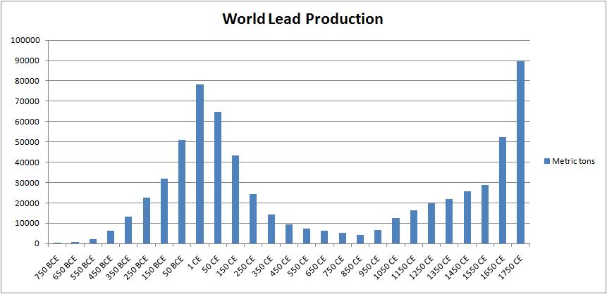
That bump around 1 AD reminds me of another graph I’ve seen. Scientists have looked at the pollution levels in the Greenland ice cap, and used it to estimate the output of metal from Roman mines.
Gibbon called the golden age of the Antonines, a bit later (ca. 100-180 AD) the time when “the condition of the human race was most happy and prosperous”. I dunno, Gibbon. The time around Augustus’s reign is sure starting to look interesting.
BTW, that lead production chart actually makes me think of the famous one, showing the size of Napoleon’s army during the invasion of Russia. Maybe one shouldn’t extrapolate too much from levels of lead pollution, but it’s tempting to think that there’s a story being told right there, about Rome, the Middle Ages and modern times, more starkly than any narrative history can do.
