This is my answer as well.
I’m in the camp of people who saw it for the first time or just glanced at it and it was clearly a white and gold dress, the lighting is bad, people on the Internet are dumb…
Then I scrolled down, and scrolled back up after I read the article and OMG BLUE AND BLACK.
I just clicked on it again and saw it afresh and it’s “white and gold with bad lighting” again.
Wired: From a color-analysis point of view it’s blue, but there are actual, scientific reasons why a lot of people are seeing white.
I saw it online and saw it as white and gold, no question. Then on the news I heard the newscaster say that the Internet was buzzing over a dress. Without looking up from my iPad, I said, “White and gold!”
My husband asked me where I was getting those colors, so I looked up, and the dress was definitely blue and black. I found it again online, and it was white and gold. So I showed the online picture to my husband, who said, “Oh.”
So it’s not my retinas as one explanation thinks.
Too bad this thread isn’t a poll.
I posted it on FB and I’m getting different answers from family and friends & their families.
The question as I see it, is what colors do you see this dress as, in this picture. People shouldn’t be answering what they think it should be or might really be IRL, but should be answering what they see in front of their eyeballs while looking at the picture.
I can see where some of the misinterpretation might be happening.
I see periwinkle and bronze.
I’m also a photographer as in old school film and paper and smelly chemicals and getting shit right in the darkroom, so I also see an amazingly overexposed crap cell phone photo of a dress that’s probably a much darker/richer blue with inky black lace trim. Maybe my brain is accustomed to color correcting (lest my color photo developing be totally wrong, wrong, wrong), seeing as it is rather than as it should be? The image hasn’t changed for me at all, upon several viewings on different screens, with different brightnesses applied. Of course the hue is slightly different depending on the screen and brightness, but it’s still periwinkle and bronze to my eyes.
White and gold. I’ve got about 7 tabs open on this subject now, from Metafilter to Reddit to here. I see white and gold. Came back to it, it’s still white and gold.
The first few times I looked at the page the dress was very white with light gold accents. I couldn’t not see anything even close to blue and black. Then I scrolled to the bottom of the page to read things and when I scrolled back up to the dress it was the darkest blue color with pure black trim. This happened a few times where the dress was white/ gold until I scrolled down then up again. Now the dress is a faded blue/ dull black no matter what I do.
Now it’s back to white/ gold, scroll faded blue/ black. I guess the more white background I look at the bluer it gets?
This is a good read.
My take on the white and gold people, especially after reading the Wired article, is their monitors are not color balanced very well.
For instance, LCD displays that have always had trouble with dark black and tend to make it grayish, even moreso when the backlight is turned up. Makes everything even brighter which might make that overexposure even worse and therefore the highlights closer to white (blue-white) and the black washed out to beige/gold.
I just came across this a few minutes ago on Facebook. It looks like bluish-white and mustard to me. My brain wants to correct the bluish part to white, which would make the mustardy part even more golden. Apparently, the actual dress is blue and black. So I did some Photoshopping with what is apparently the image of the real dress, and tried to expose it as the camera would see it. The camera is going to overexpose the image a bit for the dark tones, and it’s going to shift the image towards yellow to compensate for the blue (thinking the overabundance of blue in the frame is a sign of a blue color cast.)
This is what I came up with. (Original image of actual dress on left. Photoshop on right.)
Looks pretty darned close. Apparently, what is happening is the white-and-gold crowd is white balancing for the light tones, making them white. The bluish-and-mustard crowd (like me) is seeing the colors as they are (and Photoshop confirms the blue/white areas are bluish and the darker areas are a desaturated yellow-orange.) And the blue-black crowd is white balancing for the darker portions of the dress. Quite interesting, I have to say.
This would also be a good description of what I see.
What about people looking at the same monitor, and seeing different things?
Jesus Freakin’ Christ. I went away for a while and came back to the computer and now it’s blue and black. I thought you all were just full of it when I read the colour changed for people.
I just can’t believe how the lace part changed from gold to black. Perception is a weird, weird thing.
No doubt. While I can’t, no matter how hard I try, get that gold/bronze part to turn to black, there’s this optical illusion which shows how color perception changes (in this case, based on neighboring colors. The non-reddish/orange tones in the blue swirl and green swirl are exactly the same color.)
Blue and black.
Admittedly, when I say “black,” I mean “cheap fabric that was dyed with cheap dye, so with the glare and the backlighting and the reflection, the green undertones are very apparent - but it was meant to be ‘black’ not green.” So I can kind of see how someone might be picking up on the green and the glare and the slight metallic kind of look and come up with “gold” as a description for the yoke and the lace.
But that’s blue. Bright royal blue. Not pale, off-whitish, bluing got in the whites, soft blue but a very deeply saturated blue. I can’t see how that possibly be seen as white.
Anyone who looks at that photo and thinks they are seeing white either has shitty eyesight or a monitor with an awful color display or has the brightness on their monitor up way too high.
Every single time I’ve seen that photo it has looked exactly the same. No changes whatsoever. Whether I see only a part of it or the whole thing.
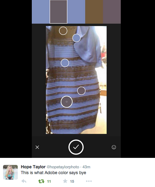
This image shows the dress with Adobe’s color tool showing the colors in the image and the little circles match exactly to how the whole thing looks to me.
Debate over.
Xkcd is now on the case.
Looks light blue and gray to me.
I agree. It appears to me that the real colors are white and gold. The white cloth looks blue because of the lighting.
I can see that it possibly could actually be a pale blue and I’m overcompensating for the effect of the light. But I can’t see any way in which there’s any black cloth.