Looks like an old typewritten font. The caps and "t"s seem to be heavier strokes also.
Belwe Bold.
Do you mean, what is the font of the word “Patagonia” as centered at the top of the webpage? I agree, it looks like Belwe Bold.
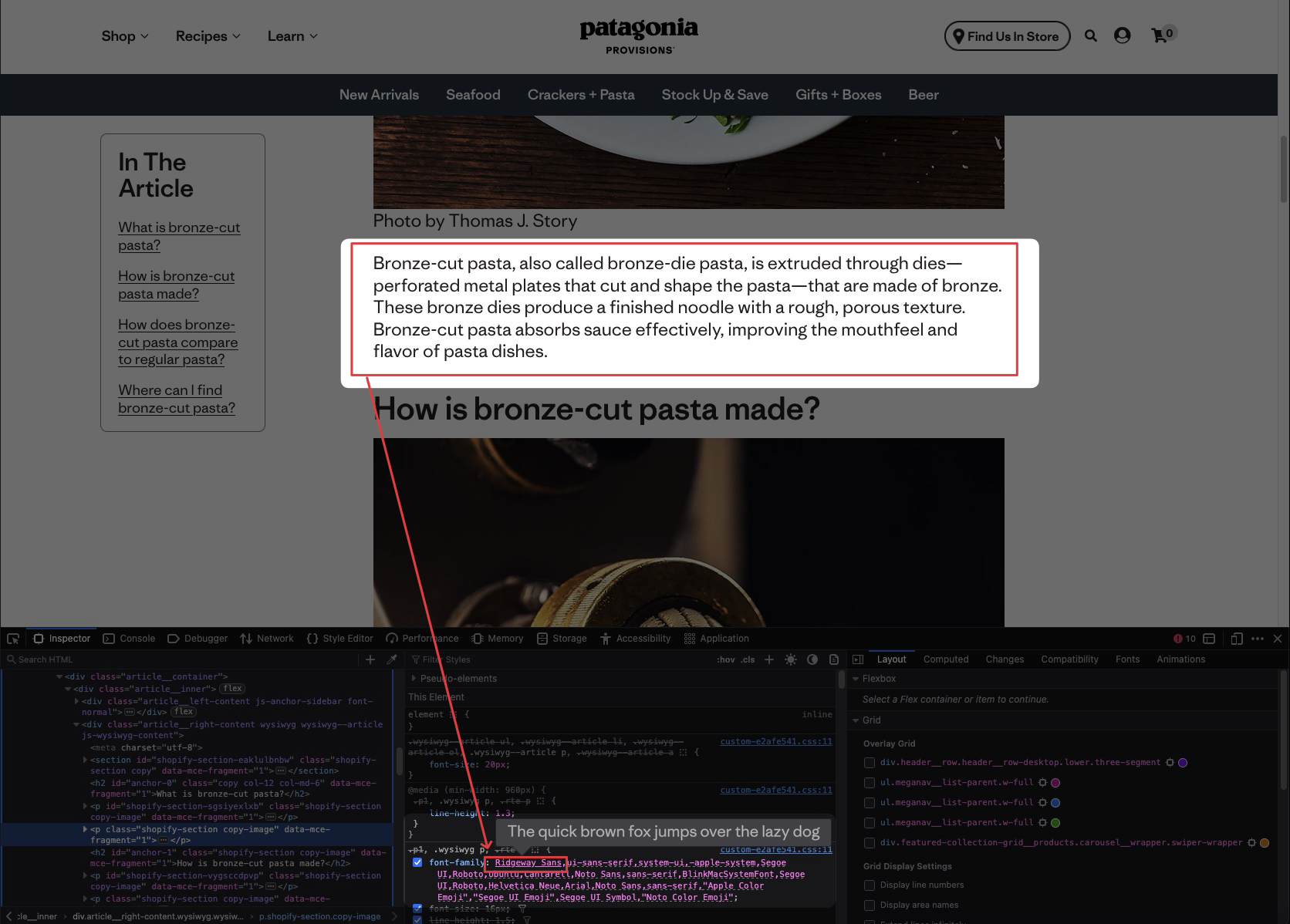
Ridgeway Sans
That’s the new font, replacing the font used that @mixdenny was asking about.
As usual, the corporate idiots replace something distinctive with an exciting new font that looks like every other boring font.
Fucking idiots.
ETA: She’s dead so she can’t object.
Sorry, I should have been more specific. I was referring to the body of the ad copy.
Hi RC. I’m not understanding your post. Are you saying that the ad the OP linked to does not use the Ridgeway fonts? (And thanks for the link about the font @GuanoLad!)
I thought the original post was referring to the Patagonia logo.
I’m so happy they managed to write absolute bollocks like this:
Our goal was to refine and streamline Patagonia’s typographic legacy—creating a distinctive, authentic voice that represents its principles across all touchpoints.
You make jackets and bags. Get over yourselves.
Actually, Chinese subcontractors make jackets and bags. And embroider Patagonia’s name on them. Patagonia just provides the pretention and most of the markup.
Just to confirm the body typeface, it is indeed Ridgeway Sans:
Side topic:
As far Patagonia sourcing, it feels weird to defend a clothing company, but for what it’s worth, they do put quite a lot of effort into their materials and labor sourcing, and 98% of the company’s shares belongs to a climate action nonprofit — the clothing company is still for a for-profit, but its profits go to the climate trust, not shareholders or the Chouinard family. The family still controls decision-making at the trust, but that money then gets disbursed to different environmental groups (see Holdfast Collective - InfluenceWatch - InfluenceWatch).
Even before they became a 501c4, Patagonia helped fund several of the small environmental groups I worked with, both in merchandise/swag and sometimes in direct funding. I’ve heard similar stories from others in the environmental sector, for what it’s worth.
Yes, some of it is just plain greenwashing, but some of it is legit as well. And it’s quite a bit beyond what most other outdoor brands (or brands of any sort) do.
The textiles/clothing industry is notoriously bad for both labor and the environment, and it’s always better to buy used if possible (they run their own Patagonia thrift store, both online and in-store). But if you’re going to buy new outdoor stuff, you could do worse than Patagonia, ethically speaking at least. Quality-wise, I find much of their stuff to be rather lacking and prone to fraying, zipper issues, etc. I own way too much of their stuff (they offer generous pro-deals to their environmental partners and grantees, one of which I used to work for) and had numerous issues with them. But their customer service is also very good, and they’ll repair (free) whatever they can and/or resell or recycle it.
I suppose you could hypothetically end up with more impact if you simply bought the cheapest clothes you could find and then donate the savings directly to the causes of your choice, but done that way, it doesn’t really impact the rest of the clothing industry. Patagonia’s actions and sustainability marketing have led to similar copycat practices across much of the rest of the outdoor industry (though not textiles/fashion as a whole), which should be a good thing, even if it’s dollar-for-dollar not as impactful as direct donations to small nonprofits. Besides, under the 501c4 structure, in theory the final profits should flow to those groups anyway (albeit selected by their board and the family, not you).
Anyway, sorry for the side rant. It’s just rare to see a modern big company going to these lengths. Even if half of it is greenwashing, the other half is still substantial enough to be notable for the good it does do. It’s a far cry from, say, Shein.
Color me edumacated. Thank you.