Mercator is awful and was discredited a century ago. Why would a cutting-edge company like Google be using it in their maps? This projection simply reinforces ignorance. Greenland is not the size of Africa!
Cause there are advantages for them (and other online maps), per wikipedia:
Many major online street mapping services (Bing Maps, OpenStreetMap, Google Maps, MapQuest, Yahoo Maps, and others) use a variant of the Mercator projection for their map images[2] called Web Mercator or Google Web Mercator. Despite its obvious scale variation at small scales, the projection is well-suited as an interactive world map that can be zoomed seamlessly to large-scale (local) maps, where there is relatively little distortion due to the variant projection’s near-conformality.
The major online street mapping services tiling systems display most of the world at the lowest zoom level as a single square image, excluding the polar regions by truncation at latitudes of φmax = ±85.05113°. (See below.) Latitude values outside this range are mapped using a different relationship that doesn’t diverge at φ = ±90°.
I would make a guess that because a lot of the US information at least comes from the USGS and they use a transverse Mercator projection. Instead of redoing everything they take what’s been created previously.
Mercator also makes navigation and distance calculations easier. Plus most people know what the Mercator looks like and are used to it. What else would you propose using, some sort of conical projection? Maybe the one that looks like a cut up fruit?
I find it absolutely mystifying why people think the Mercator projection is “Awful” and “discredited.” It is neither.
The Mercator projection is really, really, really useful if you have to, you know, navigate. Mercator’s map is meant to help you orient yourself and go from place to place. Which, last I checked, is the main reason Google Maps exists.
Because Google Maps is not made for cartographers but for the average consumer, and most of them are used to Mercator. And I’m not sure that it matters for the scale at which most people us the maps: most don’t use it to plan a path from Brugges to Windhoek. That and many of the other systems don’t scroll good if they aren’t rectangular: there’s a reason why Pacman is a rectangle field. Or some mess with the direction of north.
It could be worse: I think a great April Fools’ prank (as Google is wont to do) would be to change the system to the execrable Gall-Peters. The programming might be too awful though, unless it’s a pixel-by-pixel mapping?
If you look at Wikipedia’s article on Map Projection, there are a variety of alternatives, but they would be worse for my purposes.
The vast majority of my use of Google Maps is for driving directions.
I like that
- North is the same direction everywhere on the map; you don’t zoom in on Anchorage AK and forget that North is actually at a 45 degree angle from vertical.
- Things that are adjacent in real life are adjacent on the map (I actually have never traveled off the edge of a standard Mercator map)
Because I don’t do a lot of long-distance travel planning, the length distortions at different latitudes doesn’t matter, Google provides a distance scale that is accurate enough for driving diractions.
To quote google itself on the topic:
Most uses of Google maps are looking at small regions of the globe – the distance that can be driven in a day at most, so the relative apparent size of Greenland and Africa is not relevant to the usual use case.
Oh, obligatory: xkcd: Map Projections
The real question is why people think that the purpose of a map should not be to usefully describe reality but rather to advance social justice goals. The people who attack Mercator projections tend to use moralistic language (“awful”, “ignorant”) instead of factual claims.
Also, I’m not really sure how Gall-Peters (and other equal area maps) even promote progressive values. When I first saw it, my first thought was “Wow, Europe is really small. It’s even more impressive that they conquered the world”.
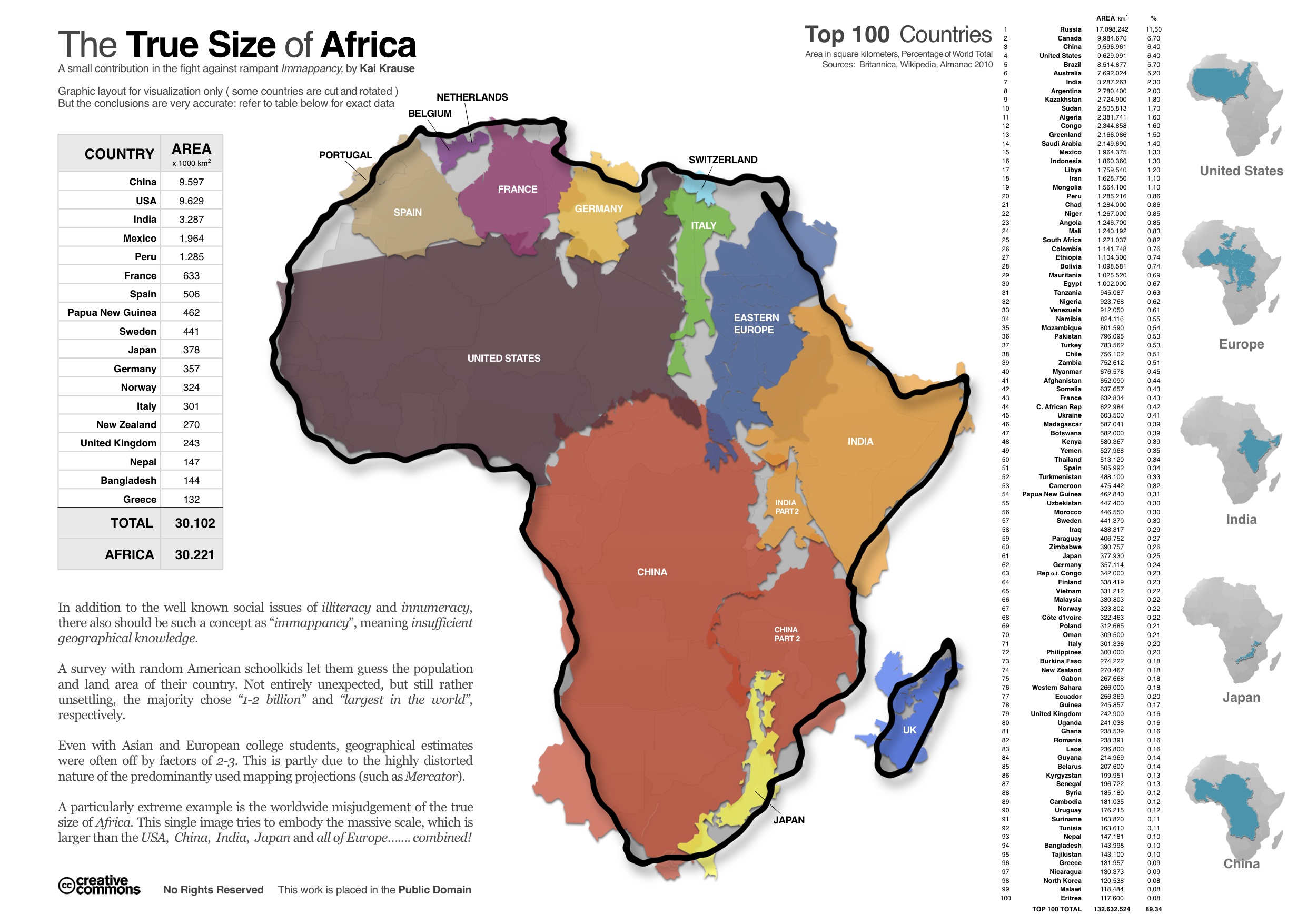
It is useful to see how big Africa really is, to understand that “problems in Africa” actually refer to a lot of area. At the very least it would help people to understand that an Ebola outbreak in Nigera doesn’t necessarily make everyone in Africa a potential plague-carrier.
Still, I don’t see that kind of enlightenment as the responsibility of the people who help me find my way across town.
This describes most modern thinking.
Once moving on the the next great depiction, it will be essential that Google, Tesla, Garmin and all the other GPS/Self-Driving corporations dutifully map, foot by foot, the entire interiors of Africa, Arabia, Australia and all the other roads not travelled before doing North America and Europe, otherwise it’s unfair. And discriminatory. And mean.
And there’ll be articles in Slate.
Already pretty well covered, but to sum up:
a. It’s a lot easier to do the computer stuff, because everything can be stored in square tiles that always have north at the top.
b. Nearly all usage is looking at areas so small that the projection is irrelevant.
At the mapmakers convention a few years ago, we had a frank freewheeling discussion with part of the Google Maps team about this issue, and some folks felt they should have consulted with actual cartographers before making such a far-reaching decision. And there’s new technology—vector tiles—in the slippy map world that may allow on-the-fly reprojection, so you could have one projection when zoomed in to a town, and a different one when looking at an entire continent.
If Google were to move away from Mercator they should just jump straight to zooming out to a globe. Anything else is just half measures.
It’s not as though Mercator projections make Africa look small. It’s still obviously a fucking huge continent; you’re not going to confuse it with Italy or something.
I have no idea what any of this means, but I assume you just got answered by an expert who knows his shit. The power of the SDMB.
I would query the comments in this thread that somehow ‘most people’ know or are used to Mercator - that might apply to the US perhaps, but I would doubt it is the most generally used map projection throughout the whole world. (although I’m open to be shown wrong).
For interest - True size of Africa. Good to have a comparison.
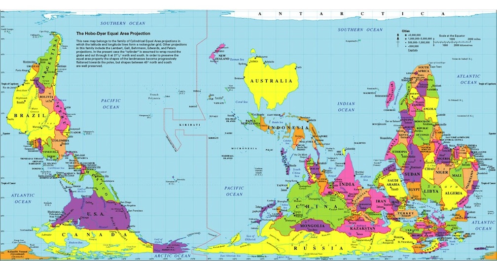
I like the Hobo-Dyer projection personally; the expanded size of Canada / Russia / Greenland common on the Mercator are removed for an equal-area arrangement - I have this inverted one on my study wall at home.
But, my preferences aside, Google are obviously free to do what they like (or what works best), really.
I think the “familiarity” argument is a red herring. Maybe “most” people are familiar with Mercator projection (for a suitably defined definition of “most”), but Google Maps developers are not “most people”. I imagine the intersection of “people who work on Google Maps” and “people who don’t understand the shortcomings and of the Mercator projection” to be the null set. It’s not overly specialized knowledge.
Hell, I imagine that the intersection of “people who work on Google Maps” and “people who haven’t read that XKCD that someone posts in every thread that even tangentially references map projections” to be the null set.
But it’s not about “people who work on google maps”. It’s about “people who USE google maps”, the vast majority of whom don’t work on google maps.
But the people who work on google maps have a much, much greater influence on the choice of map projection used. The other people basically have to use whatever they decide.