My uncle could write beautiful calligraphy. He got lots of requests to so family bibles, greeting cards, wedding invitations and so on.
Computers have the capability to easily produce very detailed fonts. Either on the monitor screen or on a laser printer. Unfortunately finding a gorgeous script font is difficult. MS Words is ugly. Probably because consumers aren’t asking for calligraphy fonts.
Why are we settling for sterile and boring typewriter fonts? Wouldn’t a gorgeous cursive font give this posting a more personal feel?
It’s a shame that cursive writing is becoming extinct. Especially since computers are capable of such detailed and precise fonts.
I agree informative articles like news and tutorials needs to be printed. But, I’d enjoy reading personalized cursive postings on message boards.
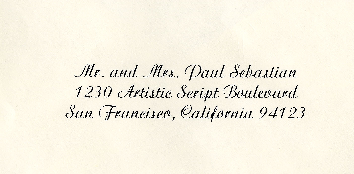
Hers a very readable example. Gorgeous. Except for their R. Looks too much like a V.
Sure, after wasting 15 years reading typewriter fonts this would jolt a few people. But, if we gave it a chance we’d quickly adjust. I read cursive letters from relatives for thirty years. I only wish their handwriting had been this good.
Printed fonts caught on at first because it’s really hard to make a good cursive font that joins up properly, especially on a mechanical device like a typewriter. With computers, joined-up fonts became possible, but by that time the printed fonts had already caught on and become standard.
Ms Word’s cursive font doesn’t join the letters together. It’s a terrible cursive font. Probably designed for primitive dot matrix printers from the 80’s.
Can only speak for myself, but I found the example you linked to difficult to read.
When I learned to read all these many years ago, I learned to read print. This is true of basically everybody in the United States. I didn’t learn to read cursive till several years later, when I learned to write it too, sort of, and never found it comfortable to read…still don’t.
If cursive were easy to read, books for very young children would likely be printed in it.
It isn’t that easy to read, fine for an address but imagine a 30 page document written like that.
I’ll also note my immediate reaction was “it’s so girly” – swirly letters look childish to me. It seems okay for an address on a fancy invitation, but not suitable for conveying information. If I got medical results addressed in that font, I would certainly find it odd. Obviously, that’s because of what I’m used to.
You might want to check out the documentary “Helvetica,” it talks about modernism as it applies to fonts (its specifically about Helvetica’s place in cutulre and how it became such a prominent font). Its quite interesting with lots of points of view on whether the modernistic view of conveying information is a good one. There’s a strongly worded debate about “hand-drawn” fonts - those meant to represent the irregularity of handwriting.
Cursive isn’t meant to be easy to read, it’s meant to be easier to write.
That said, Chronos hit on the major problem with cursive fonts: letter combination. You’d need a vast amount of ligatures in order for a cursive font to look natural, which is the whole idea behind a cursive font. Even with computer fonts and “smart ligatures”, for most purposes a cursive, or even script fonts are too heavy-handed and flowery, if not obnoxiously so for more utilitarian or casual reading.
Cursive, script or calligraphic fonts are usually reserved for limited usage to get across a tone in graphic design, like most other more elaborate display faces. In the hands of a good designer, it can work, but in typical hands cursive fonts are usually a disaster.
MS Word has several cursive fonts:
Brush Script
Freestyle Script
Kunstler Script
Lucida Handwriting
Mistral
Palace Script MT
Segoe Script
Script MT Bold
Vladimir Script
You might as well ask why an approximation to cursive hasn’t been used in printed books (the closest I can think of is the old German Gothic font). In fact, it was not even used in manuscript books after the invention of Roman Uncial (I don’t know the exact history, but even manuscripts before the invention of printing did not use cursive per se for the most part, right?).
And as another poster said, it came down to readability.
I thought that was pretty damn good for what it was. Cursive is hard to read. My favorite font to read is Century Schoolbook. Really easy to read and calls not attention to itself.
Aside from legibility, it should be noted that monitors and printers twenty years ago didn’t have the same pixel and color depth that modern equipment does. Writing an attractive cursive requires being able to display variable stroke sizes in addition to the ligatures. That’s much harder when you’re limited to how smooth your blending and lines can be. San Serif fonts looked better on most of the monitors at the time and were easier to read on the old dot matrix printers, as well.
One of the early differences between the way Macs and Windows was that the Mac OS was dedicated to reproducing the different stroke weights as accurately as they would appear once printed in a magazine. Early monitors, even the very expensive ones, didn’t display variable weight slanted lines or colors as smoothly as they would ultimately look on the page, but that was goal. It wasn’t as easy to read those fonts on a document that was printed on the common dot-matrix printer,
Windows, otoh, prioritized making fonts for documents that would be read on office monitors or printed on office printers rather than something that would be sent to a professional print shop. They used strong sans serif fonts that would be more legible even on a cheapo dot matrix printer and home quality monitor resolutions. In fact, sometimes the font that was displayed on the screen was slightly different once it was printed out due to insoncistencies in printer manufacturers and publishing software. These early Windows fonts weren’t as good for serious publishing houses, since the font on the screen was not accurate. A professional printer needs to know as precisely as possible what the page is going to look like. OTOH, for typing up office memos and school reports and so on, regular business and home use, it doesn’t much matter. What matters is that it be easy to read on the screen and paper. For the early home and business user, Windows’ approach made more sense.
The Mac approach is more artistic. People who care about typography look for things like weight strokes and serifs. They tend to prefer the Mac style fonts even today when modern equipment can handle any font we throw at it. To people more accustomed to the Windows approach, Mac style fonts can look thin and spidery. To Mac users, Windows style fonts can seem to lack fine detail. Since Windows users widely outnumber Mac users, the end result is that most websites and software is designed to look good on Windows machines, using the customary Windows approach to typography.
I wonder if these days, it’s simple enough to have some sort of “smart font” in which various strokes can be altered slightly one to the other at random, to produce a more natural look?
You would need to have something sort of equivalent to a kerning table, which would list every digraph and contain some kind of description of how to draw the connector between each pair.