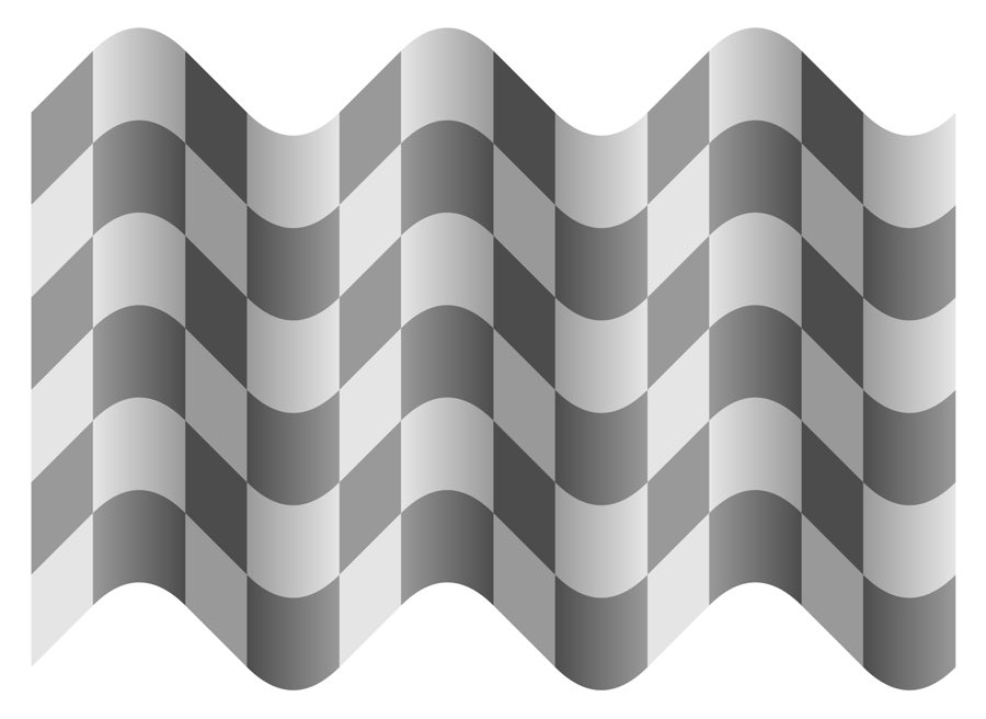
It’s a take off of the checkerboard illusion but more confounding. I’m having a hard time seeing the transition.
As you said, it’s a variation of Checker shadow illusion - Wikipedia
Might be easier to see in an animation:
Also see his other illusions: Akiyoshi's illusion pages
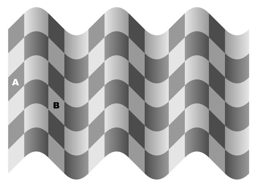
I think it’s cool how “durable” the illusion is. The darker tiles above and below the “B” are not the same color as A — that much we know, since B=A already, so the adjacent ones must be darker. But even when you copy A over and replace that entire column with it, B still looks lighter. The entire column looks lighter. It isn’t until you black out the other visual cues, the two columns next to B, that the illusion stops. Neat stuff!
I’m pretty sure artists have been aware of this phenomenon for (at least) centuries and relied on it in their works.
The link in the OP also refers to a similar illusion where the “light” square is in shadow and we compensate for it, but says there is no shadow in this illusion.
The IS a shadow in this illusion the square immediately to the left of B is lighter on the left edge than the right edge, we interpret this as the image it lit from the left hand side to the right edge is in shadow and the left edge is not but as the surface is curved the change is gradual.
A very powerful illusion but one we see all the time when images are projected onto a white screen, suddenly the areas of the screen that receive no light from the projection are perceived as black as everything else reflects more light.
He mentions that the ‘A’ and ‘B’ being black and white are part of the illusion but I don’t think that’s true. If you cover up the bottom half of the image (hiding the A and B), the illusion is just as strong.
It might even be stronger without the letters:
Vs the original: (from his tweet):
The letters actually seem to brighten the left tile while darkening the right tile, averaging them out a bit. To me the effect seems more noticeable without them.
It’s got something to do with rhodopsin in our retinas. The surrounding squares signal the rods to release different levels of rhodopsin, and the rods “like” low levels of light. The fact that A is darker than the surrounding squares and B is lighter causes more rhodopsin to be released in the area of retina that is seeing the A square, so it looks darker.
This is why it’s black and white-- you can fool rods when the color-sensitive cones are not participating.
In fact, there’s probably an argument to be made that when the squares stimulate different levels of rhodopsin, they are axiomatically different colors. Change the way they strike the retina, and you have changed the color. It’s no different from turning a dimmer switch.
Thank you for explaining that!
For this part, though, the illusion still seems to work even when colored?
Yeah, it’s simultaneous contrast, works on both value and color. I was taught to use it in first year design class.
This guy covers largely the same thing. He does it with pieces of colored paper, we did it with gouache.

Speaking of which (and this may seem a divagation but it isn’t a complete detour) if you google “brown” one of the first results is the chart below.

Many people around the world would look at the “brown” in the upper‑right corner and call it “red.”
I imagine you mean upper-left? Because I would call that red or close to it.
The upper left and the upper right are actually the same color.
not really ![]()
Sorry. Upper-left, indeed.
(Maybe I should focus on the New Year’s Eve party. ![]() )
)
Specifically, that’s #A52A2A, which makes it a slightly grayish red. That’s not any shade of brown at all, and that chart is just plain wrong: Brown absolutely must have more G than B.