Aesthetically I like the ones with ferns in them. The red white and blue one is perhaps a little too colonial but I don’t know about the colour balance in the other one. Is there significance (beyond rugby) of the colour black?
All of that said, the case that the artist makes for ‘first to the light’ is compelling. If I were in a committee, think I would take that.
That’s the one that most looks like a “normal” national flag to me. Reading a bit more about it and its background and symbolism, I do like it. It suffers a bit from being a little boring, but it does look more like a national flag design than my choices, the koru flag and the red-and-blue colored fern flag.
I initially liked number 4, but now the more I look at it the less I like it, I can’t say why. Number 2 is simple but boring. Number 3 just looks weird. Numbers 1 and 5 are basically the same, except for the choice of black vs red. There are too many red white and blue flags out there as it is, so lets go with number 1.
I had never previously heard of vexillology. I have looked it up and am now using it once in a sentence. It shall be mine forever by the end of the day. You have successfully fought ignorance in my world today.
I’m really excited about you guys choosing a new flag! The reasons are more than sound.
I like the Koru best, hypnoflag or no. The black and white silver fern is also fantastic, if a bit busy. Either one would be a great choice. There are no other black and white national flags, and no other flags have similar motifs.
The ones that incorporate the silver fern and the southern cross are way too busy, and they just seem like a mishmosh. The red white and blue one looks better than the other one because it has one fewer color, but that’s also the most common color combo worldwide, and thus should be avoided for new flags.
The red peak is just hideous. I love the idea. I love the symbolism. I even like the basic idea of the design. The execution stinks. It’s just blocky and clumsy and ugly and has 4 colors where 2 or 3 would have been sufficient. That said, I think it edges out the fern-and-southern-cross designs because it’s not so busy and has a single strong theme.
In case anybody didn’t know, Fiji is also dumping their Union Jack flag and having a flag contest. They have released 23 finalists - way way too many, and most are pretty hideous. They all keep the Fiji blue background, so that’s pretty cool. (The official site keeps crashing my computer. This siteshows them all though) JRDelirious - there are a lot of other flags out there with the Southern Cross or similar configurations of stars.
The short answer is *almost * a ‘no’. However, black, with the white fern, are the national representative sporting ‘colours’.
It would also be fair to say that a significant number of NZers consider All Blacks rugby, together with the uniform, as the complete embodiment of the national psyche.
A significant number also find this monomania embarrassing.
If you were to quote me in full I think it would be apparent that I wasn’t suggesting that at all.
I wasn’t, in fact, suggesting anything - merely noting that one of the prime drivers for re-design is to positively differentiate NZ from Australia.
I am all for unique and distinct flags, and I actually like the proposed flag designs for New Zealand. The current flag is very similar to Australia, and is not really attractive, in fact quiet boring.
Canada changed their flag and dumped their ugly British inspired flag, I just can’t understand why many think New Zealand changing theirs will spell the end of the country, will show distance from tradition and every other objection given by those who support the status quo flags?
I hope people truly vote for whichever they like and not let politics get in the way. If you don’t like the proposed new flag, vote against it but don’t vote against it because you don’t like Prime Minister John Key or think it’s a waste of money that could have been used for something else. I doubt all the country’s resources are being spent on flags and guess what, poverty or other issues will still be around, whether the flag is changed or not. You can change the flag and tackle important issues you know kiwis?
Duh!
I like 1, 3 and 4. Totally blows the current flag out the water.
As designs, I like the koru and the vegetarian pirate flags. I visited New Zealand - a beautiful but unsettling country - some decades ago, and saw the extent to which the silver fern and the color black were national symbols.
But as flags, I don’t think they work as well - too busy. Kiwis aren’t just going to see this flag flying over Parliament or carried in an ANZAC day parade; it’s also going to be on ships and trucks and the shoulders of your military. You need, I think, a design that is recognizable when shrunk down to postage stamp or shoulder patch size.
I should be fair and say three butter packets and a monkey’s bum; Red Peak at least looks like a flag and not a corporate logo: the trouble is that it’s not particularly a New Zealand flag, even when you’ve had it explained.
It would never fly for political reasons - it’s the flag of Maori sovereignty - but the *Tino Rangatiratanga *flag gets my vote as far and away the strongest design; it looks bloody fantastic when flown.
 You have successfully fought ignorance in my world today.
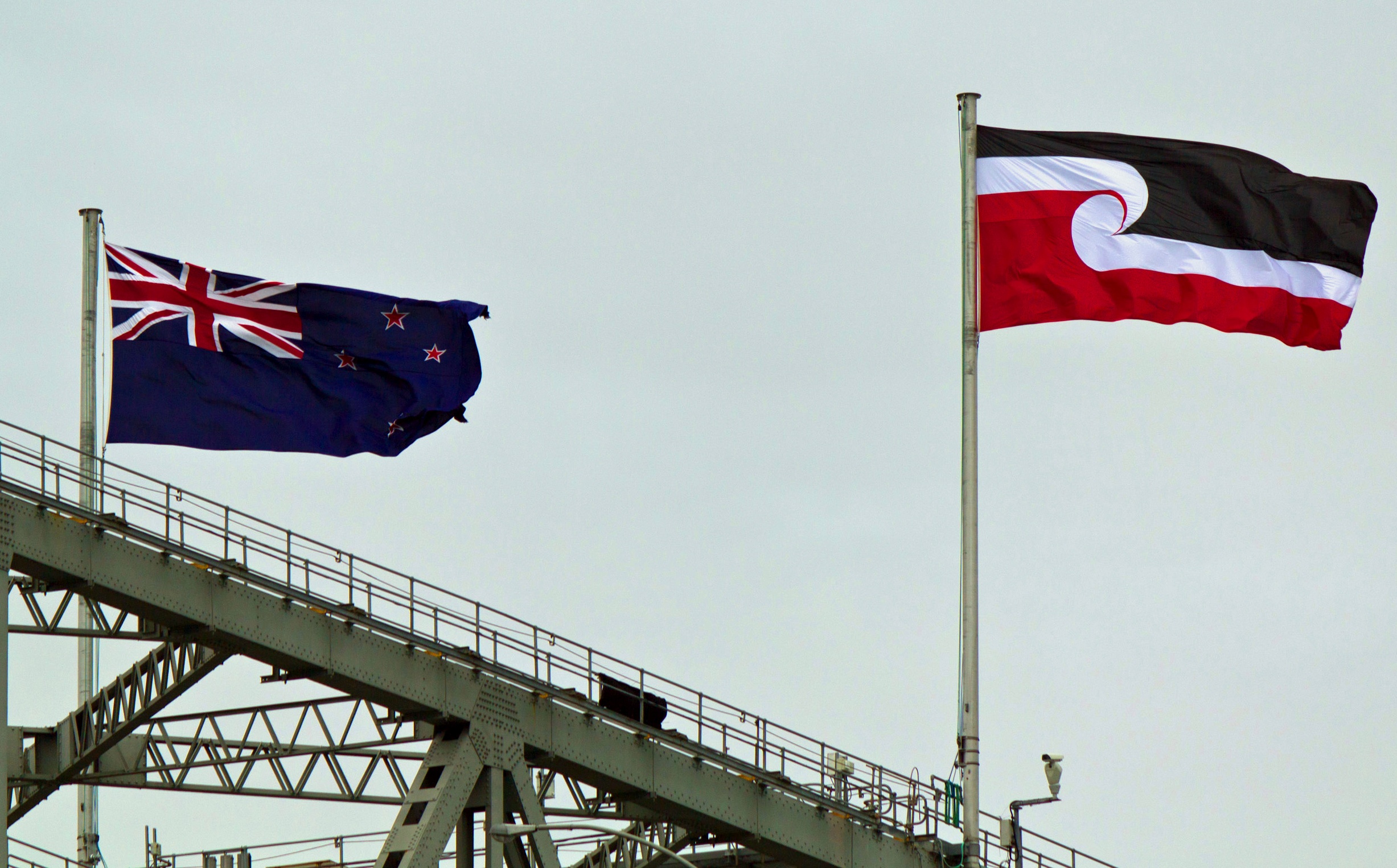