Not being a vexillologist [on flag design]

…can someone who is explain what makes a good or bad flag design? I’ve seen comments on a couple of threads* that sound as though they’re meant to be expert judgements dismissing this or that example, but what’s the authoritative guidance?

*e.g., one on making extra states out of California, and therefore fitting extra stars on the US flag; and one some time ago on local/municipal flags

The North American Vexillologist Association actually has a booklet devoted to Good Flag Design:

https://nava.org/good-flag-bad-flag/

Highly relevant:

He goes over principles of good flag design, and offers numerous examples of each. Among other things, use meaningful symbols, a few basic colors, and features that are large enough to easily identify at a distance. A lot of shitty flags get these things wrong, most often by using tiny font or images that you couldn’t possibly make out unless you were holding it in your hands.

I don’t have a definite guide, but to my eye the worst ones have solid backgrounds with overly-complicated seals or graphics in the middle where none of the details could possibly be seen at a distance. Missouri, for example.

Good ones have striking arrangements of color fields with simple design elements that can be seen at a distance and instantly recognized. Bonus points for symbolically relevant and easily interpreted elements. St. Louis City for example.

My mom was a vexillologist for the department of the army. Growing up, our library was filled with books about flags, uniforms and medals. Sadly, my brother got most of her books, but she would have loved this thread.

This page is interesting. It has flags that look impressive, but violate the laws of Good Flag, Bad Flag

I have to admit, the Zheleznogorsk is pretty awesome.

This topic is inherently subjective enough that it may be better suited for IMHO, but what the heck.

I have always thought the “Keep it simple, so simple a child can draw it from memory” rule was far too restrictive (and in fact I have even literally thought “Yeah, but what about Wales? The Welsh flag is totally cool!”)

In general, the other principles strike me as pretty sensible: “Use meaningful symbolism” seems kind of a no-brainer; “Use two to three basic colors” is perhaps a decent rule of thumb, but also a rule that can be broken when appropriate; “No lettering or seals of any kind” is generally a quite good rule of flag design (but even it can be broken–as in the “California Republic”); and finally “Be distinctive or be related” also seems straightforward and obvious. (If anything, “…or be related” may be too lenient: There are, or historically have been, several regions of the world–Africa, the Arab states, Central America, the old Soviet Socialist Republics–where I think the designers took the “be related” principle a little too much to heart.)

Hard to beat a bear ripping open an atomic nucleus by main force.

The New Mexico flag might have been judged a winner in terms of design, but it’s not well-loved by the Zia Pueblo of New Mexico.

To begin with, it uses as its center a 12-rayed sun design taken from a very private Zia sun symbol. The guy who designed the flag saw it in a state museum, but the Zia insist it was gotten illegally, because they would never release such a sacred image to general public viewing. Now they’re upset because it’s all over anything with “New Mexico” in the name, including rentable port-a-potties.

Since it is out there, they decided to use it as the symbol on the Zia Pueblo flag. Only their version uses a red sun symbol on a white background. The guy who designed the New Mexico flag used the red and gold colors of Spain, because New Mexico had been a Spanish colony – and that doesn’t sit too well with the Zia Pueblo, either.

(I know because I researched this for an article on sun symbols.)

It’s kind of like that flag for Iraq that somebody in the US designed after the US Gulf War. I can’t find any images of it online, but it resembled the Chaldean flag:

It was quickly scrapped and replaced by this:

But both flags, it was argued, looked way too much like the flag of Israel. It didn’t help when they explained that the two blue stripes were supposed to represent the Tigris and Euprates, a reference to Iraq as containing Mesopotamia, the “land between the rivers”. The symbolism and resemblance trumped everything. So the flag was redesigned.

The Chicago Flag is pretty decent by that yardstick. Apparently the North American Vexillogocial Association agrees with me.

Fun fact, when I was in Iraq, the first time I saw the new flag of Iraq was when we were driving through Baghdad and we all were wondering what flag they were burning. Now that’s a bad design.

Yeah, really these are not hard-and-fast “objective” rules but rather more like “best practices”. The principle about distinctive simplicity I understood as harkening to the historic use of flags as battle standards and ships’ ensigns, especially after the rise of firearms, where you wanted something that you could spot at a reasonable distance and recognize if that was friend or foe before you were in shooting range.

And yes, those are examples of cases in which one guideline or another is broken but it works. For example, you will know Maryland at a reasonable distance in all but the worst light conditions.

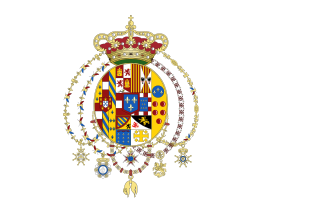
I suppose the simplicity rule was more aimed towards avoiding some of those corporate-logo-city-flag probems or the old-style royal banners that incorporated every heraldic symbol of the last 4 generations of the king’s ancestors, quartered and requartered. In turn it would be tied in to the later-enunciated distinctiveness principle. So really rather than than that “a child could draw it” it should be “a (reasonably intelligent) child (or ship’s lookout) can tell you what it is” – thus, “it’s a red dragon” or “it’s a shield and spears”.

Indeed. I give you the Flag of the Kingdom of the Two Sicilies:

That is a better rule!

Saudi Arabia

has a far better example of the Arabic religious text theme

Another exception to the “no text” rule is Ohio: The circle in the design is the letter “O”. But it’s just one letter, and a generically-shaped letter at that, and that’s hardly what makes the flag distinctive.

As for distinctiveness, see Australia and New Zealand. Sure, that might be a good flag for one of those countries, if you don’t mind having another country’s flag as an element of your own. But it can’t be a good flag for both countries.

Many Australians and New Zealanders agree with you. In 2015 NZ looked at changing its flag which, had it got up, would have solved that problem.

The Australian Aboriginal flag, which I think is brilliant and meets the good design criteria, was designed by an indigenous artist and is still under copyright, which has made using it on t-shirts and clothing really problematic.


You may not be aware that the South African flag was designed by a middle-aged white Anglo-Saxon male called Fred.

Here’s the improbable, but true, story:
 

After the fall of apartheid a new South African flag was needed, and the new government decided to make the selection process as open, democratic, and fair as possible. The public was asked to submit designs, and thousands of designs were sent in by people ranging from school children to top artists and designers.

A very politically correct committee, consisting of representatives of all races, colours, creeds, languages, genders, and sexual orientations, was created to consider the designs. They came up with a short list of 10 designs which were then published everywhere. The public was then asked to vote on them, so that the most popular could be democratically adopted.

Unfortunately, the reaction of the public was uniformly and overwhelmingly negative. They didn’t like any of the designs. Not one. The most popular hardly got an approval rating extending into double digits. The democratic process had failed. The politicians were at a loss. A new flag was urgently needed for the rapidly approaching independence celebrations. So what was to be done?

This was when Fred Brownell, occupant of the obscure post of State Herald, came to the rescue. He was the only person in the country actually paid a salary to think about the design of the national flag, so naturally nobody had bothered to consult him.

Not often in the life of a State Herald is there a National Vexillological Crisis, but Fred rose to the occasion magnificently. He managed to convene a meeting of the leading politicians, held behind closed doors, and presented to them his own design for the flag. It was the same as the current flag, except for the black triangle at one side.

The political leaders agreed that it would do as well as anything else, but the Black parties insisted that it must have ‘some black in it’. Fred then took out his black marking pen and coloured in the black triangle, producing the present form of the flag.

The next problem was how to present the flag to the public, considering their reaction last time.

The politicians fell back on a tried and trusted method, hallowed by centuries of use. A notice was published in the Government Gazette, and an announcement was made by a minor public official, “This is the new South African flag.” End of story.

Of course, when they put it that way there was no problem. There was just the normal grumbling about government incompetence, and a couple of unprintable jokes about what the flag looked like. However, the South African public soon took the new flag into their hearts, and lived happily ever after.

I’m not sure what the moral of this story is.

It’s surprising that neither country has changed their flag, particularly with the colonial implications of the British flag in the upper quadrant (canton). The old Canadian flag (the red ensign) incorporated the British flag in the same way, but that was abolished in 1965. The “Pearson pennant” was the favored replacement candidate for a while, with three red maple leaves and blue bars (illustrated in the article). It seemed attractive to me at the time, but looks ugly today compared to the much simplified red and white design that was finally adopted. While you can occasionally get away with breaking the rules, this one I believe follows all the rules of good design and looks simple and distinguished.

It’s interesting that formal decisions about symbols seem to be much more difficult than others - hence the flag issues (and the question of the monarchy in Australia). No new suggestion seems to please enough people.