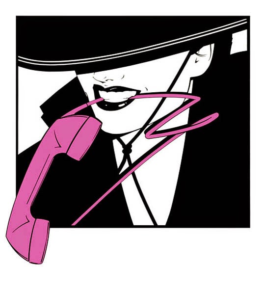
Does anyone know the origin of this design fad? The earliest example I’ve found is in the promotional material for 1983’s Flashdance (movie posters, soundtrack album and single covers, etc.). The page for the Andy Warhol advertisement I linked to above calls the squiggles “Haring-style”, presumably a reference to artist Keith Haring. Is Haring really responsible for inventing, or at least popularizing, the technique?
And for all those reading this thread who don’t know the answer but just want to admire (or mock) more squiggle art, feel free to post your favourite examples.
I’d say no, when I think of Haring, I think mostly of the simplified humanoid figures and geometric mazelike structures he did, not squiggly outlines. A lot of the figures did have comic-book-style movement lines, but those are black, not the fluorescent lines of your examples. haring for me is thick black outlines and primary colour fills, not photos and dayglo squiggles.
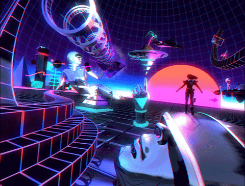
The Tron lines aren’t really drawn on, are they? They’re just glowing highlights on the characters’ costumes. And the lines tend to be straight or circular, not squiggly freehand-like lines. So I think that Tron would at best be a precursor of the sort of art I’m talking about.
IIRC, Tron was heavily rotoscoped over years. Guys painstakingly drawing the glowing parts over the footage, frame-by-frame.
That said, I don’t feel Tron was of any inspiration at all to that style of graphic design. No one comes to mind in particular. It was most likely a self-perpetuating trend in the design world at the time. Like the “grunge” fonts of the 90s.
Except for the obvious one around the bottle in the Warhol ad, none of them seem derived from Haring, the squiggles are just squiggles and the outlines are just outlines.
Just cases of someone saying, “you know what this picture needs?”
I’d love to blame it on coke, lol, but I don’t think so. I do sense it being a little of an 80’s thing though, I think what they were after was “Party!”
Keith Haring was very open that the biggest influences for his art were anonymous graffiti artists. The concept of adding colorful lines to photo images was originally a graffiti practice - poster ads that adorned subway walls and bus stop shelters would often get outlined in spray-painted (“tagged”) in ways that altered the image. Graphic designers adopted the practice to spice up photo shots that were otherwise static and dull.
I was going to argue for the influence of Patrick Nagel, as per memory I remember his illustrations having those sort of squiggles, and he died in early 1984.
Looking at most of his work, though, it seems that he used fewer squiggles than I remember - note that links include non-nude but racy pinup-type Nagel images- lots of colorblocks and lines behind or in front of the figures, but only a handful of ‘floatingsquiggles’. Still, he was influential enough on the design and art style of the 80’s that others might have taken that idea and run further with it.
One source of squiggles was the Memphis Group–mostly Italian designers of striking & uncomfortable looking furniture. As of last summer, the look was coming back…
Remember, this was the early days of “computers” infiltrating mass culture. Primitive wireframegraphicsand unnatural colors were all the rage. The sort of hand-drawn squiggles that the OP cites were popular because they echoed these same design elements.