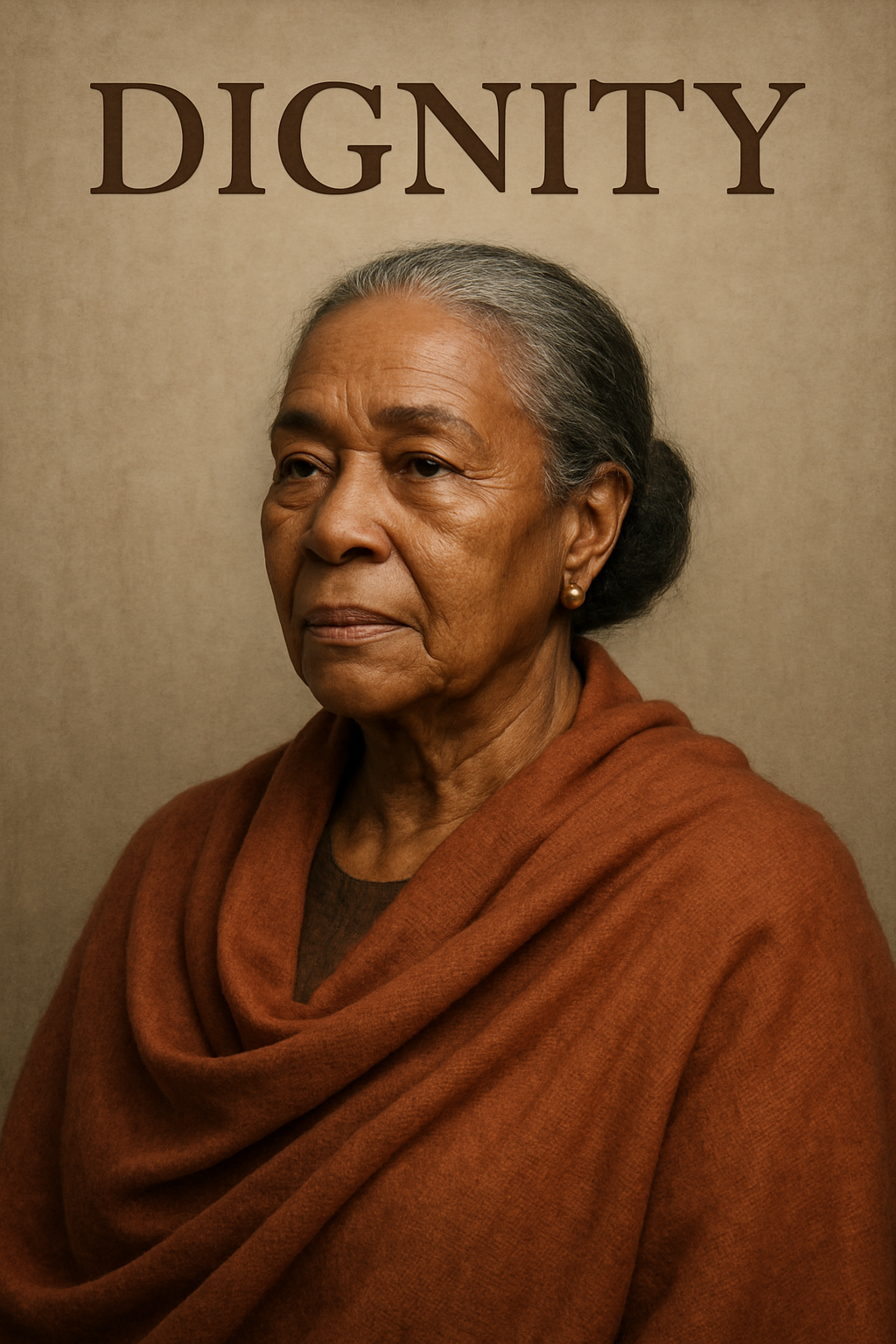
I gave it a one-word prompt: dignity.

So everyone, take note for your next Pictionary session: “dignity” is an elderly African-American man.
I gave it a one-word prompt: dignity.
So everyone, take note for your next Pictionary session: “dignity” is an elderly African-American man.
Or woman.
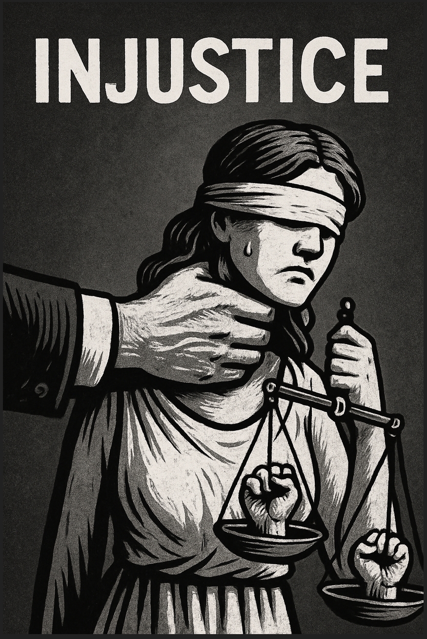
Indignity.

Also, two that I did a couple of days ago
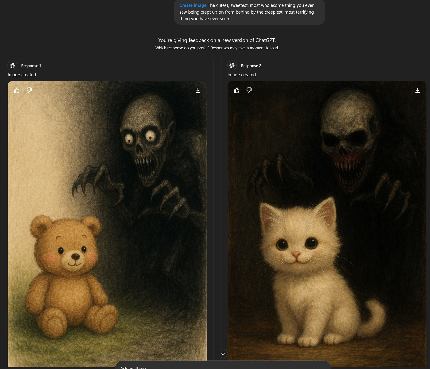
The cutest, sweetest, most wholesome thing you ever saw being creeped up on from behind by the creepiest, most terrifying thing you have ever seen.

The cutest, sweetest, most wholesome creature you ever saw being creeped up on from behind by the creepiest, most terrifying creature you have ever seen.

Those were disappointingly ordinary.
I got a 2-fer and as they started I wondered if they were going to both be pretty much the same things:
Why yes, I was annoyed at that little underline from the autocorrect.
Again, kind of tame. I was hoping for something more creative, like in the Squirrel Girl selfie above where for “weirdest” it made the green thing covered in eyes and the one-eyed thing with the dendritic antlers.
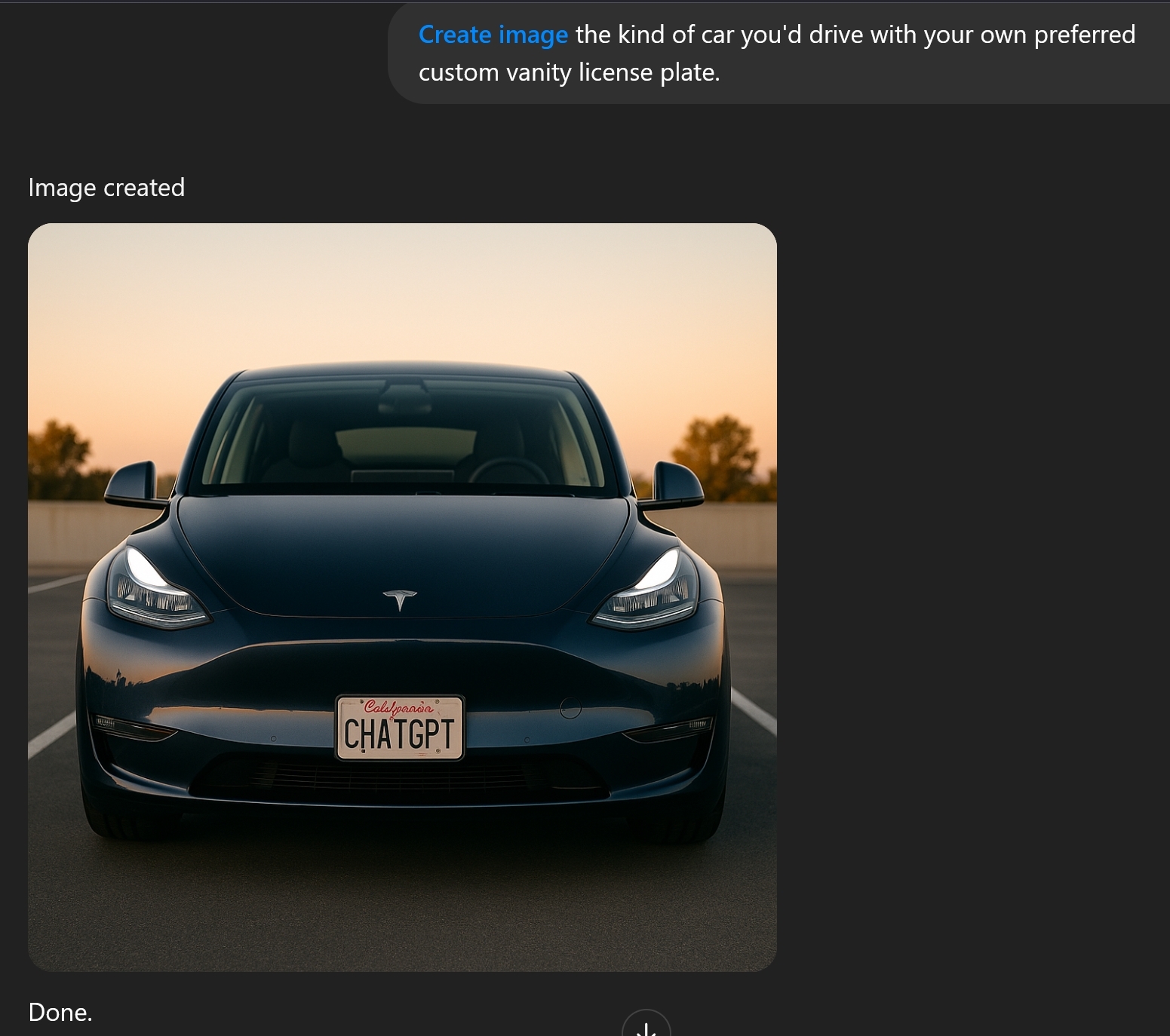
Inspired by the custom plates seen in the wild thread:
Speaking of Squirrel Girl, I made a couple of images involving Squirrel Girl and Spider-Gwen and some of those claw things in Sora, then decided to swap in a less esoteric opponent and choose smurfs. Got an image I liked but it left in one claw. Then it refused to edit out the claw. It refused to make a full new version with the same prompt. I tried the “turn the image into a negative” trick (which works for infilling/outpainting sites that see something they don’t like) and it refused that. I scrawled SG and SG out of the image and it didn’t mind working with it but made a whole new image instead just working with the problem area. The mentioned infilling options aren’t good enough to match the content well. But I iked the image and concept so I bit the bullet and used my limited editing skills to fix it by hand.


If there was ever a car designed to get keyed…
Yeah. But those eye-headlights are frickin’ laser beams, so the surprise is gonna be on the keyer, not the keyee.
ChatGPT struggled with the (admittedly contradictory) idea of a duck being realistic and holding a gun. I had four images (including a “survey, which one do you like better” pair) and none quite got it, but this one was good enough that I could replace the human hand gripping the gun with a mirrored left wingtip. (Others had basically just a gun touching a duck with no visible means of support.)

Kirk Van Houten would not agree
Asked for a comic book cover, title “sifu” dark alley at night, moon and neon-lit, silhouetted protagonist walking away surrounded by defeated enemies. Got everything right but some typos in the label. The barcode does not check out.

That reminds me of an image and prompt I saved recently. The prompt included
Reserve two small unobstructed rectangular spaces at the top corners of the cover: one on the top-left for a vintage 25¢ price tag and issue number (‘No. 15’), and one on the top-right for a vintage ‘Comics Code Authority’ approval stamp.
I don’t know if that “reserve a space” language is specifically meaningful to ChatGPT, but it seems to have worked.
The full prompt
Reserve two small unobstructed rectangular spaces at the top corners of the cover: one on the top-left for a vintage 25¢ price tag and issue number (‘No. 15’), and one on the top-right for a vintage ‘Comics Code Authority’ approval stamp. Center the main title (‘BLINDING’) between these two spaces across the top, slightly lower if needed to avoid overlapping. Below the title, in a smaller placard, display the artist name: ‘FLORENCE + THE MACHINE’ in smaller retro serif font. The artwork should not intrude into these reserved corner spaces or behind the title.
A vintage 1950s EC Comics–style horror comic book cover inspired by the song ‘Blinding’ by Florence + the Machine.
The comic series title ‘BLINDING’ appears in large cracked and distressed retro horror comic book lettering across the top center. Below the title, in a smaller placard, display the artist name: ‘FLORENCE + THE MACHINE’ in smaller retro serif font.
Florence Welch stands at the edge of a surreal, flooded graveyard at twilight.
Her white torn dress clings to her body as she wades barefoot through ankle-deep dark water that has risen up over the graves.
The gravestones around her are cracked, leaning, and covered in dying vines. Some tombs have shattered open, releasing faint ghostly figures that dissolve into mist as they rise — lost, not resurrected.
Florence holds a cracked mirror close to her chest, reflecting a blurry image of herself asleep.
Her eyes are now wide open, sharp and aware, as she steps forward into the ruined graveyard, leaving the ghosts behind.
Thunder rumbles in the distance, splitting the stormy purple sky with faint lightning as the walls of the dreamworld collapse into black mist at the horizon.
The background should use a realistic flooded graveyard photograph blended underneath heavy jagged black ink comic linework, typical of EC Comics — with cracked stones, swirling mist, broken vines, and shattered reflections.
Include a dramatic tagline in noticeably smaller lettering inside a small bold rectangular box somewhere below the title area, reading: ‘NO MORE DREAMING OF THE DEAD…’ The tagline box should appear slightly tilted or rough-edged, colored a bold bloody red, slightly faded with age. The tagline text itself should be cracked or distressed white vintage horror lettering. The tagline box should be visually small enough that it does not compete with the main title, styled like a classic 1950s pulp horror teaser.
The color palette should feature muddy drowned greens, misty grays, ghostly pale blues, dead browns, and storm-violet highlights, aged and distressed to match vintage horror comic book printing.
Add distressed vintage paper texture, worn creases, visible halftone comic dots, torn edges, and yellowed stains to make the cover feel like a heavily read 1950s horror comic.
And original image

It also mangled the CCA stamp. If you’re concerned about getting that right, you could upload a reference image of it.
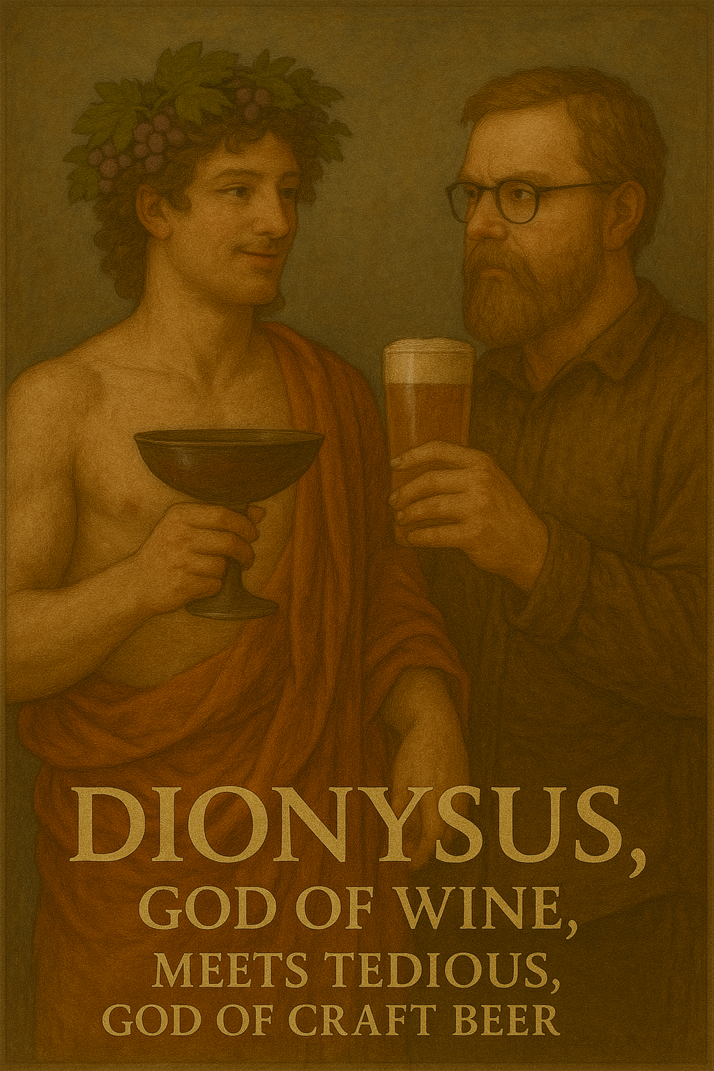
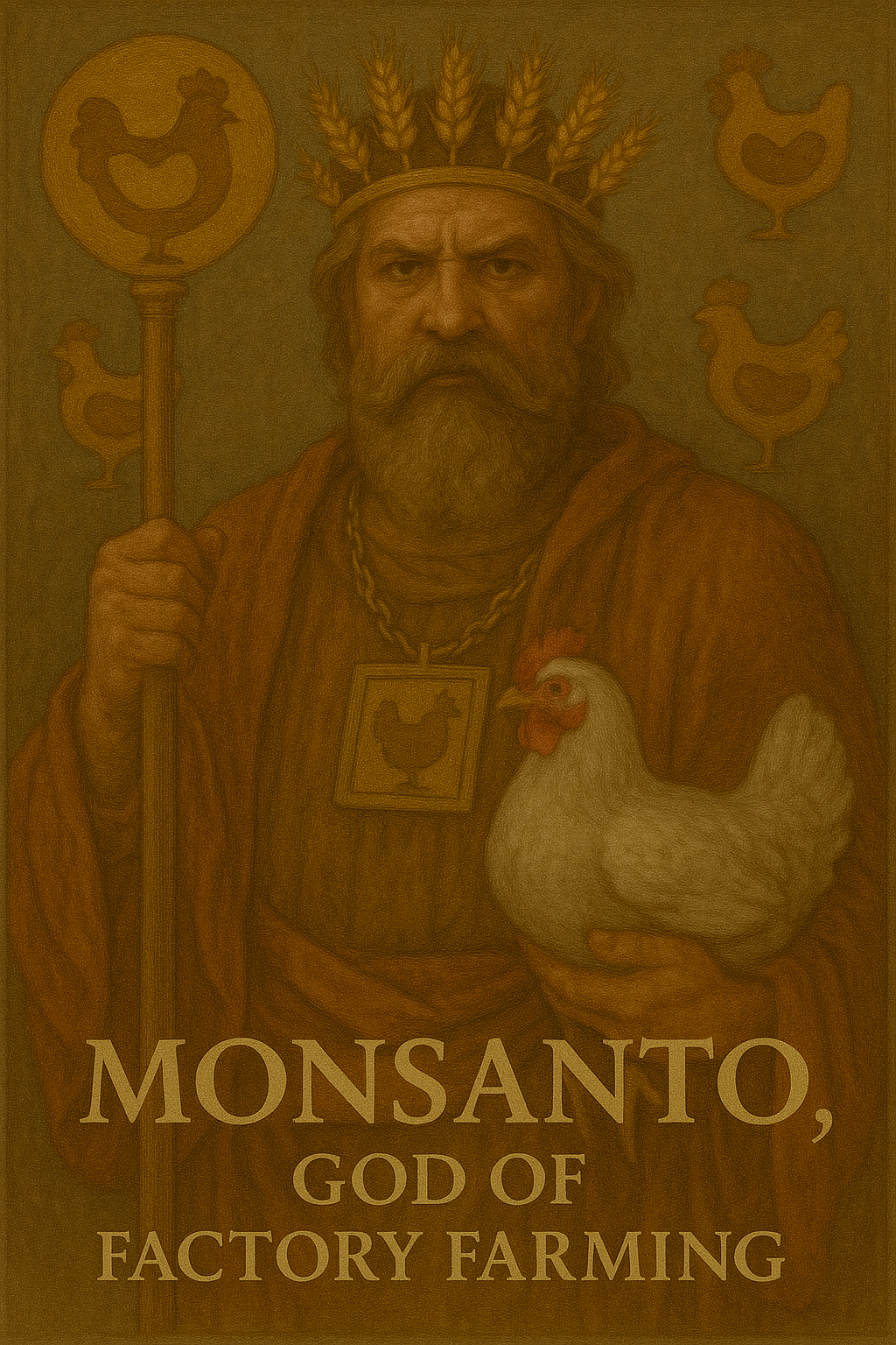
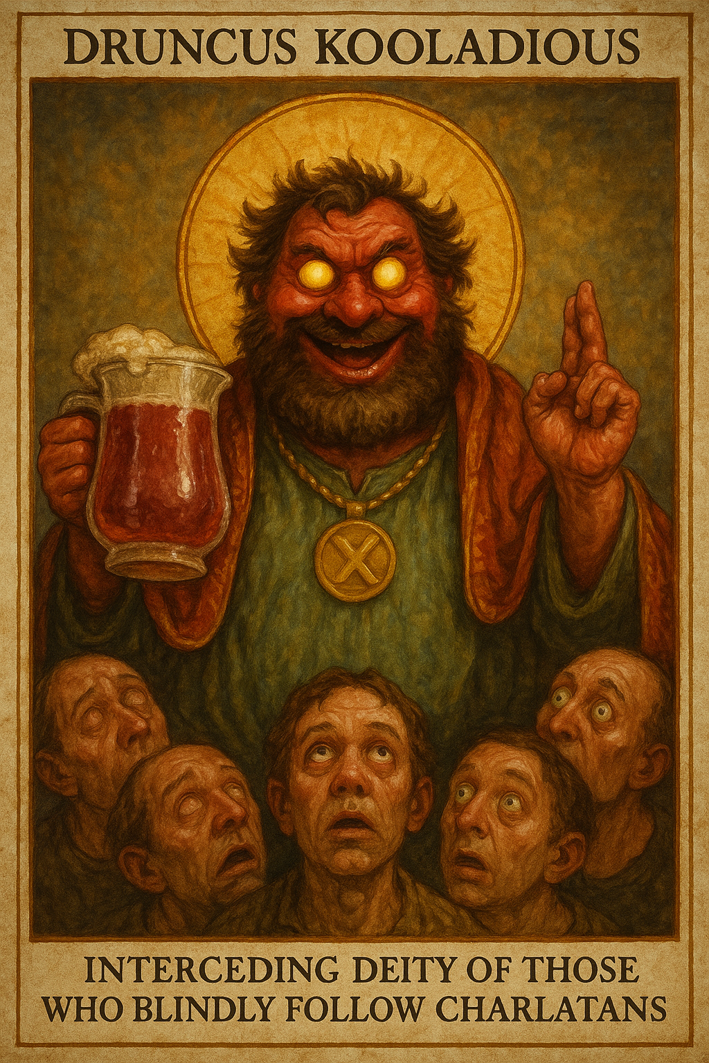
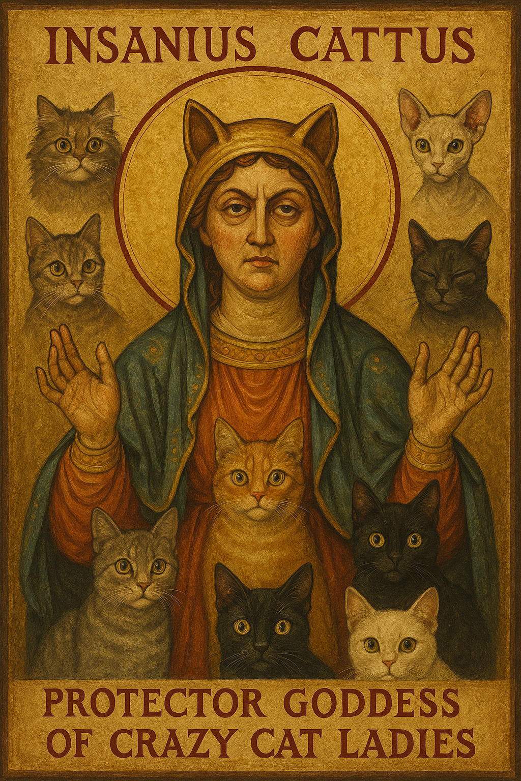
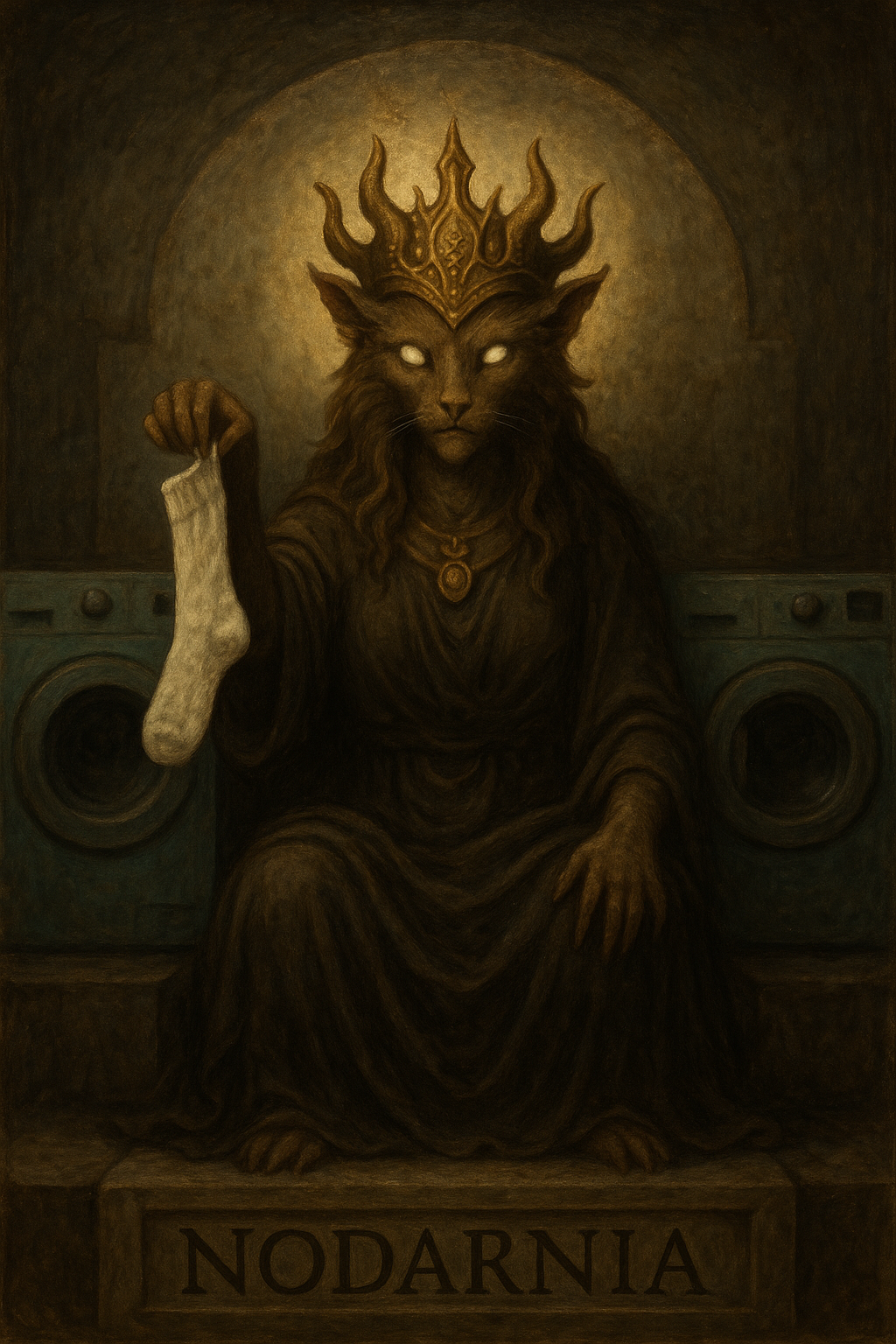
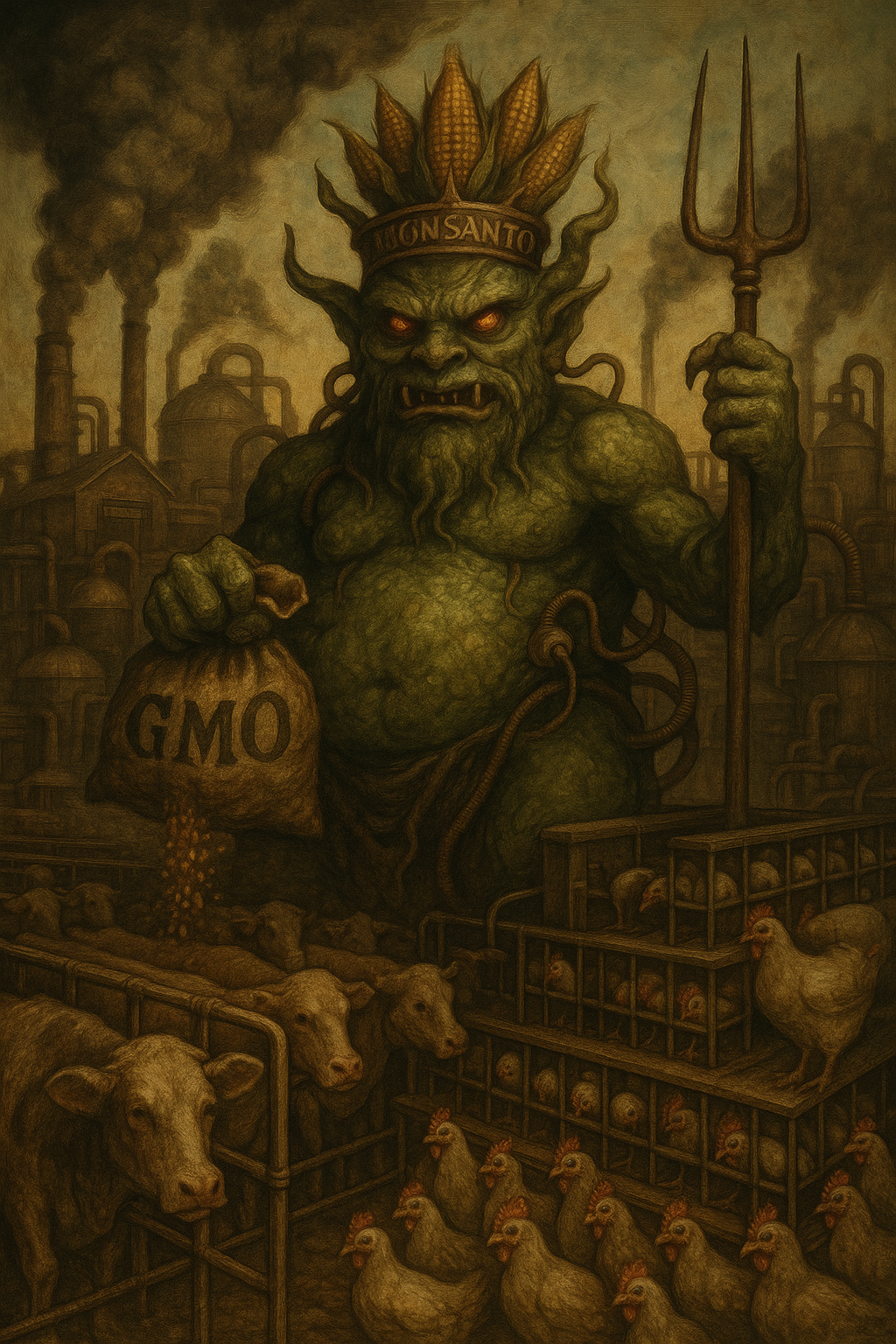
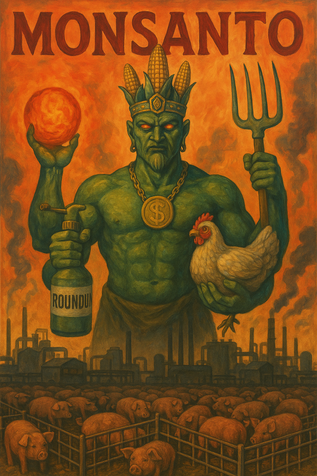
Inspired by recent posts over in thread games, Let’s make a modern pantheon of gods
I did these all in one conversation. It started out well, but as the conversation went on, things started to suffer adaptation decay…
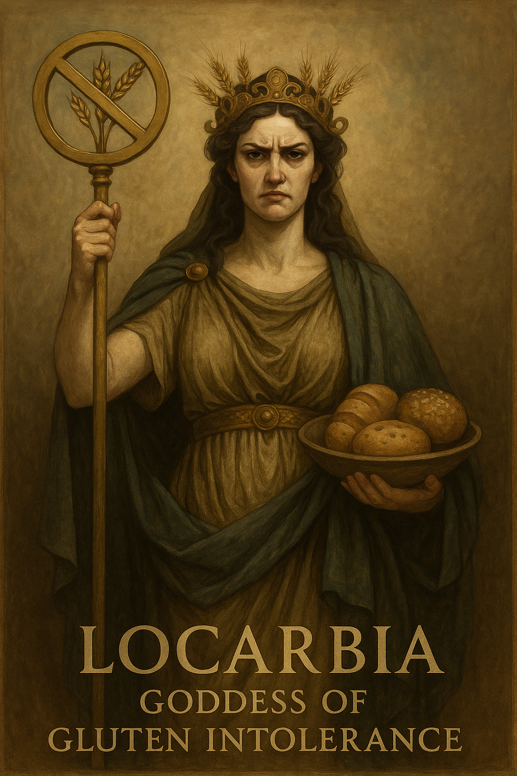
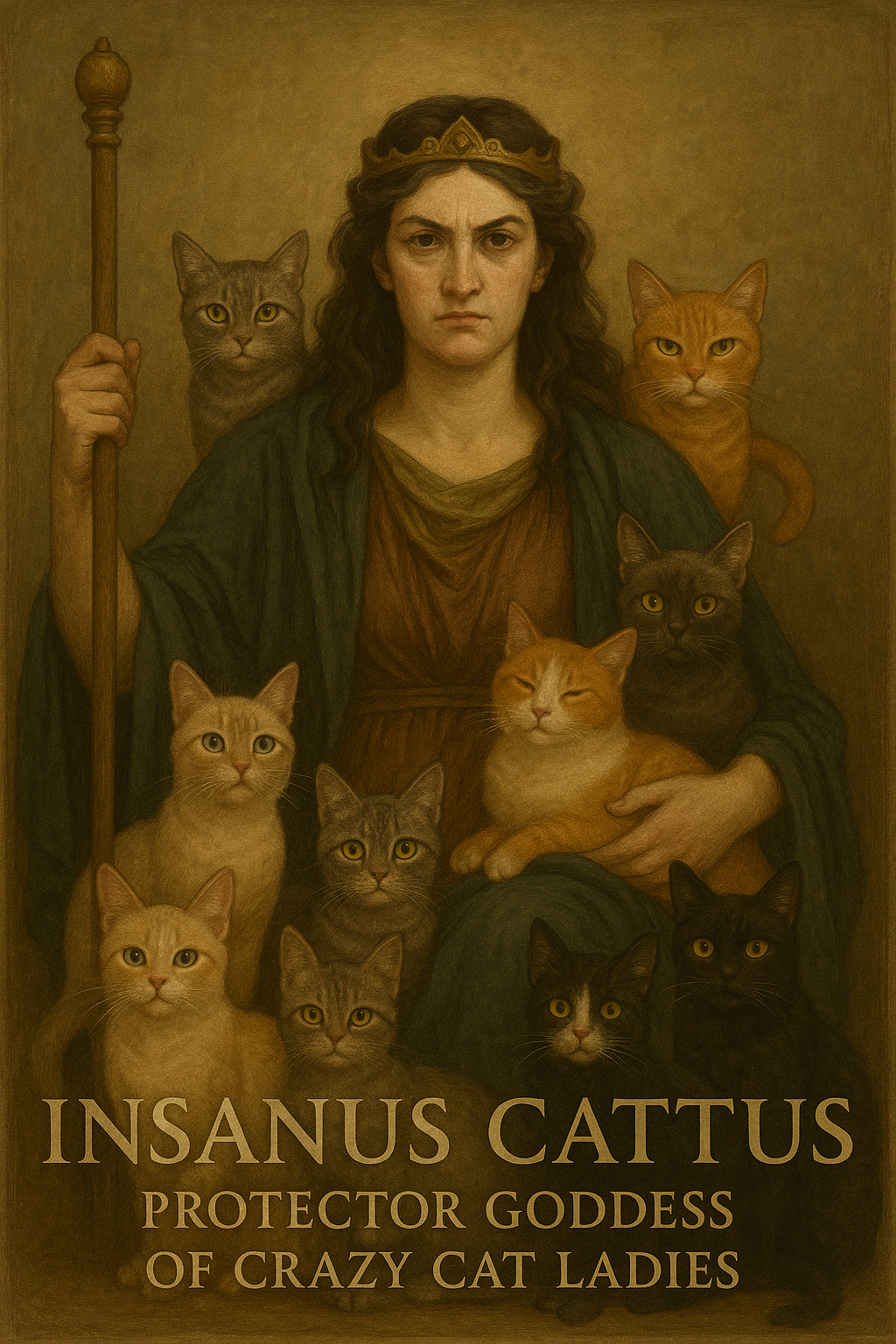
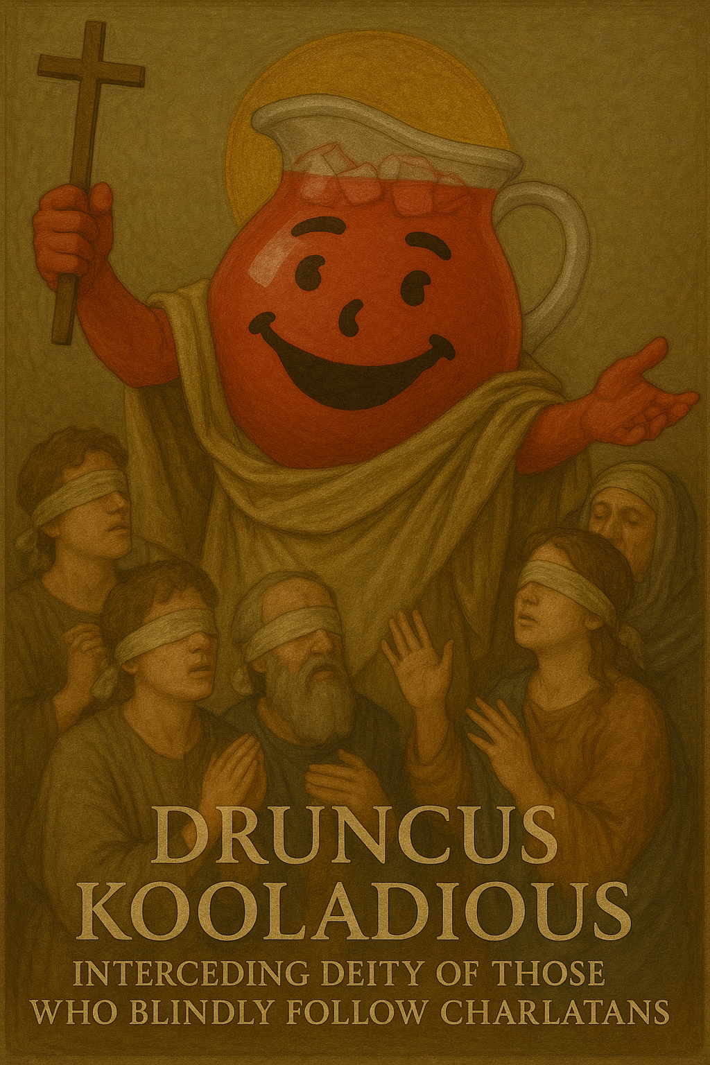
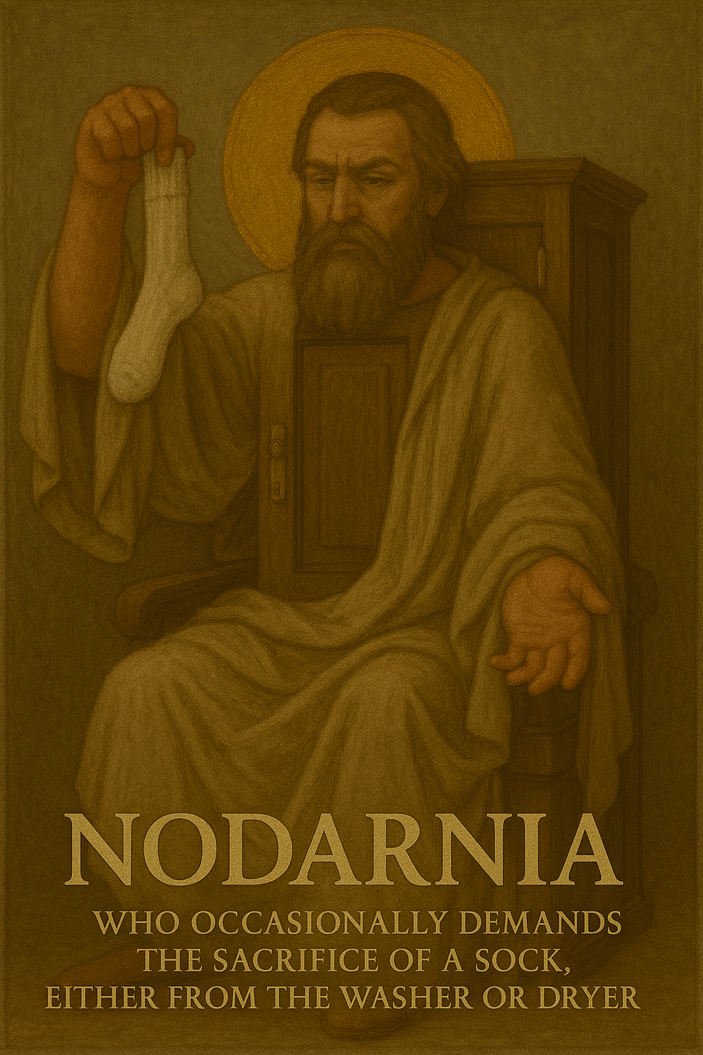
I stopped here before things faded out completely!
I often start fresh chats for new images because otherwise details can leak from one prompt to the next.
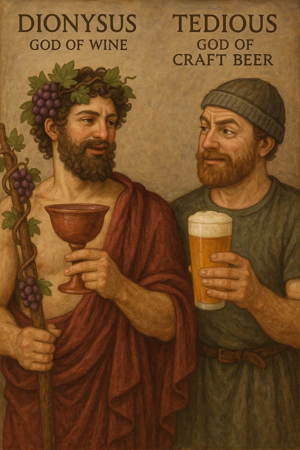
Yeah, I already redid all but the first in separate conversations. Except for Druncus, I think they all came out better. Got a couple 2-fers along the way.
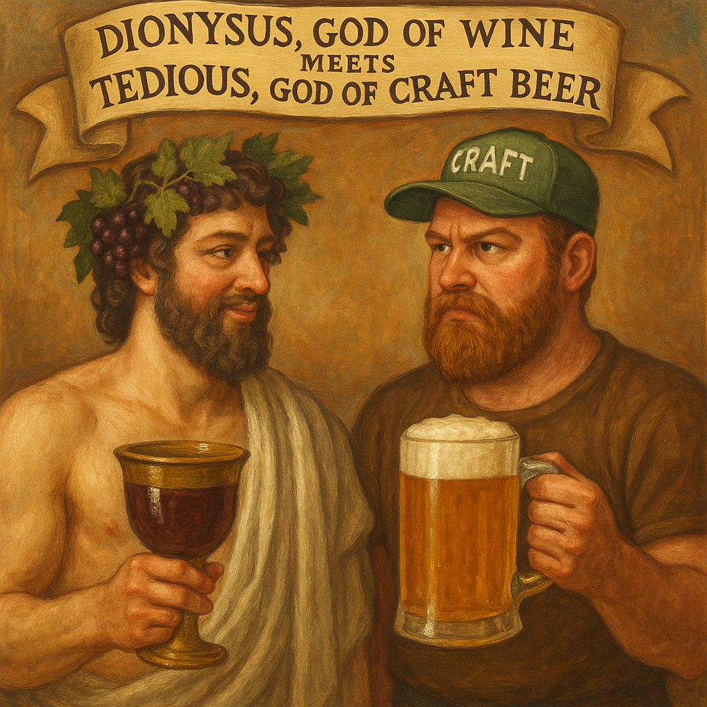
Holy crap, your “Tedious, god of craft beer” is hilarious.
Yeah that was pretty good. Did you like either of the replacements any better than the first?
This one took several retries until it was preserving all the details I liked.
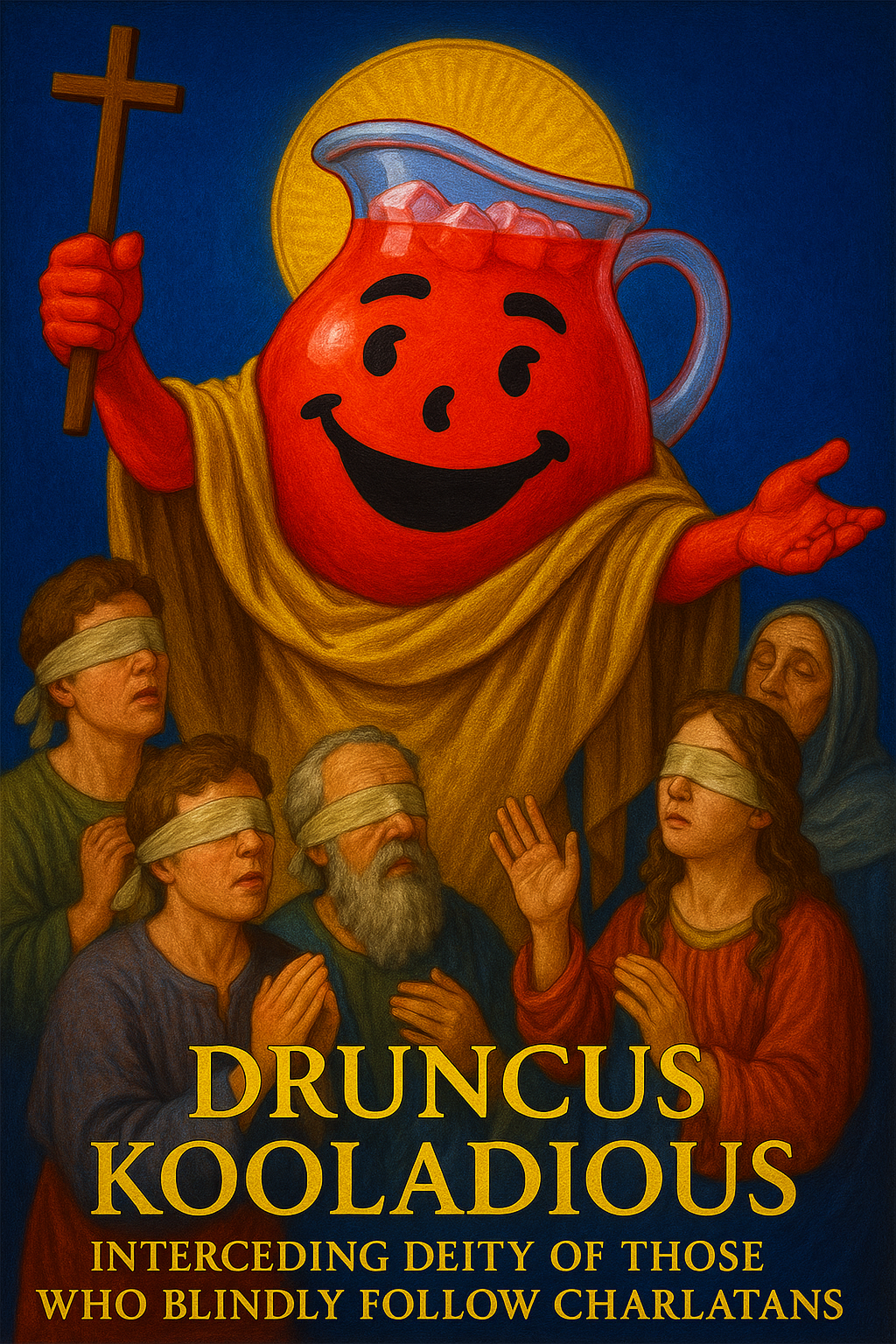
I’d say the third one is best, followed by the first (original) one. The resentful, competitive expression on the beer guy in the second one doesn’t work so well, I think. Surely Dionysus would be happy to party with the dude, pretentious or not.