It looks cluttered and distracting.
It’s as good as any snapshot taken by Aunt Millie at a kids birthday party. Not the caliber I would have expected from Annie Liebowitz. Maybe the “casualness” is normally outside of her comfort zone so she believed it to be “artsy”?
I agree that Sears could have done better.
Apparently not easy enough . . . :dubious:
This was my first impression.
:rolleyes: Reaching a bit, are we.
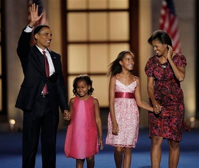
Out of the flaws mentioned in this thread, I’m only really distracted by the frame “halo” behind Sasha, it seems the picture would have benefitted from a negative space in that area.
Judging from the comments in this thread, it seems a lot of people just want to see a formal, mantielpiece photo with no distractions whatsoever. I would agree that I did not feel “wowed” by the photo that I would have expected (as I have been before by Leibowitz), but I appreciate the direction, that the photo actually has depth and a context and doesn’t play conventionally safe.
Not at all.
The background is a disgrace on so many levels. This isn’t a snapshot from a tourist…it’s Annie Freakin’ Liebowitz. She may not be everyone’s cup of tea (she’s not really mine), but she knows better. This pic, while the warmth & love of the family comes through, suffers from unfortunate clothing choices, questionable posing decisions and an terrible placement in the room.
To be fair, I’d guess (no cite) they gave Liebowitz something like 5 minutes to get a shot, and she was unable to consider some of the things that are usually completely within her control.
:smack: Right you are. Sasha’s the younger, with her arm around her dad.
I disagree almost entirely. I think all the elements of the shot were carefully chosen. If not staged, or styled, then very consciously allowed to remain as is. I think it brilliantly gives exactly the effect intended, and to imagine you’re that much smarter than Annie Liebovitz is pretty preposterous.
Almost as preposterous as rationalizing your opinion by imagining the bizarre impossibility that surely Ms. Liebovitz would have done it exactly as you would have if she’d been given more than 5 minutes.
Actually I take it all back. Turns out you guys were right. Apparently there was a mixup and the version that’s been released was the pre-photoshopped version. The “official” official version has been posted, and all the problems pointed out in this thread have been corrected.
I have seen a lot of photography from Annie Liebowitz and am usually impressed but this is not one of her better photos.
Sorry, but I agree it looks like something anyone on this thread could have done with a $50 camera.
I am totally underwhelmed with this photo.
We don’t know situation, but it is entirely possible that a photographer could have under 15 minutes access to the First Family to take a photo.
I’ve done on-site executive portraits and been given under 10 minutes per person. And my guess is the subjects had far fewer obligations than Barack Obama.
Your guess that what look like flaws are actually daring artistic decisions is, well, at odds with my own opinion.
The only person in the photo who really looks good is Michelle… an intentionally daring aesthetic move I’m sure.
But what about the aforementioned, uhm, questionable placement of the daughter on the right in front of the figure of a carved man in the fireplace? I’m not trying to be juvenile – it’s worse than bunny ears, or trees sprouting out of people’s heads.
A quick search turns up several photos demonstrating what a good-looking family they are. Leibovitz’s photo isn’t awful, but it’s sub par, considering what she had to work with.
More like a tourist walking by who accidently squeezed the shutter button.
If you cut the President and the younger daughter out she got a good shot of the other two.
I’m undecided about this. It looks so obviously amateurish. Too obvious. That’s the tug-of-war going on in my head.
Liebowitz has never seemed to take her central task to be an idealization or prettification of her subjects, in fact she’s famous for doing just the opposite. That’s a point in favor of an interpretation like Lissener’s.
There is a stark difference between me claiming I’m smarter than Liebovitz, and my criticizing her work. You are entitled to your opinion (which I won’t presume my superiority by saying is “preposterous”) and I’m entitled to mine. In my somewhat humble opinion, the opinion of a fellow professional portrait photographer, I find the photo lacking.
Have you ever watched a movie by an acclaimed director that you thought was crap? If so, what makes you “much smarter” than that director?
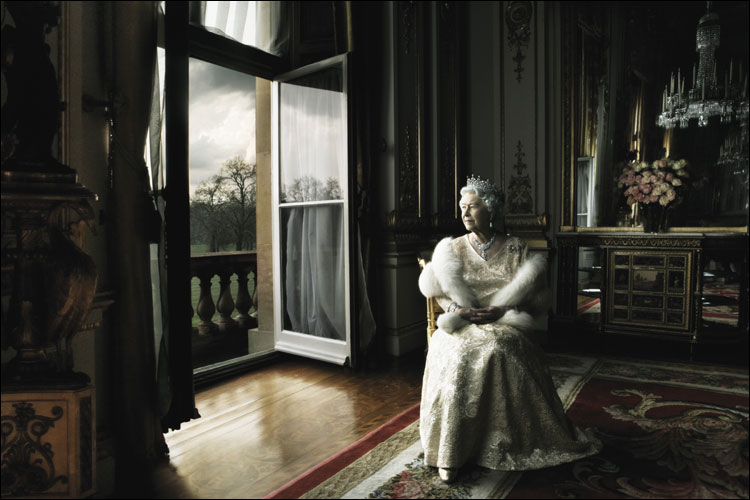
I think it’s perfectly of a series with this portrait of Elizabeth II. Remember the uproar at the time? Along the same lines as this teapot tempest. I think that in both cases she’s showing someone who is ALWAYS shown in ways that emphasize their power, their privilege, or what have you, only she’s taking the unique approach of showing their humanity.
It’s “official.” “Official” is not interchangeable with “formal.” Just because that’s always been the default style doesn’t mean it’s a law. As someone who was in photo school in the 80s, arguably the highpoint of Leibovitz’s career, I’d thought of her as old hat, a shark jumper emeritus. Frankly, this photo–and the one of the queen–smell like fresh air to me.
I love the the photo of Queen Elizabeth. The familiarity, the dramatic lighting, the feeling like you’re looking at an unstructured moment in the Queen’s life.
The Obama shot, not so much. It’s flat, it’s awkward, it’s busy. Of course, it is only my uneducated opinion.
Sigh. It wasn’t simply that you disagree, which is what you imply: *every time I have a negative opinion it must be because I’m smarter than the director. *(Hint: if the inference you’ve drawn is that astonishingly ridiculous, have another go at it: you probably drew the wrong inference.)
*Obviously *I was *specifically *addressing what you were *specifically *criticizing: the details you seem so sure she “missed.” When in fact it’s far more likely that she consciously chose to include them. For you to draw from that specific point the outrageous generalization that I would categorize EVERY disagreement in exactly the same way is supernaturally ludicrous.
That is a truly gorgeous work of art. You’d never know it was the same photographer. Obviously Liebowitz was going for something entirely different this time, considering the subjects. But I’m afraid it falls short.
This does not mean I consider myself “smarter.” That’s just stupid.
Wow, I knew they photographed well, but all three of those pictures are light years better than this rather lame official portrait. I agree with many others in this thread, I could have done a better job.