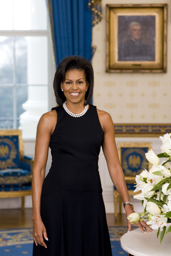
New portrait. It’s a nice picture, but the art in priceless.
What am I missing? I can’t tell who the portrait on the wall is supposed to be.
I don’t get it. Are you referring to the fact that you can see a portrait of the slave-owning, black-woman-loving Jefferson in the background?
Looks like Thomas Jefferson.
And it’s a great portrait. What a beautiful woman she is.
I agree she is a beautiful woman, but the placement in the portrait seems off to me–way too much space above her head, the chair cut off in the background, etc. Seems there could have been better placement for her in the backdrop in my opinion–having blue come out of the top of her head isn’t exactly the right placement!
It looks like a photo my mother would have taken: cut off the legs and make it look like there’s a growth on her head. It should have either been full length or head & shoulders, and with a better backdrop. Also, stop leaning on the table. Was this photographer a professional?
Yes, the blue drapery leaping out from her head does look… odd.
Am I the only one hearing Thomas Jefferson doing Quagmire’s voice while staring at her?
“Ahhhhhhhhhhhhhhh…right!”
It’s like a cliche of a badly composed photograph, with an object in the backdrop looking like it grew out of the person’s head!
She looks good in it, though.
I’d hit that.
uh… ok. I guess I’m missing the “power is an aphrodisiac” gene or something. She’s as attractive as Laura Bush, I guess.
But Jefferson in the background isn’t that big of a deal to me. If it was totally posed and fake they’d probably have Lincoln back there, but she’s living in a city named after a slave owner. Not many of our presidents have been saints.
Well, Clinton had at least one worshiper on her knees.
What the hell is that growing out of her hand?
Do you mean the flower or her wristbone?
I don’t like the pose, and the composition stinks. That window in the left background really looks bad. I’d expect better from the junior high photo club.
Yeah, the composition is…questionable (big drape out of her head, big white space in the top left corner, flower in front of hand,etc.) Pretty poor, if I may be frank. However, the expression looks natural, and the lighting is competent, so that saves the photo, although I wouldn’t call it a great photo by any stretch.
The only good thing about the photo is Michelle. That photographer is worse than half the shutter monkeys on Flickr.
The photo gives her one big eye and one little eye, which seems a little weird.
Thank you–I thought I was going crazy. It’s a badly framed pic and she looks to me like she needs to hold onto the table for support. I’m sure she doesn’t, so wth?
She is one hot FLITF.