A geeky and obscure thread, but one that I feel needs to exist nonetheless. I was just thinking about how video game and PC game box art always seems to be really crappy. It is rarely very artistic, usually relying on cheesy attempts at summing up the game’s atmosphere and gameplay in an illustration. I understand that the game developers and distributors want to catch people’s eye and give them an idea of what the game is like, but why does this preclude having artistic design?
One example stands out: the box art of Forsaken (for Nintendo 64.) This was a rather forgettable Descent-style game whose most notable element was the great electronica soundtrack by The Swarm. But that box cover is great, and very unique. Instead of splashing the game’s name across the front with huge cheesy graphics, it makes the beautiful woman’s face the centerpiece, and the game’s name is contained within the small tattoo on her cheek. Additionally, the contrast between the color face and the ominous black and white background is very striking. This is certainly one of the best game boxes, even if the game was crappy.
But I’m having a hard time thinking of others. I know there are a lot of gamers here, so I’m curious to hear what others think are good examples of box art for PC and video games.
I think that that Forsaken cover is really, really bad.
But there have been some great ones, like Contact for the DS.
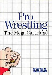
I always thought that the Sega Master System boxes were really elegantly designed, especially for the garish era that they came out of. They all were based on that grid, and some just had a mere icon somewhere on the cover representing the actual game, like Pro Wrestling. Even when they got more fancy, like Phantasy Star, they still had a big sense of panache.
For me, it’s gotta be the oft-ridiculed box-art for Phalanx. Sure, a confused hillbilly staring at a spaceship doesn’t really jibe with a “hyper-speed shootout in space,” but the mental image of the hillbilly looking up confused as a spaceship jets at hyperspeed in the sky has always stuck with me.
Could you explain what you don’t like about the Forsaken cover?
It seems like every time I say I like something on this board, someone comes along and tells me it sucks. But nobody ever explains why. I understand that liking stuff and not liking stuff is all a matter of personal opinion, but since I am someone who is obsessed with design, I always want to know why certain aesthetic things are appealing to some and not appealing to others.
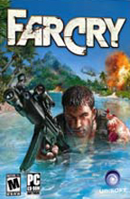
Namely, I’ve listed a bunch of things that stand out about the Forsaken cover and make it really unique, set it apart from all the other games out there that splash the game’s name across the front in huge cheesy letters and have an “action scene” in the background, like the Far Cry box. There is so much mystery in the Forsaken cover:
You can’t tell what the game is about. This draws you in and makes you more curious about it.
Nobody ever has a tattoo on their cheek, so it catches your eye.
Cratered landscape hints at a futuristic setting (rather than shoving it right in your face that it’s a sci-fi theme)
Color and black and white contrast with the background and the foreground.
The game’s name, “Forsaken,” is in tiny letters, and they’re off to the side instead of being centered, which is unique.
See, I think about design in a very focused way. To some, it may seem like I’m wasting my time thinking about all this, but it’s what I live for. I think I’ve provided pretty good evidence for the Forsaken box showing unique and creative elements of design. So what do you not like about it?
I’ve always been a fan of the NES Rescue Rangers box cover—and that, I’m afraid, is the biggest scan of it I could find—it always seemed to draw me in. (Mostly, I’m guessing, because of the small “missing” poster of Gadget on the foreground telephone pole.)