Yep. Just like how my old Marine uniform shrank just hanging in the closet for 20 years.
TV Kirk is a Timelord. His tunic was made out of psychic cloth.
And yet, there are period photos showing gold tunics.
As I said, it’s unlikely that the photographer was using the same film stock that was being used in the motion picture cameras. Thus it is unlikely that two different stocks would show the same aberration. Also, the images in the link: ‘Without flash, the fabric appears lime green in color … With flash, an effect similar to the bright Desilu soundstage lights is achieved, and the tunic appears gold in color …’ In lower-light conditions, colours appear less saturated. So naturally an object photographed with a flash is going to appear to be a different colour than one that is not. And which is it? Does the second photo appear gold because the lighting is similar to the set lighting? Or is it ‘one of those film stock things’?
Certainly one film stock captures images differently from another film stock, and certainly it’s possible what we saw on TV was not how they appeared IRL. But given that period photographs show gold tunics, still photographers use different film stock than cinematographers, no other colours in the show seemed to be affected*, and surviving tunics are gold, I suspect Theiss was misremembering.
*The author makes two claims about changing colours: The exterior shots of the ship change, and the carpet photographed ‘wrong’. He gives no citation for the carpet. The changing ship is certainly due to cost-control measures involving the use of higher-generation footage for the process shots. (They didn’t re-shoot the model for every scene, as they typically do nowadays.)
I’m checking out the original series on Netflix. Kirk’s uniform does look more green than it did when I watched it broadcast TV. I don’t know whether there has been some change in technology or what.
And doing a Google image search of “captain kirk original series,” his tunic does look more green than yellow in a surprising number of the images, especially compared to a search for “captain kirk costume.”
When I was a kid, the hair on Cesar Romero’s Joker looked yellow to me (and I knew from comic books that it was supposed to be green). Now looking at photos, I can see the green, but it’s more of a light green or lime green—maybe the same color Kirk’s shirt is supposed to be??
Funny… when I was a kid Kirk’s tunic was a light grey and the Joker’s hair was a sort of medium gray…
This reminds me—when I was in elementary school, during summer break, the local public library would run a “reading club.” They’d give you a sheet of paper folded over and printed with lines to record the books you read, and every time you took it in to the librarian, they would give you a sticker for each one you completed.
I engaged in this very enthusiastically one summer and I vividly recall that the book club record paper looked yellow to me, but my mother and brother insisted it was green. So there might be something to the issue of some light greens tending to look yellowish.
The stuff on Netflix is the remastered version, and they did color correction there.
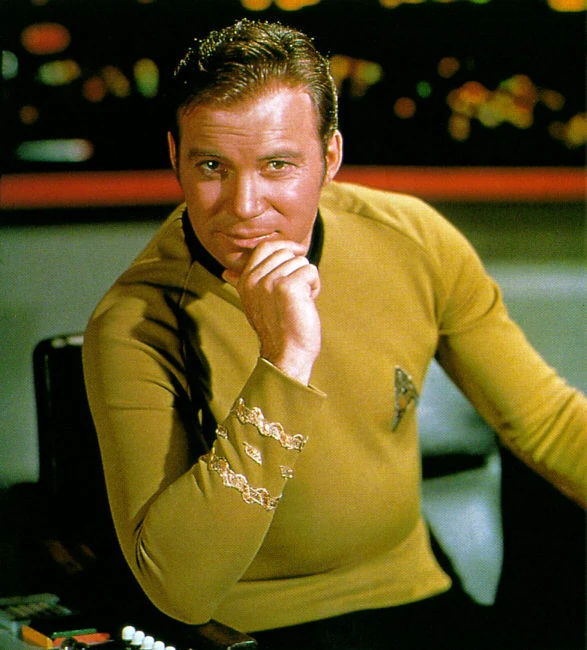
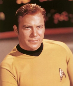
My understanding is that the dress tunic was green. The main shirt was a greener gold than it appeared on screen. They also used green in Spock’s makeup (As Leonard Nimoy mentions in his autobiography), to reflect his green blood, but that never really showed on screen, either. He just seemed a bit pale.
I think people get the green tunic, which looked a bit green even back in the day, mixed up with the slightly green shirt. Or it may indeed be a blue-black/gold-white issue, where people draw the line between yellow and green in different places.
I do note that I personally saw black and blue on my phone, but gold and white on my main screen. But my main screen had color correction. Now that I’ve removed that, it appears black and blue on my monitor. I’ve even switched the color correction off and on to see it change.
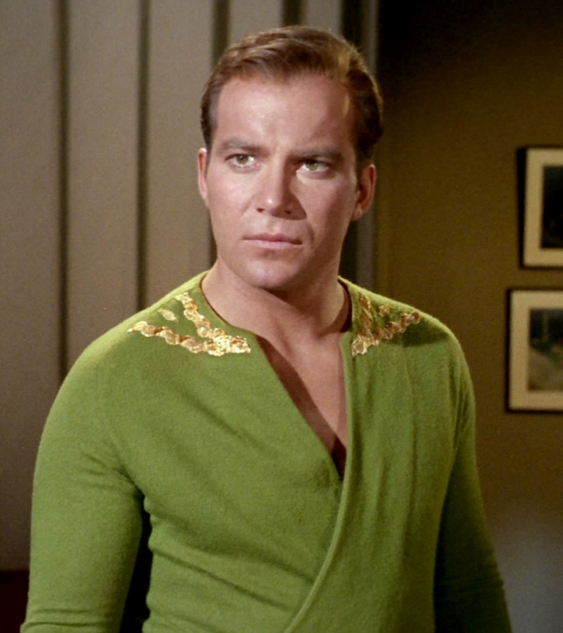
In short, I think this or this is about the actual color of his shirt, as opposed to this as it appeared on screen. This is his dress tunic.
Yeah, I don’t know if I saw any Star Trek colors on a screen before the movie came out. I saw the Batman movie when it came out in the 60s, the colors matched what I thought they were, but even seeing stills of the Star Trek characters I didn’t realize how bright the colors were at the time.
Ah, good to know.
Yes, I think these reflect pretty much what I had in my OP.
Just one nitpick though. That’s his casual tunic (or “dress down” or whatever the proper term is) in your last link. This is his dress tunic.
Another thing that occurred to me, not related to the color—on the standard uniforms, sometimes it looks like they’re wearing a bright-colored collarless tunic over a high-collard dark undershirt. But sometimes it looks like they’re wearing a bright-colored tunic with a dark collar.
For example in this picture, it looks like Kirk is wearing the former and McCoy is wearing the latter.
The short answer is yes. For decades, color correction and matching Hollywood film meant making skin tone look vibrant (and matched from shot to shot).
A good film man could push one color or another, much as any slob with a mouse can do in Photoshop today.
Also, consider: the only thing the film guy would have had for color correction in that test footage would have been her skin tone. If the color of the costume etc. was changed, who the hell would notice?
A relevant repeat because I think this is cool: the film The City of Lost Children has a very weird, off, muddy color scheme. I recently found out they did it by putting the actors in whiteface makeup, and then color-correcting to normal skin tones. That pushed the set colors “off” in a consistent, unusual way.
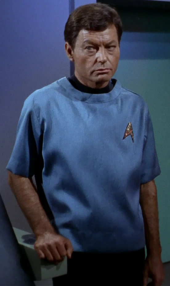
Here’s a black-and-white picture of Spock in which it is clear that his collar is integrated with the tunic.
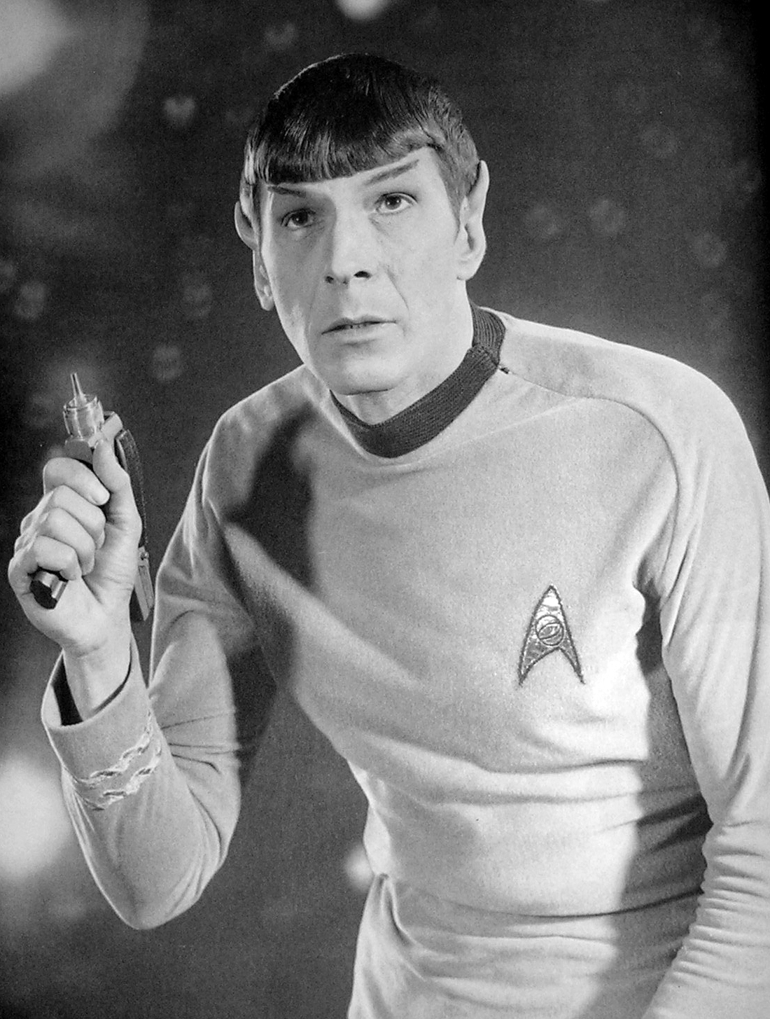
Here’s a picture of McCoy in his surgical scrubs in which it’s clear that he’s wearing a low-collared tunic over a high-collared undershirt.
I’m pretty sure that sometimes the standard uniform also looks like the latter, but I can’t find a good picture right now.
I love the dress tunics. My friend hates them and says they look cheap, run up out of satin and ‘gold’ trim from Joanne Fabrics, why would they do that in the far far future? I say, it’s a nod to tradition, like wigs for barristers in England.
I also first saw both Star Trek and Batman on a black-and-white TV when I was four or five. I wonder if there’s a way I could set my current TV to recreate that experience.
I’m wondering if the story in the OP refers to an original green shirt that appeared yellow on screen, and that in later seasons, they replaced it with an actual yellow shirt, to match what everyone had been seeing on their TV.
I used the images from Memory Alpha to make this rough chart —
I feel like I keep reading stories where things were actually green in ST but looked another color. The original model of the Enterprise is apparently quite green, too (there was a news story about it recently, which I can’t find).
My sense, from having read The Making of Star Trek and The Trouble with Tribbles long ago, is that things like this were often done in a hurry because Roddenberry or the director didn’t like a standard element. Yes, the wrap-around tunic always looked cheap and ridiculous, like Uhura in a red tutu.
The Viewmaster reels (made during The Omega Glory) have the command uniforms looking green rather than gold. It was really weird the first time I looked at them.
The images were also taken with the bridge console lights turned off, which also looks weird.
Not sure, old analog TVs could sometimes by just adjusting the color settings, and without too much work the color signal could be messed with. With digital you wouldn’t get the same effect, and if the video has been remastered it won’t produce the same results unless you creates a de-colorizing process with that intent. You could probably find video tapes to play back on a B&W TV. My buddy has an old B&W TV he keeps in his garage. The sound doesn’t work so he has another old set where the video is no good right next to it.
Slightly interesting sidetrack, I taped the move Trancers when it first came on cable, literally taped on an old early VHS, and somehow it dropped the color for the beginning of the movie in the future LA, and coincidentally the color recovered just as Jack Deth travels to the past. I thought at the time it might have been done intentionally to give the future a weird noir look.