According to the Star Wars wiki, the Imperial uniforms were olive green.
I always perceived them as gray.
World War II-era U.S. Army uniforms had a dark olive drab jacket and light olive drab trousers.
In paintings from the era, the jacket was often depicted as brown, and the trousers as gray.
I would love to chime in on this, but our color TV from that time made Black people look orange, so I’m not claiming anything.
Speaking of skin tones, I’ve heard that Spock’s skin was supposed to be very sallow, almost yellow-tinged (because of the green Vulcan blood) but he always looked pink to me. Anyone else?
I get that effect a lot due to deuteranomalous trichromacy, a form of colorblindness. A lot of borderline yellow greens and lime greens look yellow to me but not to most other people. Because it’s a fairly subtle effect it’s a form of colorblindness that is often not diagnosed until adulthood.
Another similar thing was NASCAR in the analog video days. Day glo (fluorescent) colored cars didn’t come through correctly. Fluorescent yellow (which is a bright green-yellow in person) came through as more of an off yellow on TV. But the weirdest one was the STP Petty car - the fluorescent red would “flash” on the screen sometimes. It actually moved a bit back and forth, like the camera or the electronics didn’t know what to do with it at the transitions. It was the strangest thing.
He always looked yellow (or yellow-ish) to me on our old 1969 color TVs. This was especially apparent in close-ups like the ones in “The Omega Glory,” where you can see how thickly his makeup was applied.
The character originally had reddish skin to make him look more “Martian” (and Satanic), as he was described in the series format. Tests showed the red makeup looked obviously fake on film, so they went with yellow instead. The “green blood” bit (first mentioned in “The Man Trap,” I think) subsequently followed.
Ditto on the Star Wars uniforms. I always thought they were grey to make them look more like SS uniforms.
As for WWII US Army uniforms, depends on which ones you’re talking about. I always thought the M-1941 Parsons jackets that Saunders and crew wore on Combat! were khaki; turns out they were a light shade of olive drab. The M-1943 field jackets that replaced them were a darker shade of OD that was obviously green. The woolen trousers that went with the Parsons jackets always looked dark brown to me; the cotton ones I used to buy at military surplus stores were very green.
The Ike jackets and tunics worn as dress uniforms were dark brown, though lighter khaki versions of the tunic were worn by officers in the summer. (I think US Navy officers still wear khaki today.)
The lighter woolen dress trousers worn by officers started out as khaki but often faded to grey and sometimes even pink because of the dyes that were used.
I’ve read on one site devoted to US Army uniforms that the dark brown Ike jackets were originally intended to be worn under the OD M-1943 field jackets in cold weather, but they looked so sharp on their own that GIs began wearing them as part of their dress uniforms.
If you want to get an idea of the variation in WWII US Army uniforms, watch The Dirty Dozen. I drool every time I see the wardrobe in that movie! :o
As far as I’m concerned, the new Civil War–chic Army uniforms with the berets are hideous. US Army uniforms started going downhill in the '80s, when khaki cotton shirts were replaced by lime-green polyester monstrosities. Yeccch! :mad:
In some episodes, like “By Any Other Name,” Kirk was obviously wearing a black T-shirt under his tunic. In episodes where his tunic needed to be torn off, like “Shore Leave,” he oddly wasn’t.
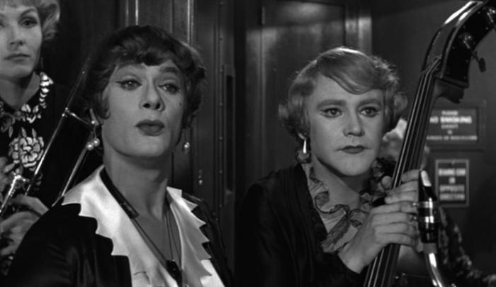
On a related note, Some Like It Hot was filmed in black-and-white partly because the makeup on Daphne and Josephine looked fake when it was photographed in color. (There are color stills from the movie where this is really, really obvious.)
The director, Billy Wilder, also hated color in principle. He was a “silver screen” artist who made B&W look gorgeous!
“Jim, as your doctor, I keep telling you to eat more salad and lay off the fancy desserts. As much as I hate to give Mr. Spock credit, you should eat more like him.”
I believe that it depended on how many lights were on it. If they’d just had five lights, it would have been green. But noooo, they kept insisting that there are only FOUR lights!
It should probably be kept in mind that TOS made heavy use of filters and colored gels to achieve its lighting effects. This would definitely have affected the way colors were photographed.
The films were also subjected to treatment in post-production to adjust saturation, tint, and so on. At one point, corrections were introduced to make Spock look more “yellow.”
“Hey, this makeup looks fake.”
“Yeah, you’re right. Let’s apply new makeup.”
“That’s too much work. How about we just do the whole movie in B&W? That way, no one will notice.”
“Good idea!”