I don’t know if I believe that, or if that’s the whole story. This may have been true when using old-style cloth ribbons, but most IBM Selectrics – and almost all of the later models – used carbon film ribbons.
Carbon film ribbons were single-use (single-pass) and made a very sharp and faithful impression of the typeface through the very thin film with no “ink spread” at all. If the typeface had thin lines, then so would the impression on the paper.
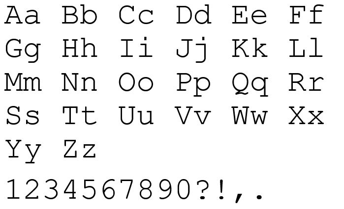
See the lower case ell in this image, hosted on the Microsoft Courier New page.
My minimum criterion is very explicit, and Courier family fonts fail it. Because, as you note, three-serif ells are standard.
The standard Courier form does not meet my use-case. The two-serif l lets me read code quicker and more accurately than the three-serif version. I review a lot of code as part of my job and mistaking characters is a hazard that I avoid by carefully choosing the font I use.
I also look at O0o, S5s, and Z2z. Some fonts lower some numerals, which sometimes helps and sometimes hinders.
Yes, it does, on a Windows machine. But I don’t trust fonts as displayed on websites, because of weird interactions between servers, style sheets, and browsers. Now that I figured out how to extract an image of the font, instead of a text render, I hope we’re all seeing the same thing.
I agree that glyph distinguishability is one of the top priorities for a monospace font, just slightly behind overall readability. 2-serifs-on-the-l doesn’t quite make my personal priority list, but definitely the zero must have a slash or dot, and any other pairing should be visually distinct.
OK, fair enough. When you spoke of your “minimum criteria” I took that to mean the minimum number of serifs you mentioned. In any case, “I” and “1” meet your requirements.
If certain fonts like Courier make your job of reading code harder, I can’t argue with that, though I wouldn’t have expected it. It’s not a problem I ever had, though it’s been a very long time since I’ve had to look at any code. The last time in the “modern” era was on Windows NT and I don’t even remember what the typical font was. Before that, in Ye Olde Dayes, it was all-caps output on IBM or DEC line printers, teletype output, dot-matrix printers, or whatever the built-in font was on dumb character-mode terminals. Speaking of which, you kids these days complaining about the readability of fonts are spoiled! Imagine going through hundreds of pages of dot-matrix printed code – those printers didn’t even have a font, just literally coarse clusters of dots that vaguely resembled letters and numbers!
I had a 9-pin dot matrix printer too, man. I’d almost say that my teachers suffered more from that than I did, though it’s not really true, since the alternative was my awful handwriting.
Set the slide switch at upper left to the M setting. That always has preview available.
Whether you see that available preview or not depends on phone vs computer & whether you have preview switched on. What device are you using? But in general the preview on/off switch is at lower right.
All these settings are remembered from one page to the next until you subsequently change them.
The Straight Dope Light theme on Safari (iPhone) is crippled the last few days. Most of the features are just gone. There are literally only 7 buttons now… The markup/WSYIWYG toggle, bold, italic, text size, link, quote, and emoji. The “quote entire post” button is gone, the extra menu with things like “blur spoiler” is gone, etc. Not a good change. It’s extremely limiting.
You sure it’s not just hidden off screen? If you drag the tool bar left, does the + icon appear?
SD Light is working fine for me on chrome and Edge. I could understand buttons not working right on Safari, but I’d be surprised if they didn’t appear.
No, it isn’t. At least, not in the SDMB Light theme on a desktop browser. You have to switch to the standard markdown editor to get the preview screen, just like before the WYSIWYG change was made.
What they did change, though, and for the better, was abandoning the idea of using a silly monospace font when using the basic markdown editor. There was no real reason for it. Now, selecting the basic markdown editor, the system works just as it did before the big change to WYSIWYG in the composition screen. I’m happy with that.
I still dread the fact that legacy browsers will soon no longer work with Discourse in order to support some stupid features that no one wants and few even understand. Although that change seems to be getting pushed back further and further, and I sincerely hope that it gets pushed so far that it falls off a cliff and drowns.
As a side note, I was checking through Preferences (in your profile) and under Interface this is now a clickable option to set:
Use monospace font in composer’s Markdown mode
I use the Dark Theme (note, NOT StraightDope Dark) and can’t say if it is or isn’t available on any of the legacy themes. But anyone who still has the issue can check to see if it’s click. I vastly prefer new display options be given an opt-in/out rather than changed directly, but do understand it can be more work for the Discourse team.
So positive reinforcement when such things are given an option!
(and yes I know, I really should read the main Discourse forums so I’m more ahead of the game)