I have to admit, I rather like North Korea’s flag. Blue and red contrast well.
And I can’t believe nobody has mentioned the flag of The Republic of Texas! (Random trivia, when I used to do Flag Detail duty when I was in JROTC in high school, we were always reminded to put the bandage on the blood when hanging the flag, so as not to look totally retarded when we were done.)
The USSR’s, China’s and Vietnam’s are/were cool (despite what they stand for). When I went to Vietnam, I had to get a visa at the consulate in Sydney. It was a big old mansion on top of a hill right at the end of the main street of our most exclusive suburb. They had an enormous communist flag flying there, right over Sydney’s version of Rodeo Drive. Very cool.
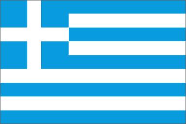
UK and USA for design reasons, as already mentioned.
Scotland’s is pretty cool.
Australia’s and New Zealand’s are flags I’m fond of, but they look too much like British Airways tail fins.
I believe he means that when hanging the flag, put the white bar (the bandage) over the red bar (the blood). So you won’t live through the embarrassment of having hung the flag upside down. :o
Actually, I just watched today’s episode of King of the Hill, and it ended with a nice Arlen scenery, complete with a flagpole with the American and Texas flags, with the latter flying blood over bandage! I noticed it because of this thread. I wonder what Mike Judge wants to tell us…
Haven’t found my favorite yet, but it has to be something grade-school kids can recreate with construction paper or crayons. That rules out dragons and crescents, IMHO.
Yesterday I saw a Corvette painted with the American flag over the entire car. I appreciated the sentiment, but it can’t compete with the Union Jack. Go Shaguar!
As I said before, tyrants have cool flags, despite what they stand for. TheLoadedDog appears to agree. Both the Nazis and most communist nations have red, which is a very strong color and looks nice on a flag. Plus you got your stars, hammer-sickle dealies, swastikas, machetes, what have you. I think that totalitarian nations had better flag designers than governments.
I have always liked the shapes and colors in Brazil’s flag, though one might say that I am biased.
I like the fact that even if it is reduced to a black-and-white “wingding” style character on a page, it is still immediately recognizable for its diamond and circle.
Can’t do that with a tricolor or even a flag with a dragon on it.
Sadly, mobo85’s site doesn’t agree:
“Starmap original but atrocious. Worst flag of any independent nation state.”
Raguleader, why would anyone need to know the “bandage-over-blood” thing to remember the correct way to fly the Texas state flag? Wouldn’t you just hoist it with the star appearing right-side up, that is, resting on two points with one pointing straight up?
I liked the flag-critique website that Mobo85 gave us, too - it was pretty funny - but I disagreed with that guy on most of his choices. Some of the flags he loved were boring, I thought, and some that I love he deemed too busy or cliched or whatever.
No accounting for taste… that’s why we have the SDMB IMHO threads!
OK, you give more credit to the average high school student than I’m generally willing to… Anyhow, when you’re holding the flag when you’re about to put it up, it can be hard to figure out which way the star is pointing until you’ve hooked it up and are hoisting it into the air. Knowing that the white part is on the top is easier.

 Anyhow, when you’re holding the flag when you’re about to put it up, it can be hard to figure out which way the star is pointing until you’ve hooked it up and are hoisting it into the air. Knowing that the white part is on the top is easier.