Confederate States of America - the stars and cross battle flag
Apartheid South Africa - the Oranje, Blanje, Blou
The North Korean flag
The flag of the Soviet Union
And, although I won’t go so far as to say the Nazi flag was “beautiful,” some do think the Swastika is a “cool looking” symbol.
Confirmation Bias.
According to Freedomhouse.org, the top abusers of human rights in 2011 were:
Equatorial Guinea
Eritrea, North Korea
Saudi Arabia
Somalia
Sudan
Syria
Turkmenistan
Uzbekistan
Tibet
Western Sahara
Do they all have the most beautiful flags?
My regional flag is red, with the coat of arms (complete, regular or simplified) in the middle. Since that’s similar to the USSR’s, does it mean I live under a Communist regime and hadn’t noticed?
I’d say that there is a large difference between “gosh, these oppressive regimes have some pretty flags” and “the prettiest flags belong to oppressive regimes”, even without entering into matters of personal taste.
The science of flags is vexillology and oppressive regimes are very vexatious.
The OP starts with a subjective assumption: that the flags listed are beautiful. If you don’t accept that assumption (as I don’t - I don’t think the flags listed are so beautiful), then the supposed linkage to oppressive regimes goes away.
marketing.
They’re not beautiful. It’s just that no one wants to admit they’re ugly.
Among the most beautiful flags I would list:
United States 
Sri Lanka
Brazil
Spain
Greece
Israel
Kazakhstan
Turkmenistan
Philippines
Brunei
Montenegro
I’m an art director designer (and complete non-Nazi), and I would say that there’s little doubt that Nazi Germany’s graphic design, uniform design, etc. was really, seriously visually impressive.
This is a Nazi “graphic standards” manual that was recently re-discovered. They put a lot of effort into this stuff, for sure.
I also think it’s pretty possible that this stuff, in hindsight, has a sort of “taboo” appeal that makes it stand out even more. That’s why biker gangs co-opted a lot of the imagery…it sends a message of being badass and anti-establishment in a very strong way.
From this story on the same manual discussed above:
I think Iceland has the nicest flag. Nothing fancy or obscure. Well-proportioned, good color choices. They don’t torture journalists or invade neighbors, and they eat a lot of fish and dairy instead of red meat.
IMHO the Jamaican flag is quite pretty, and, unless you’re gay, the Jamaican regime isn’t that oppressive.
I’m a big fan of the flags of Japan and Nepal.
I decided to learn every country’s flag, so I’ve spent a lot of time looking at them. Here are some of my favourites:
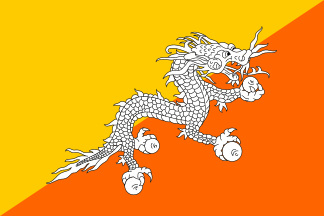
Bhutan
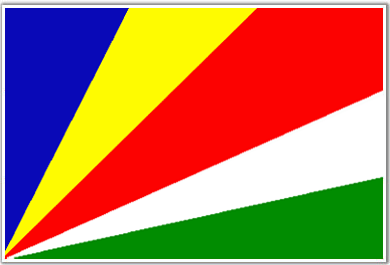
Seychelles
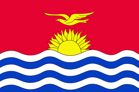
Kiribati
Macedonia
I like to think even if I weren’t British I’d think our flag is pretty cool, but who knows?
Well… from the OP:
Confederate battle standard - well designed, serves its purpose as distinctive battlefield colors better than their real national flags.
South Africa 1928-94: Good application of the underused color orange, *but *otherwise a run-of-the-mill horizontal tricolor on which they slapped a gallery-of-earlier-flags device in the center, which is vexillologically less than creative.
North Korea: Mediocre generic commie armband logo from the mid-century. Maybe good for painting as a racing stripe on the side of the "New! For the 73-78 5-Year Plan! The People’s Revolutionary Portable Radio!! Now with TWO stations!!" But then again…
…USSR already had the pick of the flag that said “Yep, we’re the communists, and what are ya gonna do about it?” in a more straightforward and elegant classic style.
All in all not a huge endorsement for “oppressors have the best flags”. 50/50 at best. Nazi paraphernalia, of course, is a special case, those cats were scarily ahead of their time at the whole branding thing.
Meanwhile, from Bear_Nenno’s list, you have two countries that are actually under occupation so the regime’s flag is not their own (Tibet and Western Sahara), Eritrea’s which is distinctive and not too busy but potentially eye straining; Somalia’s plain lone star, modestly elegant but kind of dull; Saudi Arabia has the very recognizable* shahada *banner. Then you have Uzbekistan’s which is just awful; Turkmenistan that’s in the “we don’t care if no one else can reproduce this” group; while Equatorial Guinea, Sudan and Syria are uncreative, and the latter two remind you that the Arab states seem locked into one particular palette to the point of near indistinctiveness.
Although I agree with the posters who point out that it’s mostly confirmation bias, I’ve always liked the rising sun flag and the flag of Iran (for one of the best implementations of text I’ve seen).
I thought at first you were referring to the flag of Malawi.
Confirmation bias or no, the flag of the most oppressive regime in history is indeed quite beautiful.
Though even that was to cluttered with frou-frou for the Hungarian Socialist Republic
Everyone in this thread is wrong because obviously the the Inca Empire has the most swagged out flag of all time. Such majesty.
Well when I think of beautiful flags, I think the Union Jack or Canada’s flag. Distinct but certainly not plain. (Alaska’s even better.) Certainly not opressive at all.