I have recently gotten into photography and have taken some photos I feel are actually pretty good. However, I believe to improve my skills, I need feedback.
So…with that in mind, may I humbly submit the following pictures for your critical assessment:
Foggy Morning is nice. Philster is probably right about the top being cut off but I like the contrast of the dark branches against the sky. Good detail. Did you notice the two birds in the branches? I wonder what kind they are.
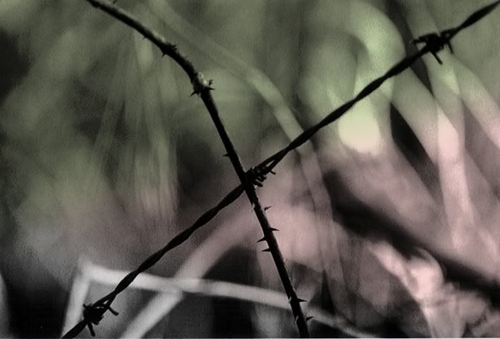
I like the moody play of light and dark in Untitled. Good composition!
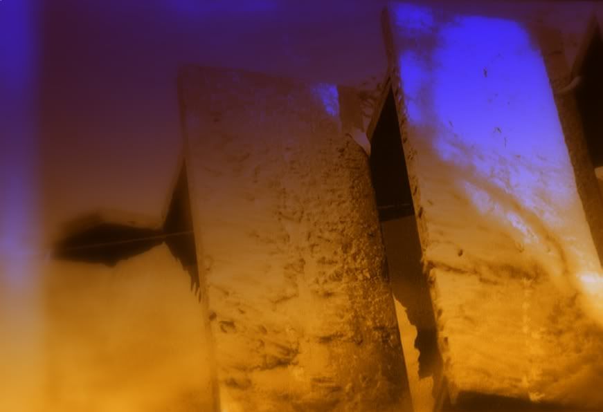
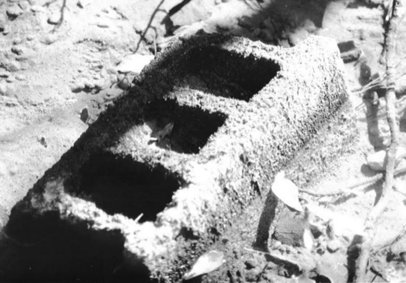
I think you should have taken Doorway when the sun was able to cast more shadow on the walls. You can’t make out much detail of the bricks around the second doorway because of the low contrast. It doesn’t draw the eye through the opening as much as it could. This looks like a stunning site to take pictures though and I hope you get to go there to take more and that you post the results.
I would re-crop Foggy Morning by slicing off the top portion at a level in between the the two birds (if that’s what they are); like this* it makes a wide landcape-format picture that, IMO, works better because a)the frame is better filled and b)it leaves no doubt as to whether the top of the tree was intended to be in the frame.
*NB: EvilAsh, I will delete my cropped copy of your image in a week or so, or earlier at your request.
The tree: It’s unfortunate that the top was clipped. Otherwise, a good, moody photo. I would have placed the tree to left or right of center, which you can experiment with by cropping.
Untitled: A very nice abstract, with a slight focus problem (but macros are tough). My favorite, composition-wise.
Doors: Great concept, and done often. I would have backed up a step or two to include the threshold of the foreground door. You can always crop, but you can’t add to the photo easily. Good contrast here.
I would continue to work in B&W, concentrating on composition and contrast. You seem to have a good eye for what works; just make sure that you are framing everything you want in the photo before snapping the shutter. Also, some cameras will show one thing in the viewfinder, but don’t always capture all of the subject (perhaps that’s where the top of the tree went).
Thank you all for the feedback. For comparison’s sake, I thought I would go ahead and upload the original, untouched photos. For the record, I like Foggy Morning III in color, almost as much as in black and white.
Also, If other Dopers want to submit their photos for feed back, I wouldn’t mind turning this into a general critique thread. It might be kind of fun, as well as interesting.
You’re right–the color version of Foggy Morning is very pleasing! I think they’re all lovely and would enjoy any of them hanging in my home!
That said, I think I find the shadow in Doorway Through Time a little distracting. But I do like the texture of the brick.
I also enjoy black and white very much. My first photographic training was exclusively in black and white, for the newspaper, and it was wonderful experience in that I could take a great lot of photos because the film was so cheap. Stopping up and down merrily until I learned what worked best. I guess now with digital you have the same experience.
I love photographing buildings the best. There is an abandoned large building here that is slated to be torn down that I’m dying to get out with a camera and shoot. It’s very depressing and industrial, made of metal and has HEAVY RACE HORSE OATS written in it in large, amateur block letters. I’ve got to get out there and shoot!
I finally got a scanner and have started going through some of my pictures and learning how to get them online. I was just thinking of starting a thread like this, then I saw this one and decided to wait, and now you’ve opened it to other submissions. Thanks.
Take a look here for my latest results. (I wasn’t really trying for artistry or composition or anything with the shots of the crested saguaro, they’re just really rare.)
So, let me have it; am I a photographer or just a shutterbug with delusions of grandeur?
There’s not enough contrast in any of the b&w’s, IMHO. But the compositions are kind of nice. The doorway, in particular, looks like the scale goes through about a quarter of the range.
The one with the fishing nets looks much nicer in color.
I don’t think anyone takes B&W photo’s for art’s sake that doesn’t do their own processing. Did you just use your camera’s “B&W” or do you do it in Photoshop? I’m guessing the former.
I’m by no means an expert, but my very first response was “too bad the top of the tree got cut off”. Otherwise I liked them alot. The one with the bouys was my least favorite largely because that genre of photos bugs me. Not sure what you call it, but many artists seem to do that snapshot of something mundane but made to look interesting style. Doesn’t work for me.
Quick question, what are you using for equipment? Digital or film? Developing yourself?
No one’s said a word yet. I can only assume you’ve all been stunned into a state of blissful silence (and possibly weeping softly) by the sheer beauty and artistry I capture in a simple image.
I like how the tree top is cropped. There’s a difference between a real-estate photograph designed to show such things as how tall the trees are and photographs that are lines and shadow for the sake of abstract form — i.e., art. I like that the branches finger their way out of view, leaving the vague question of what might be there.
I also like the centering, and part of the reason is that rule number one for the past forever has been don’t center objects. It is a rule that has become a parody of itself, along the lines of the split infinitive rule in English grammar. If it is something that you should never do, then doing it is rebellious and fresh. The tree is not a perfectly symmetrical shape anyway, and so the left side is more bushy than the right.
In my opinion, you have a great natural talent. Forget about my criticisms and that of everyone else as well. You are in a position to trust your own judgment.

