BTW, things like that are effected by whether you use “artistic” or “concise”. I rarely use “artistic” except recently when I have tried videos, because it seems like a much cruder, more limited tool. For instance, with “concise”, if I plug in “junji ito”, it tries to make the image in the style of master horror manga artist Junji Ito. With “artistic”, if I plug in “junji ito”, it appears that it attempts to blend the image with a photograph of master horror manga artist Junji Ito.
Conversely, I don’t think I’ve ever had a result I liked using Coherent and stay almost exclusively with Artistic. Once in a while I go back to Coherent for something and come away disappointed in the result. But a lot of my attempts are merging weird terms and I think Artistic handles that a lot better.
Here is the same prompt under Coherent:
https://images.nightcafe.studio/jobs/Kls4g6qAsFKDwEb9BF9C/Kls4g6qAsFKDwEb9BF9C.jpg
Though I did try “Spaceship Interior | Style of Wallace Wood | Black and White | Ink” and got this (Artistic):
https://images.nightcafe.studio/jobs/qCzMEHInqTpwDI88avyk/qCzMEHInqTpwDI88avyk.jpg
That one collected a decent number of Likes when I made it public. It doesn’t look anything much like Wood’s line work but a cool picture is worth more to me than counterfeiting Wood prints.
Of course I meant “coherent”, not “concise”.
I tend to start out in Coherent then switch to Artistic for one last evolution to get the better textures. If I don’t like the result, I go back to Coherent for another evolution.
Mardi Gras was the result of two Coherents followed by one Artistic and Dystopian Statue of Liberty two Coherents followed by two Artistics.
I didn’t try very hard but I didn’t get the Incognito thing to work so I have somewhat limited token to run images with. Either it gives me a good result or it doesn’t ![]()
I ran a couple images under both Artistic and Coherent. One gave an unexpected nice Coherent result (though I liked Artistic as well) while the other… eh.
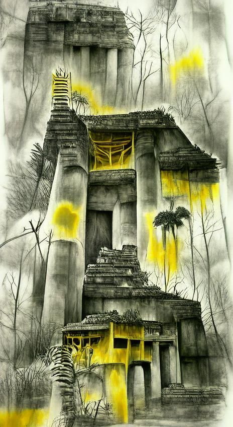
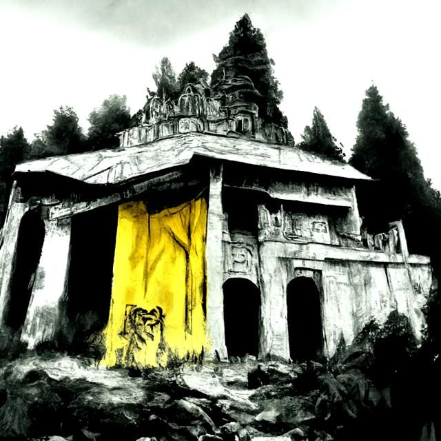
Temple of Gold | Yellow | Grayscale | Exterior Shot | Jungle | Abandoned Temple | God Rays | Ink Washes
(Artistic)
(Coherent)
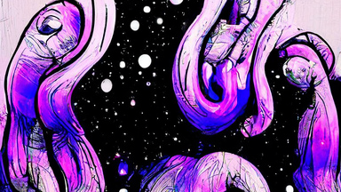
Cosmic Kraken | squid | galaxies | purple | grayscale | ink washes | beautifully lit | 8k
(Artistic)
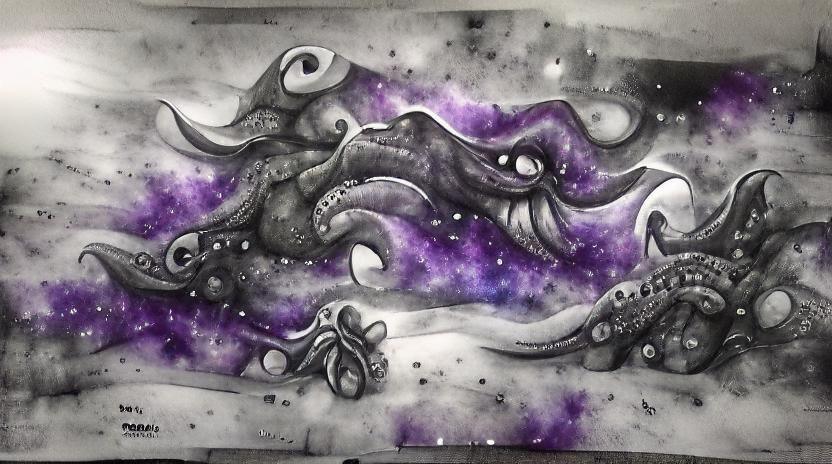
(Coherent)
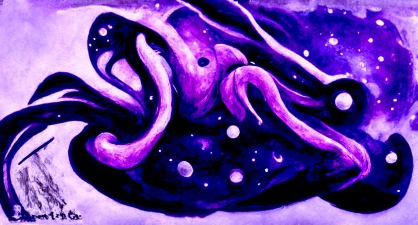
The success of the Coherent temple made me plunge right into spending the extra credit on a medium sized space squid but that was a waste. That artistic result is pretty kick-ass though.
I like the coherent squud better.
That’s the beauty of art and the beholder, I guess ![]()
I also noticed that Coherent didn’t follow the assignment very well which seems a bit ironic. But no attempt at grayscale, 8k or beautifully lit. I suppose I could charitably say it attempted ink washes. Which feels a bit odd since it handled most of the same prompts so well in the temple image.
I have a lot of fun with photos of mushrooms taken in my yard and pasted in different ways. (With the low resolution of the start images, neatness doesn’t count.) I did these just now.
(I have some earlier ones I plan on sharing later, some of which turned out spectacular.)
Here is your kraken in pixray low quality (best I could get without the app running out of memory)
That has a neat comic book quality to it.
Whereas I think that space squids actually benefit from being incoherent.
Okay, mushrooms. I decided to dump most of them in a gallery instead of filling space here with a long string of them. Basically I take cut-out mushroom photos, paste various numbers of them on an extremely simple background, then run it through with various prompts and modifiers. Usually something like “mushroom village” but sometimes something like “alien city”. (I once tried “something boring” and got something a bit like Howl’s Moving Castle in the midground, a sign in the foreground, and a dome in the background.) I have tried a panorama-level widescreen with 7 mushrooms, but that turned out to disappear some of the thinner trunks unless I did medium-res, 3 credit renders, leaving floating buildings (which is okay for some renders anyway) so most of them are narrower. Some are highly upscaled, some not depending on the credits I had available at the time.

I’m only going to single out one image from the group to highlight individually. It is my favorite out of several that rise to the level of brilliance. It came out of “mushroom village” and the “horror” preset, believe it or not. (It sure looks like an alien city, though.)

Feel free to use any of these as input for your own creations.
One of my earliest experiments turned into a landscape:
My very first creation would not go directly to a landscape so I had to take it a different direction before it would go there.
There appears to be a rooftop burger bar in the background.
I gave up on artistic before I started trying source images, so I’m giving that a try.
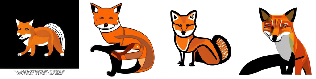
Neither system could give me Girl With a Squirrel Earring, though.
Well, you’ve successfully gotten at least one neural net to render that prompt. And that neural net incidentally thinks it’s hilarious.
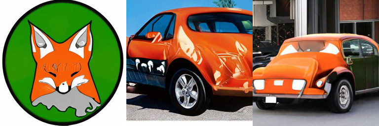
Car Fox, by Nightcafe
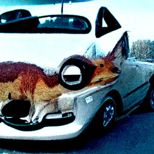
I was not sure what to expect. It looks like it was going for a car with a fox painted on it, but got confused halfway through.
Why did it not try rendering a fox standing next to a car?
Let’s try again, with an “accuracy boost”:
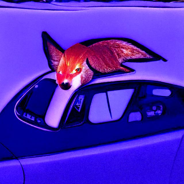
laionide-v4
laionide-v3
This is not what I was aming for (see the start image) but it works.
(I noticed it was my 95th image published from my registered account, so I scrolled back for 5 more reasonable unpublished ones to add. You get 10 free credits at 100.)
I gave “image around text” another try, this time trimmed down to just two letters (my initials) because small details are lost (added to a noisy ground/sky background I made). The left one is “The letters ‘DG’ standing in a grassy field” with the oil and charcoal mods and artistic renderer. It is from iteration 50/25% because it went to crap after that. The right one is “The letters ‘DG’ standing on an alien planet” with oil, charcoal, and the “moonscape” mod that is listed but I haven’t tried before and the artistic renderer. This one only reached iteration 40/20% before it started going bad.

This could be useful for generating avatars.
Couple more failures to landscapes: