I’ve been rewatching The Simpsons right from the start on Disney+ (I’ve got all the series 1 - 14 on dvd but it’s more convenient for watching on my phone) and I swear the small characters in the picture for Big Book of Hell became one of the fairly anonymous background schoolkid characters, in the early episodes at least. The character design is very familiar.
That’s Akbar and Jeff!
They had their own book.
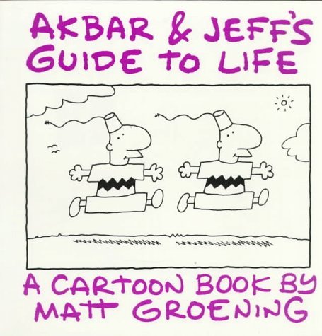
A strikingly Homer Simpson-ish figure also appears in Work Is Hell. (Look for “The Incompetent Manager” under “The 81 Types of Employees.”)

That’s not so surprising; artists have their own style, so it would make sense to see a resemblance. (And regarding Akbar & Jeff, I remember years ago, Matt Groening was asked if the duo were brothers or lovers or what. His answer? Whatever offends you the most.)
Some here may have come to The Simpsons later, but I’m old enough to have watched the show since the beginning. The first five or ten years were probably the peak for the show, when it was at the heart of popular culture, with really clever writing and episodes that referenced various books, movies and television shows. Even the opening animated sequences (the “couch gag”) often drew on the styles of other animators or visual artists.
I recall him once describing them as “possibly both.”
I feel exactly the same way about Van Gogh’s murals in the Sistine Chapel.
Also, during the early days, The Simpsons were at the forefront of popular culture and even politics. During his 1992 election campaign, George H. W. Bush said at a convention of religious broadcasters, “We’re going to keep trying to strengthen the American family. To make them more like the Waltons and less like the Simpsons.” And then a few days later, Bart Simpson replied on the show, “Hey, we’re just like the Waltons. We’re praying for an end to the Depression, too.”
There is a similar pair of twins on Disenchantment.
I’m old enough to remember the Tracy Allman show with the original Simpsons as decoration. I enjoyed both, but appreciate how the art work evolved in later years.
I also read Life in Hell when it was a syndicated cartoon in underground newspapers (remember newspapers?). Interesting, but I wasn’t a big fan of MG just from that.
Anyone remember the episode(s) where the cast was drawn in 3-D? Or when the alternate “Evil Bart” took over? Quite innovative, methinks.
I believe those were both from “Treehouse of Horror” episodes which are among the best episodes of the show.
I loved the episode with the haunted Krusty doll that was trying to kill people (Chucky style) until it was discovered that there was a switch on its back that you have to flip from “Evil” to “Good”. Or my all-time favorite Halloween bit which was the parody of The Shining.
Treehouse of Horror poll coming in a few minutes-PLEASE don’t reply in the poll thread when I link it here!
Personally, I always favored crudely-drawn cartoons with great writing over slickly-drawn ones that were unfunny.
Life in Hell, as several have noted, was Groening’s comic strip, which preceded The Simpsons. It was, indeed, syndicated, and typically appeared in alternative newspapers (along with other subversive and often NSFW content).
I discovered Groening and Life in Hell when I was attending the University of Wisconsin-Madison in the 1980s, and reading Isthmus, the city’s alternative weekly; I also discovered The Straight Dope column in that same paper.
The chinlessness may be what turned me off Bob’s Burgers (and other shows with the same animation style).