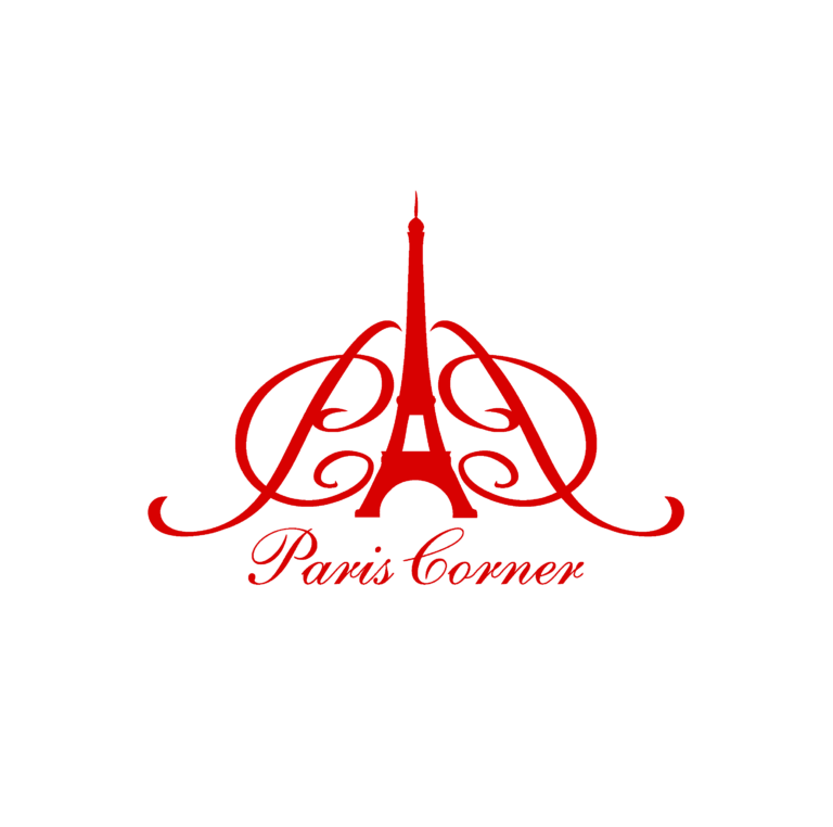
My wife recently bought a fragrance made by the Dubai-based perfumery Paris Corner. On the box was this logo:
That logo is doubtlessly heavily stylized Arabic script, correct? The characters are shifted and stretched to resemble the Eiffel Tower? The brand name “Paris Corner” seems to be rendered phonetically in Arabic script as باريس كورنر (romanized roughly as “baris kurnar” per Google Translate).
So, looking at the logo … the top half kind of seems to be the “Paris/baris” part, with the “s” being shoehorned into the lower left corner of the logo? And then the entire word “Corner/kurnar” starting from the lower right corner and running leftward three characters? Is all that correct?
And there’s a very long tradition of stylized Arabic calligraphy as art, because most interpretations of the laws of Islam prohibit representational art, but artists gonna art, and stylized calligraphy is one of the art forms that is allowed.
That logo really doesn’t resemble the Burj Kalifa at all. That tower doesn’t have any diagonal lines, and certainly no concave lines. Plus, of course, the brand is named after Paris.
iconically, The Burj Kalifa is depicted rising out of a group of surrounding towers. And I note the logo in the OP also doesn’t look like the Eiffel tower at all – it’s too wide at the base. As shown in the red logo. And, unlike the Burj Kalifa, the Eiffel tower is not surrounded by a group of buildings.
I could describe it as an Eiffel logo with a call-out to the Burj Kalifa depiction, but I have no actual knowledge of what the designers were trying for – when I read what logo designers have to say, I generally think that their skills lie more in logo design than in cultural references.