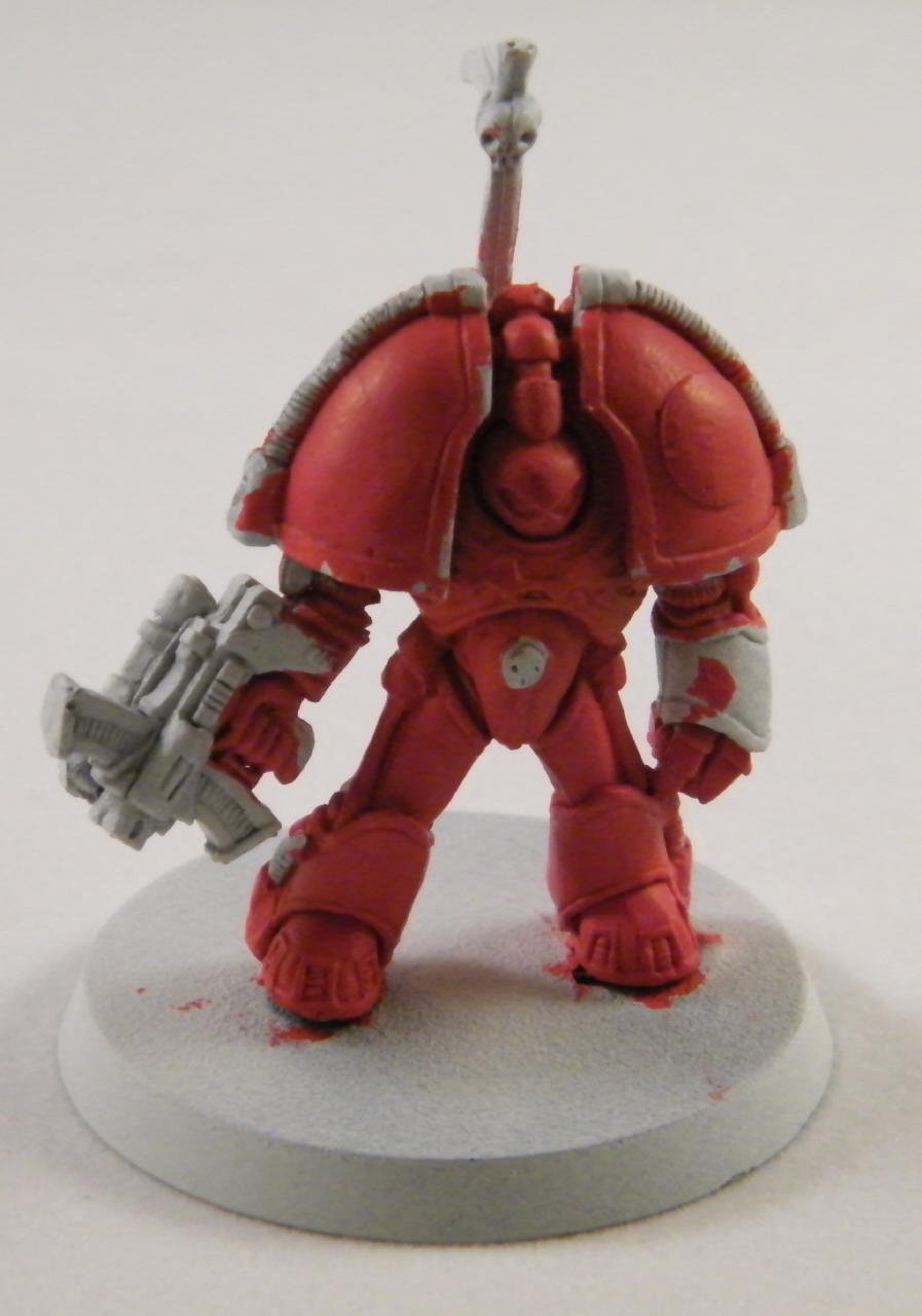
Officially, in First Edition, Blood Angels used helmet stripes like everybody else and their gauntlets were a darker shade of red than the “terracotta” color of the armour. This evolved in Second Edition when GW released Angels of Death and both the Blood Angels and Dark Angels were revealed to have deviated substantially from the Codex.
The transfer sheets from the old bike sets seems to work best, as the chapter symbols are slightly smaller there than on the tactical or devastator sheets. Given the width of the Blood Angels icon, I’ve found that if you’re having trouble getting it to stick properly to the shoulder guard’s curved surface that you can cut the “wings” free from the blood drop and position the three pieces separately.
Once I get the icon on, I usually go back and add some highlights (usually a white “shine” to the blood drop) or paint over the transfer’s edges if I see something I don’t like. It’s worked better sometimes than others.
The helmet color I can take or leave – I just do it to be Chapter Approved. I really dig the differing squad insignia on the knee guards, though. This is something unique to the Blood Angels, as other chapters note squad number on the right shoulder guard. Unfortunately, I have a large number of First Edition beekees featuring the straight Mk VI-style greaves with no knee-guards. It sure makes them hard to tell apart!
Apparently, my Blood Angels only fight on perfectly manicured green meadows… :rolleyes:
Sorry I didn’t get back to you quicker. They look great. Very clean with no brush strokes or overlap errors visible. Certainly better than my work. There’s only one thing that bugs me and it’s personal preference. I always paint the underside of the shoulders black to create depth and shadow. I definitely like that you paint the flexible joints at the backs of the knees and at the hips black. I guess Star Wars Storm Troopers made that the only right way for it to look in my mind. I also like the brick and grass bases. What did you make the bricks out of?
So maybe I could start painting again, if I find the time and the motivation… like most GW enthusiasts, I have a stock of unpainted models that - had they their arms and weapons - would surely lay waste to what I actually have painted.
My first round of pictures didn’t come out too well, but here are some that would impress if I could get them finished up:
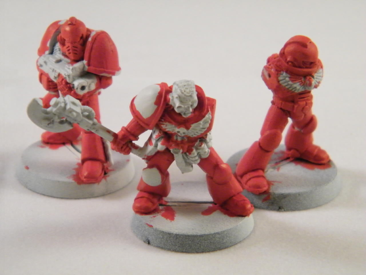
… and a trio of Blood Angels intended to flesh out the Third Company’s Fourth Squad (Tactical); from left to right, a Mk IV Imperium Maximus suit, a Second Edition Veteran Sergeant with bionic eye and power axe, and a Mk VIII Errant Armour.
Yeah, I waffled on the underside of the shoulders - I think one of them may be my final ‘base’ color under there, and the rest may be the slightly darker red that I use as a pre-coat. That’s something I may fix before sealing. I’m also thinking of doing a black ink wash over them to see if that looks good - I’ll do one of them and see how it turns out.
The bricks were a bit of inspiration that hit me early on in the process, but they didn’t go Quite as smoothly as I wanted. They are made from a comic book backing board - essentially, cardstock, with a semi-glossy coating on one side - that I scored in a ‘brick’ pattern using a ruler and the metal tip (with lead retracted) of a mechanical pencil.
What I didn’t realize was that the paint has enough water in it to cause the grooves I scored to lose a lot of their depth. It’s still there, but it was hard to see.
I experimented with a couple of color combinations, but what finally seemed to work for me on my samples was tracing the grooves with a fine-tip marker pen, painting the bricks a light tan color (thinned a little so as not to obscure the pen’s marks), and then going over the whole thing with a brown ink wash. This produced nice, sandy-yellow bricks.
At least, that worked on my sample. When I did the ones I’d already glued to the bases, the ink wash came on a little heavy, making them look more like wood than sandy stone. So I did a 50/50 mix of the brown ink and the tan basecoat to color in the centers of the bricks - it came out a nice little shade of grey, bizarrely, but I love it.
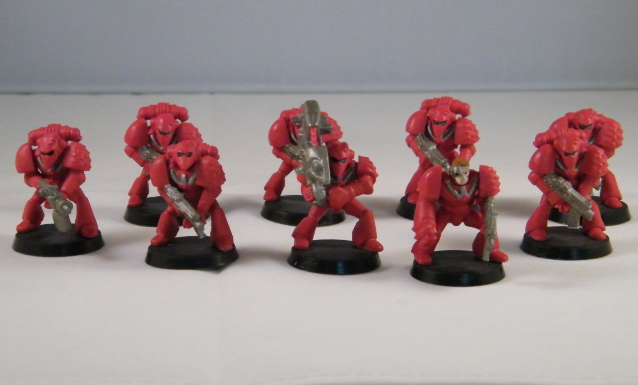
I gotta admit, even though I put down my pots & minis a long time ago… I’m kinda jealous of people who still have beakies lying around (even more so the beakies posted a little further upthread that still have the huge rivets on the boots & smaller shoulderpads).
That design was the shit. The new one is OK I suppose, but it’s no beakie.
Yeah, the RTB01 Beakie box was awesome. 30 Marines for less than a dollar each. It really encouraged experimenting. Especially since they were plastic and could be cut up easily.
I just got back into painting WH stuff. I have most of a Space Marine Army that I started painting as Templars years ago. I don’t think I want to continue with Templars though. I thought about painting some Imperial Guards as a penal army. Orange jumpsuits, black & white stripes with the officers being prison guards.
Heh. I just got back into painting right as GW was making the switch. I like the new paints. White goes on a lot smoother than the old version and actually covers what you’re painting now. The glazes and washes are convenient but I haven’t used any of their dry or textured paints. It’s annoying that they’ve changed the name of some of their colors though. Boltgun Metal is now Leadbelcher (I think) and Chaos Black is now
Abbadon Black. I hear this was done so other companies couldn’t use the same names for their paints but I don’t know if it’s true.
I’ve signed up for a couple of Warhammer events at Origins where models will be provided. The more familiarity I can get with actually playing the game, the better.
I’ve got all the elements of my photography set-up ready now, so maybe I can take a second crack at those pictures soon.
[ol]
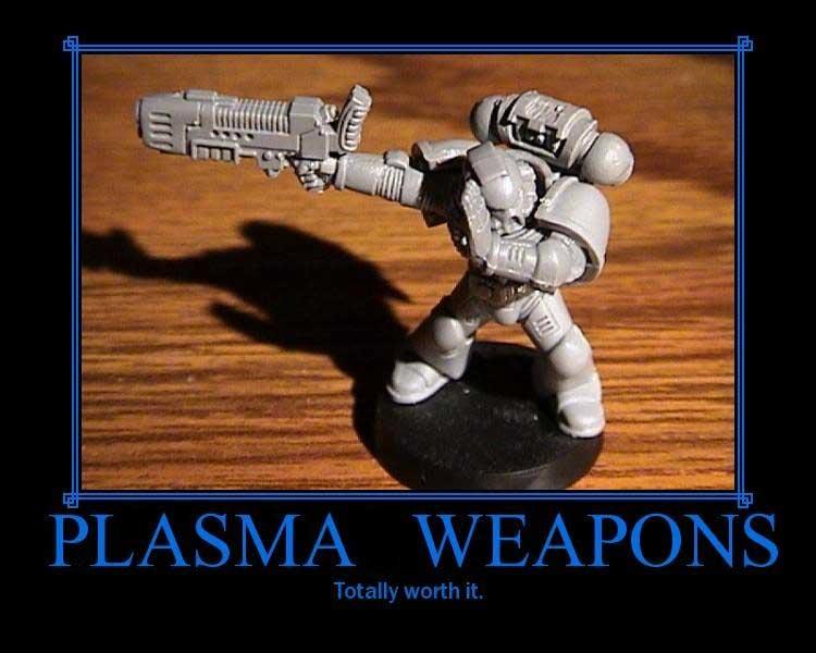
[li]If you think you can beat the Tyranids in hand-to-hand combat, you’re wrong. Yes, I know you have… but you’re still wrong.[/li][li]Dreadnought power fists are neat. If you think they make your dreadnought a match for a Wraithlord or other similarly-sized model with Toughness and Wounds, you’re wrong.[/li][li]Expensive wargear, legendary commanders, and flashy unit choices make your army look snazzy. If you think this can save you when you’re outnumbered 4-to-1 by Orks that get three attacks each in an assault, you’re wrong. [/li][li]Corollary to #3: You can’t possibly shoot them all.[/li][li]Eldar are a dying race. That’s why there are so darn many of them.[/li][li]Dark Eldar are a small offshoot of their dying parent race, whose entire society is contained in a single city hidden somewhere beyond the Webway. That’s why there are even more of them.[/li][li]The rest of the Tau army really is there just to stand in front of the guys armed with railguns.[/li][li]Space Marine Land Raiders aren’t as tough you think they are.[/li][li]Necron Monoliths are as tough as you think they are. [/li][li]Plasma weapons are totally worth it.[/li][/ol]