2nd ed. didn’t introduce a new aesthetic overall, but a lot of the settings had strong aesthetics driven largely by individual artists, like Tony DiTerlizzi with Planescape, and Tom Baxa with Dark Sun.
Thanks. I think I wasn’t playing by then (or not enough to get into those settings) but I like both of those pieces.
A lot of the early AD&D art was definitely janky, but at the same time, I actually prefer a lot of it to a lot of the more modern D&D art.
Part of it is that sense of mystery I wrote about above. A lot of early D&D art was just kind of weird, and it was hard to figure out exactly what you were looking at, which (I think accidentally) created an interesting aesthetic. This was before I encountered Lovecraft and his indescribable babble, but it created a similar sort of effect.
Another part of it was just that the artwork often seemed more imaginative. Take the owlbear:

Now, I know in 2021 that’s based on some weird, cheap random toy Gary Gygax found in a bargain bin, but at the time, when I first encountered it, it was just a weird looking critter. It created a sense that there’s weird, indescribable stuff in the world, and the best anyone can come up with is a half-description, like “owlbear”, and the best depiction anyone can make is a crude rendering that doesn’t look like anything in particular.
Then there’s the modern interpretations, which are all pretty literal:

It’s a cross between an owl and a bear. Which, ok, but…it just seems like something from Avatar: The Last Airbender, rather than a weirdly evocative image of monstrous otherness.
Evocative of early European drawings of the beasts of Africa or something.
Of course, Otus’ stuff was deliberately weird and Lovecraftian and tripped out ![]()
There’s sort of an “outsider art” appeal to those early illustrations. The weirdness was highlighted in 1st edition, because they had enough money to put out these nice, quality hardcover books with professional quality illustrations, and then inside it looks like a bad acid trip.
I’ve read that TSR still had quite a bit of unsold 1st edition material lying around in their warehouse at the time they went out of business in 1997. As much as I love many of 2nd edition settings, they produced too many of them and even I couldn’t keep up. And the more I’ve read about TSR, the more amazed I am that they were able to stay in business as long as they did. They’re a textbook example of how a company with a hot product can make money hand over first to the point where it mitigates bad business decisions on their part.
My favorite is still the original PHB cover.
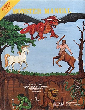
My Monster Manual is signed by Gygax – we managed to convince him to be GOH for PlatteCon Alpha (gaming convention at UW-Platteville) – he did it for $100 (it helps that he liked visiting the area). Later I had Tom Wham autograph his beholder pic. (GG showed up for PlatteCon Beta as well)
Brian
Exactly! The original owlbear looks like something a survivor of an encounter sketched out based on their hazy recollections of the monster that dismembered their friends.
Yep. It was “stylized” art, quite different from the more photorealistic stuff that’s common today, but he was a genuinely talented artist.
What is the story behind the replacement of that cover? Someone here must know it. (I know I can Google it.)
The Deity and Demigod one was tied to legal reasons as I recall.
Well, eventually they got the high-quality covers (the “orange binding” editions), but some of us grognards still recall the original cover art:
Which (to me) is less evocatively crude, and more just kind of cheap.
I don’t think there really was one besides AD&D getting more popular and them being able to afford new, slicker, art with a more cohesive theme for the new printings. The original covers for the PHB, DMG, D&D and MM were sort of all over the place. I think they were good (except MM looks like something I would have drawn on my math notebook cover in 7th grade) but they were also all pretty different from one another and didn’t really look like a matched set.
Deities & Demigods had some issues with the Lovecraft and Moorcock material inside but the cover didn’t reflect any of that. It was just part of the overall new printing changes.
Thanks.
To add to the discussion of AD&D covers, I agree the with @Maus_Magill that the original PHB cover is a masterpiece:
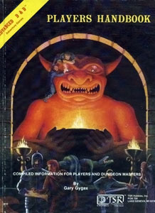
One of my favorite game designers is Robin Laws, and he talks a lot about the “core activity” of a game. He frequently cites Dungeons & Dragons as an exemplar of the right way to do this - the core activity of the game is right there in the name. Similarly, I think the core activity is right there on the cover of the PHB. Adventurers, in a dungeon, cleaning up after a battle, looking at (presumably) a map of the dungeon and where they’ve explored so far and where they’re going next, and looting the room, with the defeated monsters piled in a heap. In terms of giving a succinct and evocative visual of the game’s core activity, giving players a literal illustration of what they’re expected to do with the handbook, it may well be the best cover in the history of RPGs.