If this is deemed help with homework, so be it. Banish me to the wolves and burn me at the stake. Or something.
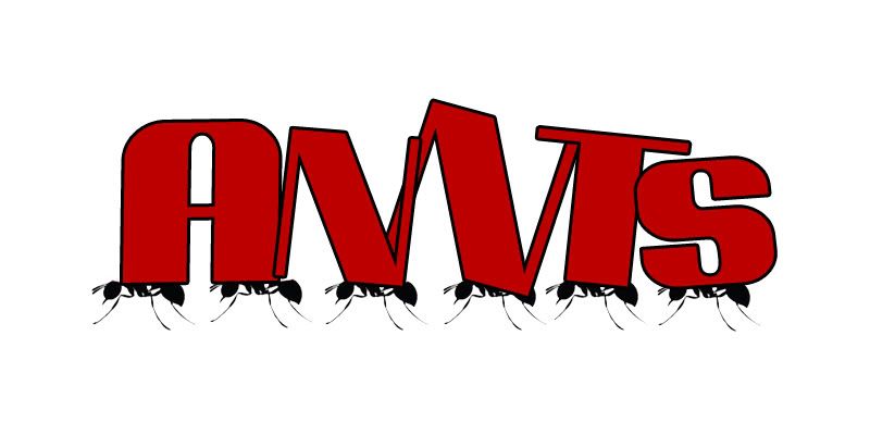
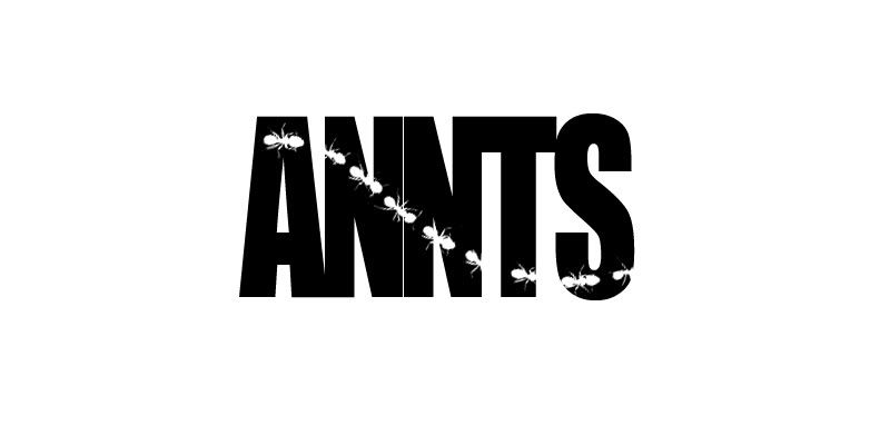
So, this is for a Master’s level online course. There is a fair amount of group work that needs to be done, and our group needs a name and a logo. We’ve got a name – ANNTS. That’s the first initials of all of our names. Ants are known for their teamwork – makes for a good team name. Anyway, I’ve got access to Autocad, solidworks, photoshop, and the skills to do pretty much whatever I need to with any of them. Because of this, I’ve been tasked to create the team logo.
Problem is, I’m stuck. I don’t know what the logo should look like. First I was thinking it should be an ant made out of the letters annts – kinda word world like. Now, I’m thinking that’s too cartoony. So, any of you creative types got any ideas.
This really isn’t homework. The homework is the stuff that goes under this cover sheet. And, it’s not like I’m asking for help drawing it up. Just any ideas would be a huge help. I’d really like to get at this tonight, but I absolutely have to have it done by Sunday night.
So, how about it. Anyone wanna flex their creative artistic muscles and do some brainstorming with me?
Well, I’m going after my Master’s in Engineering, but the class is Project Management. The current project is just to do an ice breaker and team charter, but there will be other projects throughout the semester. We’ll be keeping the same team, team name, and logo for the whole class.
To play up the teamwork angle, five ants (perhaps with an identifying physical characteristic of each team member if you want to get cute) suspending a giant (to them) crumb/boulder above their heads.