That does it. I am going to take that course in laser tattoo removal. In a few years, the bucks will just roolll in.
OK, as much as I hate animal print in general, I want those “things” to be leopard spots rather than a whole bunch of women’s faces! All on somebody’s back like that? What the hell? Even if they’re smiling, that’s scary.
Actually, after looking at it again, I think they resemble the bumps you see on manhole covers.
For those doubting the pink color - I can say that a friend of mine went in to get her lips tattoo’ed. (“No!” I hear her say, “It’s NOT a tattoo, it’s PERManent LIPstick! ! !”)
She asked for a very natural rosy pink, nothing too obvious, just enough so that her lips have some color in the morning. They came out just that atrocious coral pink. Eesh!
I’m posting a link to that picture next time someone gives me a hard time for saying tattoos look like scribbling. 
They look like cells in various stages of mitosis to me. Look at the dark parts and tell me you don’t see chromosomes now.
I think I know how the spots originated. The tattooist did all the lettering and the ribbon, then stood back to look at his work and realized how bad it looked. So then he thought to himself, “This shit looks horrible, I need to do something to take people’s eyes away from that terrible lettering and that big goofy ribbon. Oh, I know… SPOTS! That will fix everything!”
What does she think of the color?
I don’t see what’s so bad about this tattoo, other than that some people are miffed it wasn’t done professionally by a highly skilled fine tattoo artiste. It looks no uglier than a skull-with-snake-crawling-through-eyesocket proudly displayed on somebody’s neck. Or those arrows on legs pointing to body orifices. Or a wise Chinese or Japanese saying on some high school dropout from Tuscaloosa.
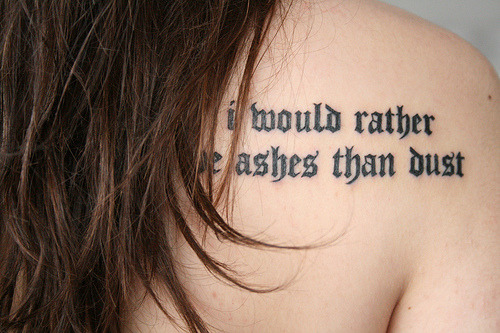
You think a photo of a bad tattoo gives any weight to your argument that **all **tattoos look like scribbling? For every horrible tattoo (like the one in the OP) you post, I can post something like this. Or this.
It’s poorly aligned, the text runs into itself, and it’s not indicative of what one usually wants a text tattoo to look like. Good text is hard to do, and good handwriting text is harder. I’ve seen really good artists who are not formally trained and really questionable artists who are formally trained; however, the quality of their work and the cleanliness of their work area and tools are more important when choosing an artist than their training.
Ew. You’re right.
But they also remind me of frog eggs. Which is an even WORSE thing to have on your back.
Or this.
Or how about this one?
(If I were ever going to get a big back piece, I would so have a Mucha print done – he’s my favorite artist)
aruvqan – I love your tat – that’s beautiful!
One thing that always amazes me…when it gets really cold here you will see people wearing tank tops, when the temps are in the 20s-30s, in order to show off spectacularly bad tattoos. Tattoos that would have me wearing long sleeves in the hottest part of summer if they were on me!
Actually, I really appreciate good ink, so it’s not like I’m anti-tat or anything.
It was a joke, son. That’s why I put a Big Grin after it.
Like removing this one? Clearly the guy makes bad decisions on occasion.
Ever since I’ve had my sleeve, anywhere I go people want to show me their (usually terrible) tattoos and ask me questions about mine. And it never fails that they’ll tell me about what a “good deal” on their work. Any decent artist can take a design off the wall and do a decent rendering, but with cover ups or extensive work you really do get what you pay for. And, IMO, it’s worth it to wait until you find the right artist. Unfortunately, people are impulsive and impatient, and that’s how they end up with dreadful work.
I was thinking the same thing. But because I think the spots make her look like she has some skin disorder. In fact, that was the first thing that jumped out at me before I noticed there even was lettering.
And if your handwriting is not clear enough to be read from a distance on paper, it’s not going to look good on someone’s back.
Amen to that. They look like giant pimples all over her back :eek:
I usually like tribute tattoos, but Z— for execution!
They almost look like gravel… like somehow her back had been pushed along a poorly paved street and picked up some stones and a ribbon that was just lying there…
Uh, yeah. No screaming, but I did have to walk away from my computer for a while. Not as bad as lotus boob lady, but still Double Plus Ungood.