The ear seems to be much too close to the jawline. It should be higher, unless her ears are actually below her nose.
The nose doesn’t look right either. It has too much color compared to the area on the face around it, which is grayed out a bit.
The ear seems to be much too close to the jawline. It should be higher, unless her ears are actually below her nose.
The nose doesn’t look right either. It has too much color compared to the area on the face around it, which is grayed out a bit.
The whole conveys an airy/windy impression to me, which I think is good and appropriate. The strands of hair are important to that impression. I think there’s just too much contrast to them; not only are they jarring against the face, they contrast a bit too strongly with the bulk of the hair. I think they should stay, but in a lighter tone; alternatively, a slightly darker tone for the rest of the hair might work.
I think the landscape format already discussed would help as well. I would recommend leaving it as uncluttered as possible–things with sweeping lines to the right would be okay, but I think that anything blocky would break up the flow of the composition. The key aesthetic I would look for is a sense of air and freedom.
Overall, I would say it has potential. It is, I think, successful art (under my idiosyncratic definitions), but not yet good art.
Disclaimer: I am not an artist, have no technical knowledge of painting, and would not know where to begin painting a portrait. I find stick figures a challenge. All I can offer are my impressions, which may well be completely wrong-headed.
While we’re at it…
The strands of hair in the face are a different color than the rest of the hair. Darkening the main mass of hair would fix it, and also increase color variety. As for that, the blouse might be better if it was white. I know that makes things especially difficult with watercolor.
I like the wind-swept idea, though. You could look for additional ways to suggest the wind. More hair strands. White caps in the water. The shirt could billow. If you can manage it, lift her chin to strain the neck like she’s enjoying the breeze.
Just remember art is a process, nobody ever said you have to be able to make a great painting all in one go. Many famous paintings have multiple versions, like Munsch’s Scream.
Oh you will, James, you will!
-Oscar Wilde (not quite)
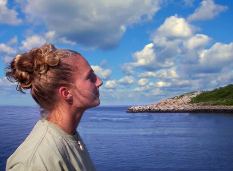
That boat and the island behind her nose is part of the problem, I think you were reacting to it. Which we do all the time, that’s not a “flaw” on your part or anything. Maybe you could block that out in Photoshop or something, just get rid of it all? I think that would make it easier to see her, you’d have a shape from her forehead to the horizon.
Lots of nice triangles in that composition, maybe you could break it down that way? Look at the shape from the tip of her chin to that buoy, and back to where the base of her neck meets her left shoulder.
In your painting, her hair has the darkest dark. But in the photograph, the shadow of her shirt, her eyeball socket, her neck, her mouth, her earlobe, and under her nose are equally dark. So’s the immediate water. If you darken all those areas, too, then her nose won’t jump out the same way. All the dark shapes need to work together.
Instead of thinking about “features” (eyes, nose), think about “dark shapes”. “Being able to draw eyes” is really a misnomer - an eye is nothing more than two darks, three mediums, and two lights.
I thought a first sight that the nose is wrong. I thought it looks bobbed and the face looks like a larger nose belongs on it. Looking at the picture I see the nose is way off. See should know what her own nose looks like, and making it smaller, will make it stand out and be wrong to her. I see more of a jag at the bridge of her nose then she seems to have in the picture and reducing that will help the nose seem like it part of the face. The nose in the painting doesn’t have a smooth flowing contection with the face. Maybe you should try just the forehead to nose contour to practice a technique. The wisps of hair add something that distract away from the nondescript background. The hair across her face could be improved. It may look better without it and a better background.
I hope you don’t mind, but I did some work on that photo using Photoshop. The clouds are from a quick image search on the web.
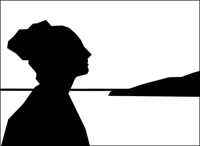
I’d prefer the girl to be higher up in the frame, pretty much as much head-room as you gave her in your original. Closer to this silouhette.
Interesting thing about painting - I think tdn’s painting is much more emotive than the cleaned-up Photoshop version of the subject photo, which is obviously (because is IS a photo) more anatomically/visually accurate.
I kinda like the way she’s lost in space in the painting he did.
When I first opened this thread, I thought the pic didn’t really appeal to me, but I didn’t see the need to post just to criticize someone else’s efforts (which far surpass anything I could do.)
Checking back in, for whatever reason it gives me a really good feeling to see that people with considerably more expertise than I responded with specific criticisms and suggestions. Cool!
Yeah, there’s some great advice. In a couple of hours I’m leaving the Dope for a week, so I don’t have time to respond to everyone, but here’s a general thanks for all of the great ideas.
I’m printing out the thread and photo so that I can work on it over vacation. You know, just in case the whole beach thing doesn’t work out.
Am I too late? looks around wildly
a) I love the palette you’re using, the cool mild feeling, and the dreamy look your model is wearing–especially her eyes.
b) The strands of hair are way too distracting–it needs to be featherier, lighter, more consistent with the main hair’s texture.
c) Her nose looks a little off to me, and her lips are a bit small.
d) Love the shading around her neck and the definition of her face and curls. I really get the sense she’s an older lady–maybe around fifty, fifty-five?
e) The shirt needs to be filled in, it looks like a rough study.
f) Like the sea and the shape of the waves.
IMHO, FWIW.  Good work!
Wow, I suck at portraying age. Her e-mail address is dot edu, and I’m pretty sure she’s not a professor. And she worked at a job normally staffed by people familiar with dorm life.
But thanks for the compliments!
:o Wow, I suck at judging people’s ages… :smack:
Funny thing is, the only portraiture I’ve seriously tried is with young blonde females. And they all come out more or less the same. I may really increase my skills if I branch out to different ages, hair colors, skin colors, and genders. Then maybe I can learn to paint what I mean.
Portraits in general can be very difficult, I think much more so than still lifes, landscapes, etc. Most everything I’ve done besides portraits turned out well, but my one attempt to paint one of my mom wasn’t far from minlokwat’s link which, btw, made me burst out laughing.