Meh.
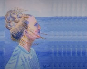
Not particularly inspired, but not offensive - if I were the young lady in the portrait I’d probably quite like it.
It’s certainly better than this one.
Not to me
What are the lines across her face all about?
I like the way her body challenges the ocean behind it. I like the way her hair extends off the page. The shadows in her hair are pleasing.
The lines (I’m betting they’re drapery folds) in her shirt don’t work for me, they seem added on and don’t define the cloth. I don’t see her shoulder, it just kind of goes flat there.
The color of her skin right by her eye/forehead is very pleasing, I like that choice and the way it reacts with your blues. The reds in her face seem a little strong. Her eye is strong, but her nose is problematic.
The ocean’s too monochromatic to me (although I strongly agree with the choices you made by lightening it just behind her back, and darkening it in front of her). I like your sky.
I think you did a really good job of reaching for a particular emotion, a sense of aspiration or challenge from your subject. She’s not a static figure in the least.
It doesn’t look like a completed portrait, more like a study.
They’re supposed to be strands of hair. They rendered too brown/red in the photo, but I suppose I could have used white gouache instead of raw sienna. Or I should have left them out altogether.
The shirt is a real disappointment. In the last version I did, it looked so real that I could touch it. Unfortunately, the face was a little too Fred Flintstone.
It’s funny, with this one either the negative or positive space looks OK (but never great), but never both.
You know what you could try? Because it’s the antithesis of how you work — try working fast. Just 30 seconds. Not from pictures, from reality - just a pile of boxes or shoes, whatever. It’s how life drawing classes usually start out, 30-second gesture drawings. Or — pile some brown paper grocery bags under a bright light and just paint the darks.
I hear you about elements in a picture that work v. elements that don’t. I think everyone has that problem at times, it’s universal. And frustrating!
What you’re almost getting, which is really the thing, is having the elements work together. A competent painting isn’t “here’s a good eye, now here, I’ll do a good ear, OK, now it’s time to do some good hair”. A competent painting is the whole thing at once, how it works together (and you’re getting some of that going, you’re making some good choices in what you emphasize, your colors, the way you’re breaking up the space). Those details, hair, eyes, they’re only part of the whole (like in that really nice piece minlokwat linked to). A competent painting is not a group of competent details.
James MacNeil Whistler never did figure out how to paint hands.
I don’t know much about it, I just know what I like to look at, but I have to say: I looked at it when I read the OP and didn’t have a strong opinion. Then I looked again after reading fessie’s analysis and “saw” a lot more there. Maybe one can come to appreciate more than just what initially looks good! :smack:
Yeah, there’s a lot to think about when looking, and especially when painting! Drawing, composition, and technique all come together for a deathmatch in a piece like this, which is probably why it’s so lackluster. In what would seem like a relatively easy thing to do, I’m trying to tackle the hardest of each of those things, and feeling wildly over my head.
fessie, I like your idea of working fast. I’ve been meaning to do that with drawing. Ironically, I haven’t been able to find the time!
The problem with painting young skin quickly is that in watercolor, timing is everything. The degree of wetness is paramount. Go too fast, you get mud. Go too slowly, you get liftouts and hard edges. Either way, what should be youth and beauty can turn into massive birth defects quite easily.
Maybe I should start with portraits of old people. I think that would be far easier.
your shading to define the planes of the face, the eyes, the jawline, the neck – those are all quite good. the ear is an excellent capture. even the main mass of hair is good. you just took it a step too far when you tried to add the wisps for detail. you got the chain on the locket well, but it looks like crayon stripes for the most part on the hair touch-ups. they’re not an organic part of the whole, just obvious add-ons.
now just get that shading into the shirt and the sea for defining texture, and that would be pretty exceptional all around.
the color choice for the nose i found a little problematic. makes it look like a Mr. Potato Head add-on to her face. you totally lost the blue highlight tints there, so it loses continuity.
no art training, so FWIW.
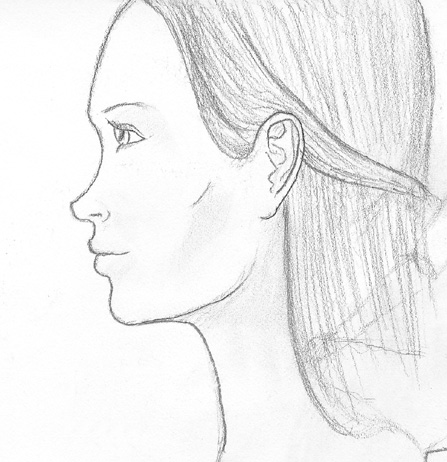
There are a few issues that jumped out at me pretty quickly. Her ears are way too low, her nose doesn’t extend far enough up, and the bottom of her face is sunken. The forehead looks kinda off too, but I can’t point to anything specific. Take a look at this sketch of a young woman’s face for a pretty good idea of how a young woman’s face should look like from the side.
I think it would’ve looked a lot better if you’d left out the strands of hair across her face and above her head–the rest of her hair looks really good, but those just look like streaks of brown paint. Her lips and eyes also look awfully dark, like she’s wearing black lipstick and eyeshadow. Something is off with the color of her nose as well, but I’m not sure exactly what or how to improve it.
I can see where watercolor would be a very unforgiving medium. Have you considered trying something that gives you a little more room to screw up? I think the normal progression is going through charcoal sketches to get the basic shapes of things right, then using colored pencils to get the colors right, and then finally painting once you’ve got a pretty good idea of what you need to do to get the subject to look right. But I’m not an artist of any kind, so take that as you will.
The composition could use work. I realize it’s a portrait, but I think it would look more dynamic if it was horizontal to give her more real estate to look at to the right. Like this. The horizon line could also be lowered.
When planning a painting, sketch (or at least imagine) the elements in silhouette and see if the arrangement looks interesting with no detail. Familiarize yourself with the rule of thirds.
Huge improvement! Yes, I’ve been thinking about a landscape format as well. I think you’ve convinced me. In earlier versions, I put in some boats and clouds to give it more rhythm and intervals. Opening up the space like that would make that work even better.
Her ear really isn’t that far off. I think where I failed is in rendering the tilt of her head, making it seem that way.
Another problem is the light source. She was at work, and was gracious enough to take time out to pose for me. I imaging it’s hard work to crew a schooner, so I didn’t want to take up too much of her time. But the Sun cast a shadow on her face, and not her nose. The result is that her eyes and mouth are in a shadow mass and too dark, while her nose is its own light mass. Hello, Mrs. Potato Head.
Were you working from a photograph, or painting her while she stood there? If you wanted to post a photo, I’d be curious to see what you were working from.
They don’t move so fast, anyway  . Actually, I find it almost impossible to please women customers beyond the age of about 50. Old men are OK with their looks, but older women generally are not - and I simply cannot “see” their younger selves. Wrinkly skin is an interesting challenge - sometimes the more you add, the stranger it gets!
Babies would be easier, if you can catch them sleeping. Plus they have those beautiful skin tones.
Just noticed - garygnu has a really nice quick-sketch on his homepage, you might want to check it out for inspiration. Love that horizontal alternative for tdn’s piece, too!
This was from a photo, which I’ll try to post later. No way I did this in person! She would have – literally – missed the boat.
Interesting thing about insulting older women. The thing is, beautiful people are in fact plain. It’s the abberrations that give character. The hook nose, the beady eyes, the double chin, the wrinkles, or the big ears. These things are great for portraits, because they can be exaggerated slightly to bring out the person’s character. But these abberrations are seen, at least in our society, as ugly. So to make a complimentary portrait is a difficult thing to do. The subject in this painting has a hook nose that I think is beautiful, but I’m reluctant to bring it out for fear of insulting her. How’s that for irony?
The only full-body painting I ever did was with a live model, who was unaware I was painting her. In fact, she was probably too young to know what a painting is. Talk about having to work fast!
Ah-ha! Very interesting. I sort of wondered about that – I’ve gotten myself into trouble in exactly the same way.
I learned some tough lessons while drawing people’s funny-looking babies (not to mince words, we all know they’re out there). First few times I tried to fix (or at least minimize) the goofy features. Bzzzzt! No good! The drawings sucked, the features didn’t “hang” together, I couldn’t even sell them.
Nowadays I know to just shut off the part of my brain that’s aware of how “attractive” they are, and just let it rip. Big ears, big nose, bulgy eyes, whatever.
In figure drawing class, I always ended up adding 15 years to people’s apparent age. (I’ll work on getting those pics scanned and up on my site tonight.) A girl in the class always subtracted 10 years from the same subjects. I’d use lines on the face to describe form and detail, while she’d just leave it out. That approach is better for either young women or to flatter older women…if you can do it right. Concept designer Iain McCaig said young women are the hardest to draw.
Be careful when working from photographs. If the resulting position of facial features looks off, even if it’s right in the photo, fudge it to make it look right. Also don’t be afraid to change the composition or background elements.
Oh, thanks, fessie, which one, exactly?
A few years ago my father took a drawing class. He did a self portrait. As he was darkening the lines, he watched himself turn into his father!