Sorry for the blur. The photo was taken in a really crowded room, and I was thinking “get a photo, get the hell out of here, and seek food.”
Drawing-wise, this is way above my level, as I really need to learn basic anatomy of both humans and horses.
But I’m wondering if, compositionally, this could work. The obvious subject would be the girl. But there is no real value or color contrast in her. And there are no lines and paths that I can see that would lead the viewer’s eye towards her. But I think there are some interesting shapes going on. Rich colors, but far too many high values.
I’d make all those distracting crowd people go away, and brighten the color of the girl and the horse.
By which time it might be easier to locate a different picture of a girl on a horse. Or maybe not.
Not that I have any artistic talent.
But I do scrapbook, and if I really wanted that picture in my scrapbook, I’d crop it heavily, except that I don’t think I could crop it to get the part which is most visually interesting to me into the picture in a way which would make sense. I mean, I like the beams and stuff up at the top. So I’d be tempted to make it a triangle, wide on the top, pointy underneath the girl’s feet. But I don’t think I could get enough of the people in the foreground out of the way to make it work.
But maybe someone who was painting could do so–maybe replace them with some nice bland bushes or something.
If you wanted to paint a woman on a horse, I don’t think there’s anywhere near enough information for you in that picture. Her baggy dress kills the line of her back. I can’t tell where the horse ends and the shadow begins.
OTOH, if you wanted to paint two men checking out a woman, that you could do . Their posture is hilarious, and it does tell a story. I love the fact that they’re both holding children and therefore fathers (so presumably they’re “spoken for”) yet they’re still scopin’ her out! I’m assuming that she’s 18, but honestly I can’t tell for sure - that part’s a little creepy.
The carousel lights in the upper right play off the left-hand guy’s shirt, and the two men’s collars line up with her breasts.
Wow. I guess I’m a worse photographer than I thought. fessie, I don’t think she’s 18, I don’t she has breasts, and I really hope that those guys weren’t scoping her out!
Eureka, I wouldn’t put bushes in it. It’s indoors, and I’d be loathe to change such a fundamental detail in an historic landmark.
I think if I could lighten the dress, and make the horse contrast with the background, it would make a better focal point. I’d have to lose the window and lights, as they are way too distracting. And yeah, get rid of the crowd.
She looks closer to eight than 18, which could give it some creepy undertones (oh Dopers, always thinking the worst). I’d keep the rest of the crowd, which can actually be subdued quite easily because of all the pink, and bring out the green in her dress. But probably not the best for human or horse anatomy.
OK, OK, no bushes. But I’m not convinced that there’s anything in that picture that really says “historic landmark” to me.
(On the other hand, I recall a few years back that Reader’s Digest had Splitrock Lighthouse on the cover. Someone wrote in asking about the lighthouse because it looked like the lighthouse from a Thomas Kincaid painting, and was assured that it was the inspiration for the painting in question. So maybe I’m missing something.)
I was thinking along the lines of delightful innocence rather than creepy.
Thin the crowd, and maybe have them not appear to lear at the girl (I honestly think they were thinking “When the hell will it be my kid’s turn? Grandma’s waiting in the minivan, and I want a lobster and a beer!”), and give them darker shirts.
Correct the girl’s sculiosis, maybe show a few more of the horses, and…
I still can’t think of a decent eye path. But I think the beams sort of lead to the girl.
Well I took a stab at it - cropped the uninteresting parts, cleaned up the image as best as i could in Photoshop and created a “canvas painting” out of it. Here is how it could look:
Aww, shit! Didn’t mean to perv-up your thread, tdn!
What were you aiming for, with that photograph? (oops, now I see you answered that)… What about her was delightfully innocent?
I remember a nice print of a carousel that one of my friends had, years ago, but I can’t find it online. However, while looking at www.allposters.com under “carousel” I found some interesting ideas . Maybe you could combine some elements of your photograph (or your memory) with one of those pieces?
Copying other people’s work is a terrific exercise all on its own anyway, it’s something all art students do. Just an idea.
I suspect that you need more than that one photograph if you want a realistic picture. If you can, take pictures of the girl by herself, and take some pictures of the horse(s) by themelves – like these that I took of a different carousel.. You can assemble a painting from pictures of details, as well as the overall picture that you have – and you can soften sharp focus like mine as has been done to one of my pictures here, but you can’t pick up details in a picture as blurred as yours.
I don’t know the girl, and I’m not near the horses anymore, but if you could arrange for me to go back there, I’m more than willing! I live for summer vacation.
I was able to find some reference photos, however. That might help flesh out some details.
What was delighfully innocent about the girl? I don’t know. Cute child in a cute summer dress, on a charming and historic ride, patiently waiting for it to start up, in a charming town in the most awesome vacation spot in the universe? Maybe you had to be there. I look at that photo and can still smell the popcorn and cotton candy, and I remember my sadness because it was my last night of vacation. The image holds a lot of emotional vibes for me.
Dorjän, that’s awesome! I did a value study of this the other night, and I cropped it almost exactly as you did.
To echo others upthread: I’d suggest losing the lights and windows, thinning (or abstracting) the crowd, and straightening/cleaning the line of the girl’s back (that dress is awful).
Beyond that, maybe blend the dress to a simple pastel, to contrast with the richer background?
The lines are a bit of problem if you want to focus on the girl–they lead to the carousel hub instead. The only thing in your favor here is the way she’s framed by the oval painting on the hub, sort of like a cameo image–perhaps you could emphasize that? Alternatively, you could try shifting the angle, so that the viewer is looking straight down the overhead beam toward the hub–that would leave the girl centered, framed by the oval, and bracketed by two angled beams pointing inward. (I have no idea how difficult this would be.)
Actually, I like it a lot, just the way it was taken. It reminds me of some of those classical paintings of random louts in a nightclub, none of them paying any attention to the viewer. If I were painting it, the only change would be to put the guy on the left in a darker shirt; the eyes are drawn to the white, and he’s a minor part of the scene. I especially like the fact that the girl’s age, and nearly everything else about her, is ambiguous, and I love the window on the right, where a fellow seems to be chatting with a boxer dog. A painter doesn’t have to explain strange details. Leave that to the viewer.
The thing I noticed about the photo is that it appears as if something has just happened that has drawn everyone’s attention (except for the woman in the front right, and maybe the boxer-chat guy). The woman on the left in particular seems to be stretching to see it. The two guys aren’t leering at the girl - the point of focus is to the right, blocked from the viewer by the man on the right.
However, there’s not really enough there to make that interesting on its own. The picture itself doesn’t give any hints, and you can’t even see faces to gauge reactions. I’m not even 100% sure it isn’t all just a coincidence that people’s heads are turned that way. It may inspire a good story, but you can’t get it from that shot alone. It leaves the viewer in the dark.
I’d keep the crowd, but lose this distracting part. Make the two men face away from each other, or maybe looking the other way. You could even make the girl in pink to be someone standing, perhaps looking straight back or to the right. Of course, it’d help to have some faces to put on them, but you don’t need incredible detail since the girl’s the primary subject. She stays as she is. The viewer still doesn’t know what she’s looking at, but that’s more acceptable as she is one person, and a child (and I think ‘waiting impatiently’ would probably be a common interpretation from her pose).
For what it’s worth, my first impression was of a boxer as well–a really, really tall boxer, or a boxer standing on something, that is–even though it’s clearly one of the horses when you look at the context.
What is it that you like about the photo? You said you went in there just to shoot it. Is it the historical place itself, the crowd, carrousels in general?
I have some fantastic pictures of my kid in a carrousel, if what you want is just a pic of a carrousel. They all have focus issues but that is something you can correct painting.
If it is the site itself, then you can probably hunt for better pictures of it.
As it is, I think that it is showing too little of what you want, unless what you like is the crowd itself, which is as valid a subject as any other.
Excellent question, and if I answer it, I might make a better painting. It’s not carousels in general, it’s that particular one. It’s really iconic of the area, something that gives the place a lot of its character. And it’s a beautiful one, at that. I like the colors. And I think the girl gives it a touch of class.
FWIW, I already selected thesefourvacationphotos as my projects for the next few months. I already didtwo, but they obviously need redoing.
I was just using the Flying Horses photo for a value exercise, but now I’m thinking it could be a real project.
 . Their posture is hilarious, and it does tell a story. I love the fact that they’re both holding children and therefore fathers (so presumably they’re “spoken for”) yet they’re still scopin’ her out! I’m assuming that she’s 18, but honestly I can’t tell for sure - that part’s a little creepy.
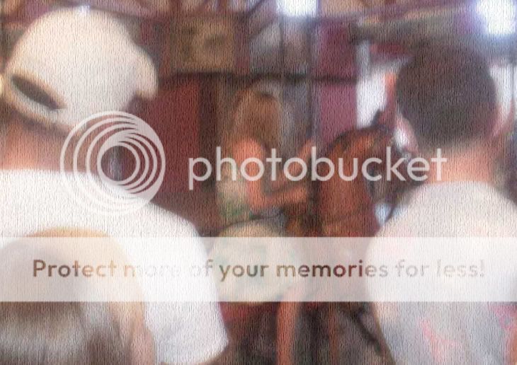