You get different function controls, depending on your zoom level. Zoom in [ctl/+] and in the upper right of a forum page there will be a Plus in a box, that opens a “search tags” window. But if you zoom out to a smaller text size, the magic Plus morphs into “+new topic” in the same box, which no longer searches tags, but opens the “new topic” window instead. Zoom back in again, and the same button no longer enables a new topic. Out erstwhile webmasters have broken new ground with the power of the zoom.
Apparently, I’m the only doper with poor enough eyesight to “see” this. Iff you ever want to search tags (whatever the hell that means)), just hit zoom a few times until “new topic” disappears from the box with a plus still in it.
Wow, that’s weird. You have to have it way zoomed up, much more than I do.
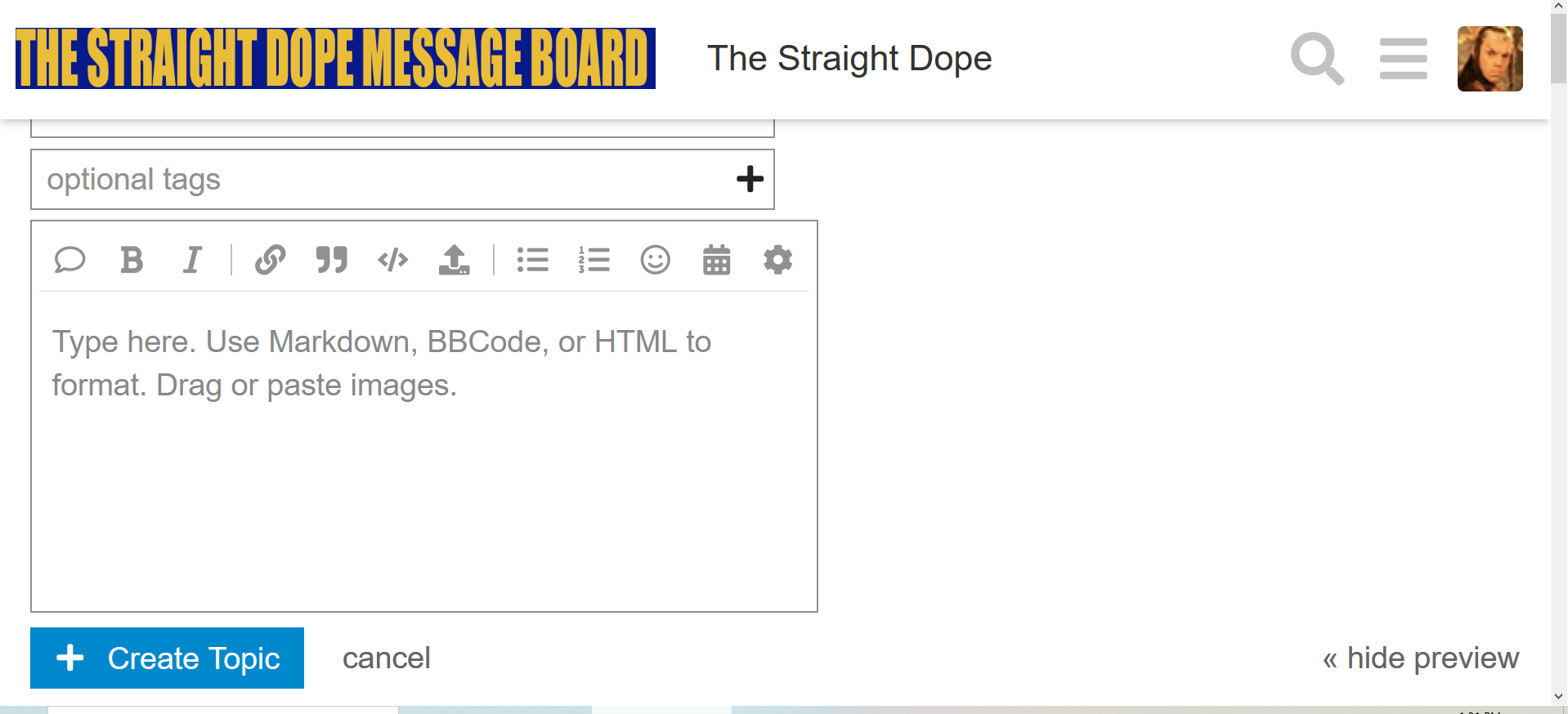
However – when I do it, under the tags box there’s a box which says “create topic”. Is that not there for you? Is it maybe below the bottom of your visible screen? Try scrolling down.
And in the not-as-zoomed version, if you click on “create topic”, there’s a box in the corner of the resulting box which says “optional tags” and has a plus in it. Clicking on that brings up the search tags version.
So you should be able to get at both of them in any size; but I don’t know why they switch places like that.
Ah, now I see what you are talking about. You have to have it zoomed in 200% for this to happen. When you go to create a thread, because the page is zoomed in it cuts off the top of the reply box so you can’t add a thread title.
Try using the zoom at just 170%, that still allows you to see all the text fields.
When writing a post, whether an OP or a reply, there’s a heavy line (it’s dark blue on the “SD light” theme) that separates the top of the editing area from the existing thread and upper page chrome.
That heavy line is a slider. You can drag it upwards to have a taller editing & preview box and not waste half your screen looking at stuff you don’t need. Dragging that up may help the OP with his issue.
I’m embarrassed how long it took me to notice that that heavy border was a functional thingy, not just a decoration.
At to the OP’s contention E0D nailed it. Once you zoom big enough vertical scroll bars appear so you can slide the editing box or the dropdown(s) above into the visible area.
Using real high zoom levels exposes all kinds of quirks in many websites.