I like the Michigan flag because it has a friendly Sasquatch waving at you. More Sasquatches should be like him instead of being shy and retiring and unwilling to have a decent picture taken and all.
Seriously, I’m feeling old right now because I can’t remember the last time I looked at the state flags. So many of them look new to me. Even Louisiana, which I knew had a pelican on it and South Carolina with its palmetto tree look different than I remember. Please don’t tell me that old age is creeping up on me. And please, please don’t tell me it’s already here.
It seems I’m the lone dissenter when it comes to the state seals on flags. I ask, what good is a state seal anyway, if you can’t fly it over your state buildings for all to see?
With all the talk about state flags, talk about redesign is making the rounds again here in Minnesota, which currently has the state seal on a blue banner. SO - what do you think about this proposed redesign - wavy fields of green, white and blue, with a yellow star on the blue. It’s been proposed since 1989 from a guy who runs a cool flag shop in my home town.
BTW, he said he has stopping selling Confederate flags this week.
A pennant is a type of flag. There’s nothing wrong with it. It’s simple and distinctive and easily recognized. The only thing I would do to improve it is remove the stars.
As soon as I saw this thread title I was going to nominate Alaska and New Mexico. Both are everything that a flag should be.
And as an Ohioan, I sort of have mixed feelings about our flag: I like that it’s unique, and it’s certainly far better than all of those seal-on-a-blue-bedsheet flags, but there’s nothing about it that really says “Ohio” (unless the big circle is an O, which violates the no-writing rule), and it’s too complicated to draw easily.
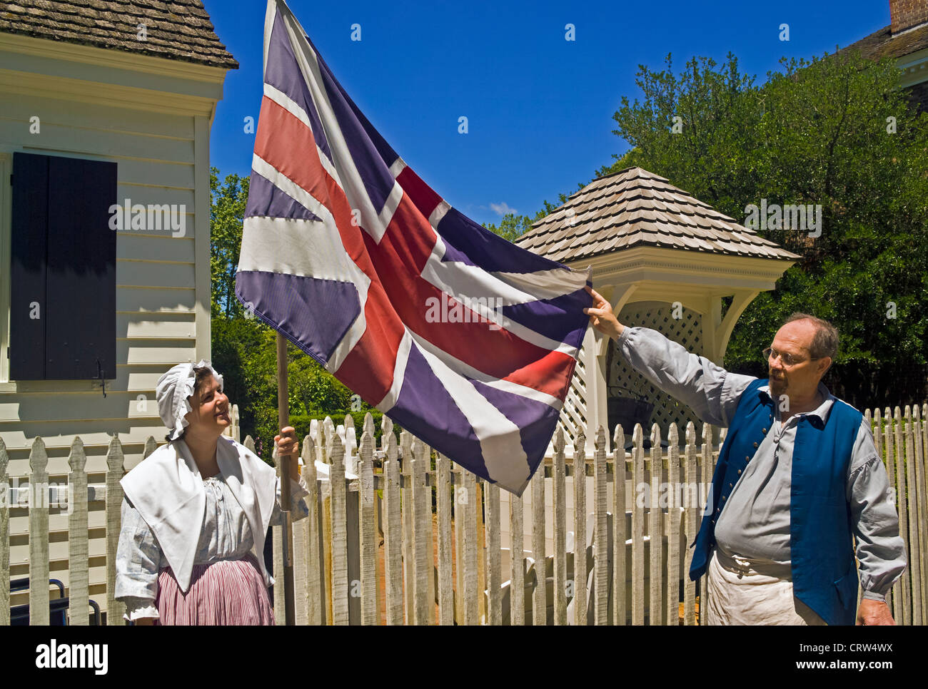
But that’s just it–by the time you’ve put it up on a pole 50 feet off the ground, on a piece of cloth that’s flapping and undulating in the wind, you can’t see it. State seals are fine for being put on fancy letterheads and such; the flag should be something that you have a snowball’s chance in hell of distinguishing from ground level when it’s up a flagpole and waving in the breeze.
I think that would be a vast improvement, and a very good state flag.
Not a state, but I think Washington DC has the best sub-national entity flag in the US. It’s perfect.
I hate, hate, hate Maryland’s flag. I used to eat at this Italian chain restaurant decked out in Italian horse racing flags, and the Maryland flag would have fit right in.
So any state flag with a saltire on it is verboten? Pish and likewise tush. Florida’s saltire references not only the Confederate battle flag, but also Spanish and British flags that once flew over the state.
As for Arkansas, I had never even heard of the Confederate symbolism of that flag before reading the Wikipedia entry you linked to. It’s pretty damned subtle. So is Alabama’s. Mississippi’s has to go, though.
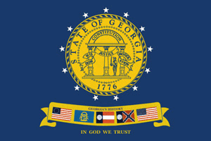
For Georgia, you want we should return to our 1956 flag? Or the one after that? Aside from being purely hateful - the Georgia Legislature added the battle flag saltire as a direct response to Brown v. Board of Education - the 1956 flag was a ugly disaster from a design perspective. So was the boring blue one, after. No, I’m very happy with our current flag. How many Americans do you think realize that it’s based off this flag, and how many do you think even know what that flag represented?
Also, Arizona’s flag looks like the logo of an Arena Football team.
In 2001, the North American Vexillogical Association did a survey of the US state and territorial and the Canadian provincial and territorial flags, and New Mexico won. Georgia came in last.
My only criticism of the proposed Minnesota flag is that it has a top-heavy aspect to it. Make all three color bands equal in size and shrink the gold star to fit.
As to Mr. Mitchell’s proposed flags…Some excellent ideas, but the constant use of red, white and blue is boring. I know he feels this gives them a “family” look, but I don’t see that as being a worthwhile goal. There is no reason why yellow, brown, green, buff and even purple couldn’t be used. Let’s reserve red, white and blue for the national flag.
The California flag has the further oddity of saying, not just “California”, but “California Republic”. The flag goes back to the days before California was a state. For a very brief time (like three weeks), a group of Americans in northern California seceded from Mexico and declared itself an independent Republic, and the flag is from that time. Wikipedia: California Republic
Hey, my post inspired a thread! Acsenray, I see you put a lot of thought into this.
I think you can tell by the level of derision in the article which flags are better than others. I’ll give you New Mexico, and a few others.
And I agree that state seals don’t work on flags, but you could probably get inspiration from some of the elements in the seals to redesign a better flag.
But I’m still not completely sold on “no words or letters allowed”, cheesy as it might be. Can we really come up with 50 distinctive designs and color combos to avoid confusing one state with another? I like some of the designs on Honey’s cite, but the identical “red white and blue” color combo for all of them makes them blur into each other after looking at the first few.
I forgot to include D.C., but I agree it’s good. I’d still rank New Mexico above it though. The D.C. flag is simple, distinctive, and striking, but it’s not particularly original—it uses standard heraldic colors and elements—and it’s not beautiful, and New Mexico’s flag is beautiful.

#/media/File:Flag_of_Georgia_(U.S._state).svg)