I have a larger nose than I’d like. When I had my deviated septum repaired, they actually also took some length off of my nose. Even with that, I still don’t really like it  So yes, I am self-conscious about my nose. (In fact I seem to recall someone once posting in my guestbook or something on my site referring to me as the “long-nosed bitch”… heh)
[QUOTE=Yllaria]
Reply on replies.
Razor Blades:
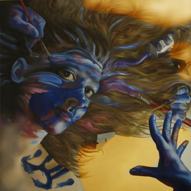
I really don’t understand the negative reaction to the razor blades. They’re tools for gosh sakes! I, personally, use them more for house painting than portrait painting, but they’re tools. They can be used for all kinds of things, including making art.
The way they’re used in this painting creates a conflict between seeing the painting as a 3-D representation and seeing it as flat.
>>>Thank you so much for sharing this painting, and the process of painting it, with us.
[/QUOTE]
Ah-hah! Your explaination of the conflict the razors cause may be the reason I dont like them - I wasnt certain why I disliked them because i really didnt feel anything specifically negative. That helps me understand the painting on a different level!
[QUOTE=Liberal]
I saw this in another thread, and I think I like it even better now.
Opal, I can only give you my honest opinion. I absolutely love it. I love the hair. I love the eyes. I love the can. The hand print. The hand(s). Those eyes. The nose. Did I mention the eyes?
I realize my taste may not be trustworthy, but I just disagree with your teacher about almost everything. Let me put it this way. If I saw your painting in a gallery and could afford it, I’d buy it in a heartbeat. It’s really beautiful.
[/QUOTE]
You’d have to get in line, man.
[QUOTE=OpalCat]
I have a larger nose than I’d like. When I had my deviated septum repaired, they actually also took some length off of my nose. Even with that, I still don’t really like it ![]() So yes, I am self-conscious about my nose. (In fact I seem to recall someone once posting in my guestbook or something on my site referring to me as the “long-nosed bitch”… heh)
So yes, I am self-conscious about my nose. (In fact I seem to recall someone once posting in my guestbook or something on my site referring to me as the “long-nosed bitch”… heh)
[/QUOTE]
Well, whoever posted that will have to get over it.
Art imitates life…I love it! Does the nose go with the razor blades? I looked at some of your other stuff on your website…dayum! You have some real talent! Which is probably what prompted the nasty comment in the first place…people can’t stand it when they see how much you to offer, so they criticize on something irrelevant.
I don’t remember what prompted the comment. I don’t discount the possibility that it was actually me being a bitch. Reference previous mention of being on better medication now.
[QUOTE=kaylasdad99]
You’d have to get in line, man.
[/QUOTE]
Aww… you guys… you honestly have no idea how meaningful it is for me to hear you say that. I’m really, really hanging a lot out on this oft-mocked idea of making a living as an artist, and I’m constantly filled with doubt that anyone would ever actually pay money for my stuff. It means so much for me to hear you say–even if you’re joking around–that my stuff might be worth buying.
[QUOTE=OpalCat]
I don’t remember what prompted the comment. I don’t discount the possibility that it was actually me being a bitch. Reference previous mention of being on better medication now.
[/QUOTE]
Hmm, I wouldn’t know. Of course there are probably those who also said “That woman is a total bitch!” and “that woman” turned out to be Mother Teresa.
I wish I had 1/10 of your artistic ability.
[QUOTE=OpalCat]
Aww… you guys… you honestly have no idea how meaningful it is for me to hear you say that. I’m really, really hanging a lot out on this oft-mocked idea of making a living as an artist, and I’m constantly filled with doubt that anyone would ever actually pay money for my stuff. It means so much for me to hear you say–even if you’re joking around–that my stuff might be worth buying.
[/QUOTE]
“Might?” I’m very serious and I think the others are as well.
If you don’t mind, I’m going to do my best to be a complete dick. What everyone else said is true, you have unbelievable talent, not just technically, but also with composition and such which is nothing you can learn.
With that being said, if we want to get into surrealism, the hair is fine. It’s realistic enough to be believable, but if you make it too realistic there’s no way to get all the shit in the hair to look believable together. It looks a lot like Magritte’s surrealistic approach. Also, I’m not sure how surrealistic this is, in the classic sense. A true surrealistic piece would have some form of piercing flesh (only mostly joking).
The main problem with the composition is the balance - both in luminance, hue, and graphic weight. Oh, here I’m saying in a classic sense, so if you do things different on purpose, then disregard. Also, I’m painting a square right now. Squares are a bitch to work with, so I sympathize.
And first, I would rotate it, like thus. But that’s a personal thing, I’ll assume you’ll stick with how you have it from here on out.
So, luminence. Basically, the upper right hand corner needs lightened, along with a smidgen of the lower left. That way, you have the gradient moving into one corner, which causes the eye to follow from your hand to your eyes, which are the two things with the most graphic weight. If you keep that corner darker, it makes everything go bonkers. Kinda like this.
All right, hue. Basically, you’re missing yellow, or more particularly, orange. You have a nice tan through the back, but it’s not yellow enough. I’m not sure if that’s raw linen or what, but it really needs a vibrant orange to set off everything. You know, complements and all that. See here.
Obviously, you’ll have to go back through and mess with the reflected shadows to make it work, but that isn’t so bad. Oh, and you’ll need to put a smidgen of orange between your neck and shoulder and hair, so that way you’ll have MASS OF ORANGE and then a tiny little area of orange, which will really answer each other. I’d also change all the reds to red red orange.
And speaking of answering, you see those two streaks of paint on the hair between your eyes and the hand in the lower right hand corner? I’d form them more into the shape of the hand, you really need a shape to answer that really bold one formed by the fingers. Oh, and if you make the nose stand out just a tad more, that would be amazing. That way it would be the paintbrush in the top left corner pointing to the nose which points to the V in the hair which answers The Hand which abruptly stops the motion with the strong black outline.
This is a lot harder online than in person. I’ll stop there unless I think of anything else. Please ask for clarifications, because I know I muddled a lot of stuff above.
(Also, random comment: A lot of artists now seem to think they can pick up a brush and start making pretty colors, completely ignoring the human figure and/or realism. It’s really, really nice to see not only someone painting realistically, but painting it so damn well. It’s something that I can’t quite get right and it’s a really under-appreciated skill. Kudos.)
Thank you ZebraShaSha for your analysis. I will read it more closely tomorrow, when I haven’t had so many 151 and Cokes to combat my horrible and debilitating tooth pain. One thing I do want to mention, though, is that I 100% agree with your point about rotating an image for compositional impact. The other image I linked to in the OP, this one, is, I feel, a much stronger painting than the original black and white photograph (which I took for my photography class, Fall 2006–the same semester I started painting) which is the same image rotated 180 degrees. If you turn it over, you suddenly see how mundane it is. Yet when you “turn it on its ass” it takes on a new dimension. I will have to think carefully about what you said. But, like I said, tomorrow.
hic
My thoughts:
- I like the razor blade in the hair (upper right). The one though directly to the right, not so much mainly because of the start Blankness of the page there. I just focus on the razor and that’s it- that makes me then look at all the empty spaces around the hair and such (I’m sure you’ll be adding stuff in, just that’s what it looks like right now).
- This is just me, because I’m kinda anal about these things- I see the purple and I see the Blue- And I dig them. I like the blue from the paintbrush, and the Purple from the tube…
But here’s my issue now: Where’s the PINK coming from? On your Cheek and neck I see those shades of pink- and I know they’re painted there and all, but I kinda wanna see a tool or some sorta explanation of how they got there too, if that kinda makes sense? - Also, what is the floating hand doing? The one just posing out in front. It makes me wonder. (I also like that I didn’t see the 3rd hand (the one in the hair on the right for me) right away, I like paintings that I can start at and discover little things about them. So that was kinda cool.
- I liked it on the whole, and thought it was a nice piece. I can’t wait to see it finished!
~Post reading comments thoughts~
Yeah, it’s only after hearing other people talk about the Nose and Ear do I start to dwell on their proportions and stuff, when I looked at it on my own, I thought it was fine. But once someone points it out, I immediately go and stare at it. Had no one said anything though, I never woulda known.
Regarding the razor blade on the edge of doom (heh) yeah, there will be hair on the other side of it, snipped off. There used to be, but it looked like crap, so I painted over it. As soon as the paint has dried enough to paint over it, I will repaint that hair and we’ll see if that razor blade gains some standing.
Is there going to be alot of “empty” space beneath the “posing” hand? or will that all get hair too?
(The coolest picture was the one w/ you standing in front of it to give it a sense of scale- very Awesome)
Regarding the hair, I can think of two things that might be bothering your inarticulate teacher. (Sounds like a very frustrating individual. The kind of person I want to pinch.) One is the hairline. Is there a sense of the hair growing out of the head? It looks as though it might have a bit of a “stuck on” look, but I could be wrong. It’s hard for me to see in the photo, since it’s fairly dark up there. The front of the hairline looks good.
The other thing is the where the hair meets the edge of the face, mostly at the curve of the brow and the cheek. Is the head meant to be resting on the hair? There’s a very hard line there and the hair as it spreads out doesn’t give the impression of “giving” beneath the weight. There’s a bit of a pasted-on look to the edge of the face and I lose the sense of three-dimensionality just at that line.
The only other thing I note is that the ear comes forward a bit. I’d want to darken it down to push it back.
That said, this painting is drop-dead gorgeous. I love the hair, I love the nose, I love the eyes, I love the concept, I love the paint and tube and razor blades, in progress though they be. You have a ton of talent. Rock on.
I too don’t like the razor blades. But beyond that, I’m not sure that the eyes are quite right: each eye is looking in a seperate direction.
But you’ve got talent!
First of all, because I know what people are like (you get a hundred pieces of fanmail and one piece of hatemail and spend the rest of the day brooding over the one), my pure visceral reaction is that I absolutely adore it. Others have said they’d buy it. I’m saying that when it’s done, if you want to sell it, email me a picture and name your price. I realize I won’t be able to afford this piece of your soul, but give me a chance. If I like the finished product this much, I’ll want the chance.
Having said that, here are the tiny things I have to say.
Does anything stand out? Well, the paint can. It doesn’t bother me, but I’m not in love with it. Also, the hand in the low right seems somewhat out of place. I can’t figure out what it’s doing. I realize there has to be something there (but even as I write this I become less certain of that) but I think it would work better if it were also holding a brush or something, rather than just being in that position.
Lighten the background in the upper right? I say nay.
The hair? Great. Don’t listen to teachers. What do they know?
As for the razor blades, I do have a little problem with the lower one. Is it just me, or does it inexplicably vanish into the background, like it’s cutting through it? I’d like it better if it were flowing freely in the hair like the upper one.
Gosh, that’s beautiful and neat. I really like it.
I think your teacher is a doofus and your hair doesn’t need any more work – it’s a little vague right above her head, but I think that adds balance. The tendrils are stunning.
Picture #2 is a better photograph of it, isn’t it? Because in the first picture, everything’s a big green and I find the blue a little off-putting, but I’m thinking that’s just the photograph. The other shots are more balanced.
What I really particularly like is the play between the hair and the background color in the upper right, it feels like a nod to portraiture of a famous era (and I can’t think of which one) – there’s something really pleasant about that. Your flesh tones are gorgeous.
The nose might be a tiny bit out of proportion, but it needs to occupy the space that way so I wouldn’t call that a flaw or anything. It’s more that it’s unflattering to you, as a self-portrait.
The ear jumps out a bit, to me. It feels a little awkward. I’m not sure you need it, I think the flow is a little better without it, because the piece is really busy.
It would be interesting to see what the rest of your classmates came up with.
Okay, went back and read the other comments, I didn’t realize you’d been fretting so over that nose. I hope your nostril fix satisfies you; I think you need that activity (the blue of the nose and its size) in that spot for that piece to work. If you truly “fixed” your nose to make it accurate, it would throw the piece waaay off. IMHO.
In going back and re-looking, I find the activity in the forehead a bit much. If your work on the nose changes the balance and lets you turn the forehead down a bit (the white bothers me), I think it will help stronger elements (hair, eyes) speak louder.
I like the razor blades.
[QUOTE=OpalCat]
Thank you ZebraShaSha for your analysis. I will read it more closely tomorrow, when I haven’t had so many 151 and Cokes to combat my horrible and debilitating tooth pain.
[/QUOTE]
Ok I’m going to grab some lunch and then read the rest of this thread, but I did want to remark, before anyone gets the wrong idea, that the “so many” number to beat, referred to above, was 2… over about a 3 hour period. Mostly it had just made me really, really sleepy. (Just didn’t want you all to think I was sitting here trashed out of my mind or anything. Not that there would necessarily have been anything wrong with that, but I’m just saying.)
![]()
Just skimmed over the other opinions, so my view won’t be too influenced by others.
GREAT painting! I’d love to have it on my wall (not gonna happen, I can’t afford nice things). Others seem to have picked out the emotional bits with the color arrangements and placements. Very clever! The mask motif/beginning to grow out of the canvas is so ingenious, first visually, then as a message.
This isn’t fun to say, because it looks like you put a lot of effort into it…the hand in the lower right? If I’m reading the composition correctly, it should be load-bearing, as if its owner (you) were using it to support yourself while the leftmost hand works with the brush. But it’s just floating there. Perhaps if it cast a shadow on the canvas? In fact, it could be another split emotion/image clue if that hand cast a shadow from a different light source than the one lighting the face…
I think I see what your teacher is getting at with the hair. Since it is supposed to be coming out of the canvas, it should be more "lifelike,’ i.e., detailed, right toward the tips, where it interacts with the paint tube and other painting stuff.
I’d keep the razor, but that’s just me. Besides having the emotional significance that it does, it belongs there, it being an expected item in a painter’s toolkit.
As long as you’re working on this scale, and if you feel comfortable doing this, there’s a chance to put a LOT of detail in the eyes, more than in their immediately surrounding area.
Critique time over! That is a spectacular painting, Opal. You better be very proud! 